Welcome to Compose. There's lots of stuff here, all about composing paintings.

Current entries appear in Dianne's weekly newsletter.


Friday, January 30, 2009

Direction: The Control Element

In no art form is the visual element direction more evident than in figure skating on ice. A figure skating choreograph resembles a Jackson Pollock painting with eights and circles and straight line pitches, vertical leaps...
Figure skating choreograph by artist Larisa Gendernalik

Paint by Jackson Pollock "Number 8"

Couples Figure Skating--Photo from mahalo.com

I can remember many years ago a certain figure skater whose routine was not much more than a set of circles with a flying bird body formation. I thought it was quite boring at the time, but we don't see any of that these days. No indeed. Figure skating can be heart-stopping with the many multi-directional changes and leaps.

Likewise, I notice that paintings with a strong directional dynamic hold my attention much longer than those whose movement is too quiet and static. Movement is the key word here: we use the visual element direction to create visual movement. Visual movement creates visual paths. And the nature of movement can create rhythm. So a lot rides on how we use direction as a part of our visual language.

We all know what direction is. North, south, east, west, right, left, up, down, around and around--all those points to which we are constantly aiming and switching. You can't even get out of bed in the mornings without changing direction. And we use "changing direction" as a life metaphor, business metaphor, relationship metaphor, behavior metaphor.

It's role in our painting? To control the viewer's attention. That sounds pretty important, right? Okay, so what do we have available to work with. Well, we can use horizontals (right and left), verticals (up and down), diagonals (leaning), and circles ('round and 'round and 'round and 'round). The key is to use these with enough repetition to prevent chaos and enough variation to keep the viewer engaged.

So how do we create with direction? Flow and transition. Two masters come to mind: Charles Reid and Richard Schmid.
Charles Reid "Two Views: Abby"
1. Accenting points
Charles is adroit at accenting certain points of the total composition so that our eyes want to move --make a transition--from one area to another.

I've indicated some of the major ones with little white arrows. Keep looking--you'll find more

2. Losing edges
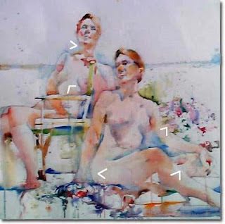
Charles is also adroit at utilizing lost edges, another tool that enables the eye movement to flow and to transition from one area to another.

Again, I've used little white arrows to point out a few key areas. Keep looking, though, and you'll keep finding them.

3. Repeating Color
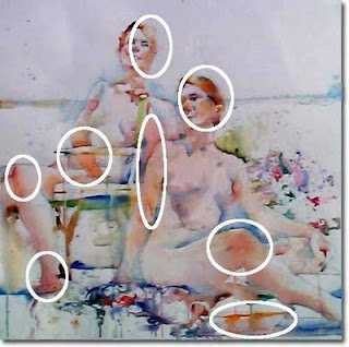
And another of Charles' real genius is his inate ability to repeat color while giving it just enough variation to keep it from being boring. I've circled a few examples here.

These repetitions of color also act both to create flow as well as make transitions.

In a cool background, Charles has used the repetition of warm colors not only to define skin tones and hair, but also to keep the eye moving in various directions.

Next we go to Richard Schmid.
Richard Schmid "Chicken"
4. Guiding Brushstrokes

Richard's delicious brushstrokes are to my mind his trademark genius. Each stroke is guided with intention to define whatever subject is being painted using the careful placement and movement of the stroke.

5. Giving Attention to Edges
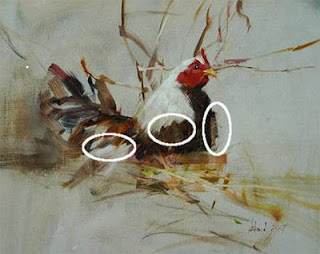
Where Charles can lose an edge, Richard can manuver it along the perimenter of the shape to show roughness or smootheness, softness or hardness, swiftness or slowness. His edges are not just perimeters--they control eye movement.

Edges contain characteristics that define the subject. Richard finds these characteristics and renders them in a way that the eye wants to pause and taste it before moving on to the next area.

But perhaps the all time great master of using direction was Leonardo da Vinci. With every thing he did in a painting, he was manipulating our attention just as with every note, volumn and rhythm, Mozart was doing the same thing.
6. Positioning Your Subject
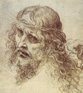
Leonardo turns the face of the Christ-figure toward the left edge, then shifts the eyes to look at the viewer while directing the flow of the hair down the shoulder to the right-hand corner.

He uses a similar ploy in his world-and-ages famous Mona Lisa where the eyes are looking at the viewer, the face is turned slightly toward the left and the hands are positioned toward the right.

Throughout time, where genius has come into play is the artists uncanny ability to notice what's available and to use it adroitly. So we're right back to last week's lesson and all those before. We hone our skills and our eyes and join them together to make it work.

Saturday, January 24, 2009

Size: It's Bigger Than You Think

What a surprise for me when I finally realized how small most daily paintings are. Looking through blog after blog of these little jewels, I automatically sized them mentally at least as large as 9" x 12". I could plainly read 6" x 6" or 5" x 7" or even "postcard," but this data failed to translate into true perception until one of the bloggers showed his little daily side by side with a coffee mug.

Light bulbs! Either the mug is huge or the painting is teeny, which brings up the first requirement for size as a visual element: Size requires clues--there must be a comparison, else size doesn't translate.

Size and Proportion
Seeing a photo of a marble or a tennis ball singularly tells us absolutely nothing about the size of either, but a photo of the two spherical objects together tells us about the size of both because we can see their relative proportion to each other.

We can draw the human body's proportion accurately by comparing the length of the head to its other parts. Keeping all the parts' sizes relative to the head (or any other part for that matter) will guarantee we render individual parts the right size therefore enabling us to create a human image in proportion to itself.

Leonardo shows this in a diagram he did for us with his famous Proportions of Man.

In fact, just as the proportion of ingredients in cooking determines the flavors in food, proportion of sizes plays an important spatial role for every artwork we make whether drawing, painting, or sculpting. Once we make the first shape, the size of every shape to follow will affect and will be affected first shape we made.

Size and Proximity
One way size affects shapes is to show their distance from one another. Our vision is such that the further away a thing is, the smaller we see it compared to anything in front of it. Looking out my window I can see trees. I can hold up one finger and totally block out a tree not thirty feet away from me. The same finger can block out five trees a hundred feet away. My finger is certainly much smaller than any of those tree trunks, yet its proximity to my eyes makes it appear larger by comparison.
In the above painting by Richard Schmid, the height of figure (Nancy) measures a little taller than the huge boulders behind her. That size puts Nancy closer to us and the boulders further away, showing them to be some distance behind her. If Schmid had painted Nancy within a couple of feet of the boulders, in the painting they would dwarf her in size. That's called size relationship.

Size and Foreshortening
But size plays yet another role-- it also enables us to foreshorten. So what does it mean to foreshorten and why is it important to know?

(To stray a bit), prowling the internet, I was hoping to find a clear explanation for foreshortening, but all I could find was a lot of dense rhetoric that I think fails to communicate exactly what foreshortening does. So let's begin with an illustration. Look below at the two photos of the same male cardinal.

The photo on the right is a side view where we can perceive the bird's full length head to tail. The other is a rear view where we can see his tail and his head, but we see them substantially closer to each other than in the side view. In the rear view, the space between the cardinal's head and tail is foreshortened.

The space between two ends of an image is shortened any time the image's length is other than parallel to our eyes.

Here's another example. Notice the cow on the left, more parallel to our eyes. Its measured length head-to-tail is greater than the length head-to-tail of the cow on the right.

Because the middle cow's rear end is closer to our eyes than its head, we see it shorter from head-to-tail than the cow on the left, but longer than the cow on the right whose backside is much further from our eyes than its head. So how much a thing is foreshortened depends upon the proximity of each it's two ends to the viewer's eyes.

Head spinning? Not to worry. None of this is necessary to know if you're a keen observer of what your eyes are actually seeing rather than what your left brain tells you you're seeing. However, when we know this stuff, we can feed it to the left brain so that it will reinforce what our right brain is responding to.

Happy seeing!

Saturday, January 17, 2009

And Then There Is Shape

What is a shape?

Try this. A shape is an area enclosed with edges, specific or implied. That's my definition.

I could not believe it. I checked the definition in my trusty old 1960 edition of Webster's New World Dictionary and I found garbley-gook. Then I got curious and started Googling for a definition. Same thing. Even dictionary.com has no clear definition for shape.

Aside from the definition, let's try to understand shape as it pertains to us as artists. First of all, important for artists to know is that every shape has two parts: the space occupied by the shape and the space around the shape. You can't have one without the other. Think about it.
Above is the famous "Hare" by Albrecht Durer along side a portrait by Pat Weaver. Both have in common an acute observation of the shape itself as well as the space around the shape. That's what makes both shapes interesting to look at, even in silhouette.
Look at the silhouette images in reverse. Switch your attention to the black shapes. Notice how interesting each black shape is on its own. Beyond being aware of both shape and the space around it, each artist has made these shapes interesting by careful observation of their edges and how the edges relate to both sides--the shape and its surrounding space.

But before we dwell on that, let's explore some nomenclature.

Since the early 20th century, shapes that occupy space have been called positive shapes whereas the space surrounding a shape is called negative space. I've always objected to these labels and I'm not alone: efforts abound to find more definitive labels, but none seem to stick. So, we will let it stay for now and use the historical labeling. (If any of you has a suggestion for how we might rename these shapes, please leave them in Comments. Thanks.)

Okay, that tells us one characteristic of shapes. The other is that they fall into two catagories--geometric shapes and organic shapes. Loosely defined, geometric shapes are those with precise edges such as a circle, square, triangle, rectangle and so on. Organic shapes are all the others, shapes whose edges are more random. In painting we are likely to be dealing with both.

And here is where the discussion gets tricky: we can know all this about shapes, but using shapes dynamically in our painting and drawing is a bit different from just knowing about them. So how can we make that happen?

Use acute observation and sensitive interpretation. Just that. Rather than look at a shape and call it a rock, for example, first look for the underlying geometric shape that forms its structure, then study intensely the variations of the edges because these variations are what create the real character of the shape.

Next, look closely at the value and textural relationship of both sides of a shape's edge. Sometimes the negative will be blending right into the positive, sometimes there is a softness between the two and sometimes there is a distinct division.

In my judgement, Charles Reid is one of the best shape-makers among our 20/21st century artists.
Charles Reid "Claire" Watercolor on paper

Reid begins each of his paintings by doing a careful contour drawing to discover and anchor the shapes and their relationships to one another. When he begins his painting, he is constantly shifting between negative and positive, sometimes causing edges between the two to be lost; other times, creating a softness between them and at others, showing distinct sharpness to the edges. What results is a lively painting that continues to invite the viewer to return to it.

For me personally, Reid's paintings are like Chopin piano works--I want to revisit them over and over again. I think that desire to keep looking at a art work is one of the marks of its strength and success. And when an artist is truly tuned in to the characteristics of each shape, a lot is bound to get translated into the resulting work.

Try this. Visit websites of artists like Reid, Jennifer McChristian, Richard Schmid, Carolyn Anderson, Robert Genn and others whose work is strong. List the ways they handle shapes in light of this discusssion, then try some of those techniques yourself and watch the world open up.


Saturday, January 10, 2009

Our Visual Vocabulary: The List and Line

Writers have words. Words have roles. A noun tells us what a thing is; a verb tells us what it is doing. Adjectives tell us something about it. Adverbs tell us how it's doing what it is doing. We call that vocabulary.

Painters have a vocabulary we call visual elements. Each element plays a role in the way we see images in our paintings and drawings. This list goes like this:

Line
Shape
Size
Direction
Texture
Value
Hue
Intensity
Temperature

As a student, I saw and heard the list over and over again. It took some time, though, before any one of the elements became a reality to me. Same in elementary school where I first met the parts of speech of the English language. "So what," I thought. But gradually it dawned on me that these very parts of speech enable me to say what I'm trying to say, that to comprehend their roles will help me to make myself understood without stammering or hesitating with "uh," or repeating that communication-devouring phrase "you know."

Same is true for the visual language. In fact, comprehending these roles is so important, I plan to spend the next several posts looking at them individually.

For example, what does Larry Roibal understands about line that enables him to do this?

Larry Roibal "Arne Duncan"

...and this...

Larry Roibal "Brother Can You Spare 34 Billion'

...and this...

Larry Roibal "Barney Franks"

Look what power Larry finds in a line. He finds the important edges of shapes that show their identity. He finds just the essentials reducing the number of lines needed. He finds a speed for making the line that communicates gesture while retaining contour.

Larry's lines cluster together where needed to communicate shadow, they become heavier where a point of emphasis is needed, and lighter where they eye needs to move on.

Larry's line is mostly a contour line. That's one that searches out edges and rides along them.

Then there's the gesture line that Rembrandt van Rijn understood and used so adroitly.

Rembrandt van Rijn
Rembrandt found action in a line.

Rather than riding edges of shape, the gesture line rides movement, captures the thrust of shapes and action which may or may not follow the edges of shape. Gesture drawing catches what the thing is doing.

Look what Helen South finds that the gestural line can do.
Look to the right here at a smaller version. You can clearly see that Helen has done a gesture drawing of a closed hand, perhaps her hand. In the larger version which initially appears to be a collection of scribbles, we are aware of the movement, what the shapes within the hand are doing--edges circling other edges, edges traveling from one area of the closed hand to another. When we reduce the size, we see the hand itself more clearly. We see that drawing what a thing is doing also commuicates what it is.

Whether riding the edges of a shape or search out what it is doing, the line is a power tool. For a thorough course in gesture and contour possibilities, I recommend Kimon Nicolaides The Natural Way to Draw.

Happy drawing!


Thursday, January 1, 2009

Lists and "Thanks, Making a Mark"

If you haven't already discovered Katherine Tyrrell's brilliant blog "Making a Mark," you must and not because she recognized this blog among her top five FAQs and Answers Really Useful blogs. Katherine's blog is one of the best experiences I've discovered within the blogshere.

Thanks, Katherine. It's quite an honor to get this recognition.
***************************************
When I was teaching in bricks and mortar, I enjoyed opening the more advanced classes with a composition lesson. At times I'd choose from one of the two major art magazines (I'll refrain from naming either) a painting that was a bit less than successful (making one wonder how it got published), then we'd analyze why the painting didn't work. At other times, I'd pick a well done painting and we would examine all the dynamics that made it work. It didn't take long for my students to realize that good painting involves much more than just copying images. They looked forward to these little mini lessons and so did I.

For them, I developed a guide which I called a "think sheet" and they called the "cheat sheet." It's not much more than a set of lists, and it's purpose is simply to jog the memory as to possibilities.

To begin the New Year, I want to share my "cheat sheet" with you. Enjoy and Happy New Year!

A Brief Outline of How the Visual Language Works
(A Think Chart for Visual Composing)
"We construct images, we compose art work."

The Elements (Our Vocabulary)
Line
Shape
Size
Direction
Texture
Value
Hue
Intensity
Temperature

The ACTION principles (Things we can do with the vocabulary to make it work)
Select and Place
Gradate or Modulate
Alternate
Contrast
Vary
Repeat
Make Similar
Elaborate
Economize
Isolate
Overlap
Juxtapose
Find and use perspective
Find and use angle of shadow/light
Create dominance

The RESULTS (What We Want To Get)
Pattern
to avoid randomness
Balance
to prevent one-sidedness
Order
to overcome chaos
Harmony
to stay in tune
Rhythm
to avoid being static
Proportion
to set relationships
Transition
to enable movement
Form
to provide structure
Focal Point and Visual Path
to guide the eye
Emphasis
to avoid being erratic

Toward our ULTIMATE GOALS
UNITY
to avoid fragmentation
PURPOSE
to negate aimlessness

The CAUTION principles (Things to avoid along the way)
Tangents
Sore Thumbs
Aimless Centering
Disconnectedness


Copyright 2009, Dianne Mize


Saturday, December 27, 2008

The Artist's Zone

There's no better place for an artist to be than "in the zone". It's a place where all creative people function at their absolute best. It's our inner hub connecting all that we are with all that we know. There is no conscious thought there, there is no time, there is only our being doing. It cannot be faked and it will not let us tell a lie. And the only momentum is forward. It is the highest form of unity and harmony working together within the artist. There is no loneliness there, only oneness. It cannot be forced. But it can be obtained.

So how does an artist get into the zone?

Let's look outside being visual artists. We could look in any direction where skill and performance come together into masterful moments. For example, Tiger Woods, Krsiti Yamaguchi, Joshua Bell, and Maya Angelou--all who have one thing in common: they are masters of their craft but each excels beyond the craft. At creativity time, each slides easily into the zone and that's where they deliver the most astonishing performances.

It's when each person's "inner hub" actively unites their obtained skills, their accumulated knowledge and their inner selves that we find them at their best.

Heavy stuff? Not really. I contend that every single individual who desires it strongly enough can become an artist who can "perform" within the artist's zone. In fact, it's probable that every one of us has already been there more than once. The trick as I see it is to find the zone each and every time we work whether while doing studies or whether working toward a finished work.

I'm convinced that the zoning in happens when we're totally focused on the subject and when we're prepared. I know Joshua Bell's preparedness includes (1) his familiarity with his instrument, (2) his skills acquired for playing the instrument, (3) his perpetual contact with the instrument (i.e. daily practice), (4) his knowledge of the music, and (5) his warm-ups.

I'd bet my last paint brush that artists who stay just as prepared and who approach their subjects with total focus on the subject itself will find themselves in their zone every time they work. Try it for three months, then let me know if it worked.

Happy New Year!


Friday, December 19, 2008

Unity, Not the Same as Harmony

Last week, I introduced the idea that unity and harmony play different roles in our painting. I focused that discussion on harmony. Here's unity:

UNITY


Unity means that all the parts fit together. In music, we designate a piece for a key such as Beethoven's Violin Concerto in D Major. The title of the piece suggests that whatever goes on in the violin concerto fits somehow with the key of D. It might fit by contrast or by similarity. The same principle works in visual art--parts all need to belong either by contrast or by similarity.

The opposite of unity is fragmentation. In life and in art, to fragment is to fall apart, to break away from the whole, and the result is incompleteness. So how do we know if our painting is fragmenting and what can we do about it? Here is where I would like very much to do the unkind thing and show some examples of fragmented art, but it would be best to try to use another approach. Let's try explaining:

Generally an art work will not fragment if it has...
  1. a strong connecting pattern of darks and lights that hold it together
  2. a good balance so that we don't feel one-sidedness
  3. a visual path to avoid aimlessness
Now, don't leave me yet. I know this little list looks like a bunch of art jargon, and I admit it does come close, but we have to use some kind of language to talk about these things. Let's look at a painting by somebody we know had it all working. Let's look at a John Singer Sargent.

Look at how the lights connect to other lights and darks connect to other darks. Let's throw it into a notan so you can see this better. That's what we mean by point number 1
Staying with Sargent, let's look for balance in point number 2. The strong vertical of the waterfalls and two figures is counter-balanced by the horizontal ornate rail in the background as well as the horzontal surface on which the woman is sitting. Nothing feels topsy-turvy.

And what about point number 3? A good visual path is as necessary to unity as a plot is to a novel. Without it, the eye just doesn't know where to go. Look at this wonderful path created by Sargent. Arguably other organizing methods can help prevent fragmentation, but I contend that if these three are working, the chances are better than average that the piece will have unity. And I believe that when a work has unity, it will stand the test of time.

Friday, December 12, 2008

Harmony and Unity

In the blogs and other art circles, we see the words harmony and unity talked about like a chef discusses salt and spices, but often I see the two words used interchangeably and they shouldn't be. Each is a distinctive result of something which has been accomplished by the artist during the process of composing and painting.

HARMONY
Harmony happens when all the elements in the painting's are in tune with one another. In an orchestra, if one of the violins is out of tune it throws an unpleasant dissonance into the piece being played. One of the worst ear-assaults is a piano out of tune. No matter how masterful the pianist, if the instrument is not tuned, the music can be nerve-wrecking.

The major element in a painting that creates harmony is color. And the major tuning has to do with the temperature of light. In representational painting, if we perceive all the colors to be illuminated by the same light, we instinctively feel the painting to be in tune.
Look at this watercolor painting by Charles Reid. He has used all the primary colors--yellows, blues and reds-- but all are tuned to the overall cool light coming from the overcast sky. He's managed this by sharp observation, by simply painting what he sees and by doing that he has given us a painting very much in tune with itself. We see yellows and reds cooled by having been neutralized thus harmonizing with the blues.

A similar type of harmony is found with Lilli Pell's painting below.
Pell has actually used complementary colors--orange/blue--as her major color scheme, yet even these complements feel in tune with one another because the oranges have been slightly cooled and neutralized toward blue. We feel the same light illuminating all the colors. Once again, Pell achieved this by looking, perceiving and responding to the colors in front of her eyes.

One emerging painter who continues to amaze me with her ability to harmonize is Karen Jurick. Look at this recent painting by Karen.
If you scan the piece, you'll find yellow, purple, orange and blue or two sets of complementary colors, yet we are not aware of the contrasts, only the freshness and vibrancy of color. Karen was painting what she saw. She got the color in tune because she responded to each of the colors she saw and how they related to one another.

As you move from blog to blog, website to website, and gallery to gallery, if something about a painting bothers you, look first to see if it feels out of tune. Keep in mind, though, that a painting can have many color contrasts and still be in tune. It is when those colors get out of harmony with one another that we feel a sense of visual irritation.

So what does the artist do to achieve harmony? Observe! And respond to what's being seen rather than to guess what one is looking out.

UNITY
Unity means belonging together or a oneness. A family might be made up of diverse personalities, various sizes of people, different eye colors and skin shades, but if the family agrees upon one strong attitude, that manner of thinking can give it unity. In an art work, when many diverse parts are made to fit together, then piece has unity.

Unity, I believe, is an overall motive for composing a painting. In next week's tutorial, I will begin to discuss different methods artists use to achieve this motive.

See you then.

Saturday, December 6, 2008

Scale and Composing

This week's and last, I'm responding to Dar who commented:
I wonder if you have any thoughts about format (size, shape, orientation) and scale (life size, sight size at arm's length or ten feet, etc), and how they apply to composition.
I took a look at format last week, so now let's look at the scale issue. Below are six paintings, each showing the human subject in a different scale in relation to the format. Notice how each puts you, the viewer, at a different distance from the person depicted in the painting. That's what scale is all about.
How far from you are the people in painting #1 as compared with the people in painting #4? And how close are we to the subject in painting #3 as compared with $6. In painting #2, to what extent is the environment important to the person portrayed as compared with painting #5?

These comparisons show that each of the above painting places a different kind of emphasis on subject. Whereas painting #6 brings us right into the little girls thoughts, painting #2 is as much about the market and street as about the person making a selection at the market.

So, when we compose, the closer we want the viewer to be to the subject, the larger the image of the subject becomes in our painting. The more important we want the surroundings to be to the subject, the smaller the subject becomes as compared to other things in the painting.

When we are very close to the subject, our composing of the elements switch pretty much to shapes within the subject and with less attention on fitting the subject into space. On the other hand, when we want the focus to be about human beings in a particular environment or situation, our handling of the elements changes in order to place the emphasis where we want it to be. Whatever our intent, the compositional principles are tools that can help us make the painting say and do what we want it to.

Compare these two paintings by Edward Hopper and Anders Zorn:
The Hopper shows a man on a tiny scale within the context of a huge building whereas Zorn shows us a man whose image occupies nearly half of the format yet the surroundings are still important. We feel very much distanced form Hopper's person, yet a bit more intimate with Zorn's. Whereas Hopper has used the principle of isolation, Zorn has woven the subject into the surroundings.

These same principle works with other subjects. Look at these paintings by Marc Hanson.
In the first, the trees are in the extreme distance with the sky becoming highly important as a unifying factor in the painting; in the second painting, the trees themselves are closer to the viewer serving more as a unifier, the sky being less important; and in the third, the viewer is within feet of the trees, so close that there is no longer an expanse of sky. It is the trees therefore that unify the painting.

Do a bit of blog surfing and look for your reaction to paintings based on how close the artist has placed you to the subject. One place to start is HERE where Karen Jurick, in her new book, shows fifty of her recent paintings on one contact sheet. Seeing them all together, you can sense the role that scale plays in creating a relationship between the viewer and the subject.

It becomes, after all, a matter of what you want to say. The composing principles then become the tools to help you say that successfully.

I hope in these two posts I have addressed what Diana was asking for.

Saturday, November 29, 2008

Format and Scale

Last week, Dar commented:
I wonder if you have any thoughts about format (size, shape, orientation) and scale (life size, sight size at arm's length or ten feet, etc), and how they apply to composition.
We've got two things here to address. I'll look at format this week and pick up on scale next week. (So you'll have to come back :) )

Format

Format means the size, shape and orientation of the surface onto which a two-dimensional art work is made. We all know sizes range from postage stamp to huge murals, that shapes range from the ellipse (or circle), square and rectangle to more complex free-form shapes. Orientation applies to the rectanglar shape--to whether it is presented as a horizontal or as a vertical.

Shape and orientation affect the overall composition more strongly than size because generally speaking, when a composition works small, it will work large and vice versa. But shape and orientation do, indeed, influence the import of the composition.

First, shape and orientation work together. Two shapes--the circle (or ellipse) and the square--have no orientation, but all rectangles do. Rectangles vary from just barely not square to extremely elongated. Look at this set of shape variations on my "Sautee Herefords at Dusk":
A distinction to be made is that the oval and circular shapes have a single, continuous edge giving the composition a softer dynamic. And because there is only one edge within a circle or an ellipse, placement of the subject matter can be almost anywhere within the shape and still work. It's the easy way out of challenging composing.

A square is the next easiest way out. Because all sides are the same in a square, there is no commitment to an orientation. For example, if the subject is a strong vertical, our choice is to reinforce the vertical with the same format or to contrast the vertical with a horizontal format, an even trickier task. But with a square, that consideration does not exist.

But with a rectangle there is variation in the size of the two sets of edges; these can vary in size from subtle to extreme. Here are three examples: Since the major reason to compose is to best interpret our ideas and feelings about our subject, choosing the shape and the format is our first decision toward how a subject will be interpreted.
Subjects usually tell us how they want to be oriented so that their character can be reinforced. Look at the four photos below:

Notice how each fits into its format's orientation as well as shape.
  • The upper left stance forms a square. The composition might be more interesting to add some space to the right changing the format to a rectangle but a square works.
  • The upper right pose is alert, a feeling that a vertical reinforces.
  • The lower left stance is also alert, but the subject "asks" that it be placed in a horizontal format because of its shape. A vertical format would require an equal amount of space at the bottom or top, thus weakening the attitude communicated by the subject.
  • The same thing is true for the lower right. Because there are two dogs, an elongated horizontal format best focuses the attention on the two as a pair.
The best idea for deciding on a format is to do thumbnail sketches of several possibilities, then use the one that best allows the most interesting composition to emerge.

Saturday, November 22, 2008

Discover Harmony by Squinting

Readers of this blog know by now that I'm an ardent fan of Richard Schmid. Recently while watching the critique section of his video, November, what caught my attention was the comment "the harmony is already out there." The other side of that is this: how do we see the harmony that's out there?

The clue to seeing is the simple act of squinting with our eyes so that no details of our subject are visible. But it's one of the most difficult of things to get an emerging artist to do. Everybody wants to jump right in and begin painting before taking a good look at what's there.

Try this. Look at a bare tree trunk and its surroundings. What do you see? Gray, black, brown?

Now squint your eyes so that all the details go away, stare at that tree trunk through your squint and hold it for a whopping ten seconds.

What colors are you beginning to see? Purples, oranges, blues, golds? Hold that squint a bit longer and allow the colors to settle in.

Notice how the longer you hold the squint, the more evident the colors become. And notice how all the colors are in harmony with one another.

Then, practice gathering information through the squint. What colors emerge? What values are those colors? Here's where the real truth of harmony lies. Below I've done a sampling of each value area.
I can do a painting of the entire scene with variations of these three colors. If I want to make the scene a bit more expressive, I can exaggerate the components of these colors.

I've discovered that these are mixtures of oranges and purples. Here's where I find the harmony and here's how I arrive at my color scheme. It's all out there to be discovered.

Try the above little exercise. Do it several dozen times--until it becomes habit--and you will find how easy it is to get into the habit of squinting in order to discover the harmony of your subject.

Saturday, November 15, 2008

Balancing Harmony

Nothing grates on the human nervous system like a dominance of dissonance. And so a good sense of harmony is as paramount to a painter as it is to a musician.

Harmony means agreement, a fitting well together and being in tune. Although utilizing similarities is a tool for achieving harmony, it does not mean that everything must be similar. It does mean that differences are balanced so that they fit and are in tune with one another. Look at this painting by Kevin MacPherson.
Differences are made by contrasts. In this painting, MacPherson has contrasted the vertical of the figure with the horizontal of the table as well as the lights along the woman's arm and behind her head with the dark of her hair. He has created harmony by weaving these differences together with a dominance of warm harmonious light and soft, loose edges which keep shapes fitting well together.

In the painting below by Richard Schmid, we see a similar way of achieving harmony.
The contrasts are warm against cool, light against dark, busy street vs. quiet distance. As is his particular mastery, Schmid has finely tuned the cools and warms so that they feel as if they're being lit by the same source. This alone can weave harmony into contrasting elements of a painting. In addition, though, Schmid has carefully crafted the edges so that they fit rather than isolate. How we handle our edges can go a long way toward giving harmony to our work, but being faithful to the temperature of the light source is crucial.

We are all aware of creating harmony by repetition of similar colors throughout such as Pat Weaver has done with the color red in the watercolor below. And we see in Weaver's painting repetition of shape and size and two other harmony-getting schemes.And we're familiar with using analogous colors to create harmony, such as Colin Page has done with blues to greens to yellow-greens in the painting below.
In fact, repeating any one of the visual elements can work as a harmonizing scheme, but to keep that scheme from producing boredom by including too many similarities, contrasts and variations are necessary.

Without a doubt, many contrasts and similarities can be used while retaining harmony within the entire piece simply by carefully crafting edges and keeping the painting's light temperature consistent. And these can be achieved by carefully observing the subject and being faithful to what the eye sees as its unique characteristics.

Friday, November 7, 2008

The Utility of What Is Not

We put thirty spokes together and call it a wheel;
But it is on the space where there is nothing that
the utility of the wheel depends.
We turn clay to make a vessel;
But it is on the space where there is nothing that
the utility of the vessel depends.
We pierce doors and windows to make a house;
and it is on these spaces where there is nothing that
the utility of the house depends.
Therefore, just as we take advantage of what is, we should
recognize the utility of what is not
Lao Tse b. 604 BC

Let's consider a concept commonly known as negative space.

First of all, I object strongly to this label because there's nothing negative about it. As far as I know, the label negative space surfaced during the abstractionists' era when images vanished and the painting of space was the major concern. As defined at that time, positive space is space occupied by shapes; negative space is the space between and around the shapes.

But in terms of the function of space that surrounds our images, I prefer defining space to negative space.
Above is an Albrecht Durer painting on the left and a Pat Weaver on the right. Below each I have converted the images or the positive shapes into white and the space around the images to black.

If we look at just the black shapes, it becomes evident how important they are to forming what we see within the light shapes. Look back at the painting of the hare and focus just on the defining space. Notice how it encompasses the subject, serving as the utility through which we read the subject itself.

Now look at the portrait by Pat Weaver. The same thing is true. The way she has constructed the space around the subject gives strength to the subject.

In the above painting by Richard Schmid, the space of the sky and frontal field are the defining space for the buildings and trees. The size variations created with the tree line create an interesting and entertaining definition of both buildings and trees.

Now, with apologies to Mr. Schmid, I have changed that space in the following illustration.
Now the defining space has lost its strength. Losing that size variation has weakened left us with a mundane sky shape and a weakened painting.

As artists, we tend to spend too much energy on the subject and not enough on the space that defines the subject. Here's an assignment to make you more aware of defining spaces:

Each day, do at least one drawing of just the defining space of a subject, leaving the subjects space blank. That's right--don't draw the subject at all, but rather the space around the subject. Doing this exercise on a regular schedule will transform the strength of your defining spaces.