Welcome to Compose. There's lots of stuff here, all about composing paintings.

Current entries appear in Dianne's weekly newsletter.


Saturday, February 28, 2009

Meet Munsell

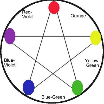
Below: Color Wheel based on Munsell's Five Primaries

It was Sir Isaac Newton who in 1666 invented what came to be known as the triadic color wheel built on three primary colors--yellow, red and blue.

But in 1898, Albert Munsell came up with a totally new color system, one built on what he called five primaries--yellow, red, violet, blue and green. (See wheel on at top.)

We can use the Munsell color wheel to put together color schemes discussed in last week's tutorial, but with slightly different results. For example, the complement of yellow according to Munsell is blue-violet, the complement of red is blue-green, but orange remains the complement of blue. Munsell's system gives a shorter range between red and yellow than our primary triad does. Whereas the triadic wheel yield 12 colors, then, Munsell has only 10.

Actually, Munsell's arrangement on the wheel is closer to how our eyes perceive color. Try this: find a bright red sheet of paper. Stare at it for 15 seconds, then suddenly shift your eyes to a white surface and hold for 3 or 4 seconds. An afterimage will appear that is actually blue-green rather than pure green.

In fact, Munsell's system is not actually built on a wheel, but rather a sphere that shows the interconnectedness of hue, value and intensity. Our triad wheel is based on hue alone.

To understand Munsell, imagine a globe with all the colors on the surface of its equator circling like colors positioned in a spectrum. Here the are the brightest, purest possible hues. Then imagine all these same colors gradually getting lighter as they migrate upward to the north pole and likewise, gradually getting darker as they move downward to the south pole. Here's what the outside of Munsell's sphere looks like.
Image borrowed from Albert H. Munsell, “A Pigment Color System and Notation

But there's more. The inside of the sphere toward its core illustrate how neutrals are formed. Imagine a slice across the center of the globe starting at green and ending at red-violet. Now imagine what's happening on that slice if on the green side a little bit of red-violet is added just inside the edge, then a little more as it moves toward the core, continuing until it reaches the core where it becomes totally neutral. On the red-violet side, the same thing is happening by adding a little bit of green at a time. That cross section would look something like this image I borrowed from Encyclopedia Britannica:

Inside the sphere color values get lighter as the rise to the top and darker toward the bottom. That's pretty much what the Munsell system looks like


In my mind, the Munsell system is scientific attempt to illustrate the workings of color whereas the triadic wheel is a thinking tool. There is no doubt that within the Munsell system, you could locate any color there is. It's somewhere in there, believe me. And it's fun to try to do that. In fact, it's a good way to understand the true nature of color.

But for my money, the triadic wheel is a better tool for thinking, leaving us more freedom for working out color mixtures.

You can get a more detailed explanation of the Munsell System by going HERE and for more references, go HERE.

Saturday, February 21, 2009

Hue: The Scheming Element


Fire truck red. Sky blue. Lemon yellow. The primary hues. Most folks call them them colors, but color covers value, intensity, and temperature as well as hue. This discussion is totally about hue, the way colors appear around a typical, traditional color wheel. Hue is the name of the color.

Today, there are multiple variations on the idea of a "color wheel", but if a person understands the traditional triadic wheel built on the primary colors yellow-red-blue, none of the others are really necessary. And it really is the simplest way to understand hue.


Studying hues aside from value, intensity and temperature helps us understand how colors relate to and effect one another.

First, there are the color schemes:
A color scheme is a limited selection of hues that will appear in the painting. The artist finds ways to adapt everything in the paintings so that these colors are the major ones appearing. They might vary in value, intensity or temperature but they will not veer away from the designated hues.

The traditional schemes are primary, secondary, tertiary, analogous, complementary, double complementary, split-complementary. Often, though, artists invent their own schemes some of which might be variations or off-shoots of these.

Primary: Red, Yellow and Blue


Charles Reid's "Brown Jumper" is done in a primary color scheme.


Secondary
: Purple, Orange and Green


Gaye Adams "White Water" is a secondary color scheme.


Tertiary Triad:


Yellow-Green, Red-Orange, Blue Violet or Blue-Green, Yellow-Orange and Red-Violet. Robert Genn's "Moscow Cafe" uses a
tertiary triad.


Analogous
: Any set of colors located between two primaries on the wheel
Clyde Aspevig's "End of June" is done with an analogous scheme with colors located between blue and yellow.


Complementary
:

Any two colors appearing as opposites on the wheel
Edgar Payne uses a complementary of reddish orange and greenish blue scheme in this sailboat painting. (Note: This is a close to a complementary scheme as I can find at the moment. Somebody's got a better one somewhere...)


Double Complementary:

Take one color, skip one, then pick the next. These plus their opposites create a double complement.
Morgan Weistling uses the double complements of yellow/violet and blue/orange in this lovely portrait, "Ophelia."


Split-Complementary:


Any color with both neighbors on either side of its opposite.
Lili Pell uses the this scheme with green opposing red-orange and red-violet. This is not
a pure SC scheme because of the appearance of blue. Few are pure.


In next week's tutorial, I'll discuss the Munsell Color Wheel and how it is different from the traditional primary wheel. See you then.


Sunday, February 15, 2009

Value: The Supreme Element

Without value we see absolutely nothing.

At night, if we lose electric power and there is no moonlight, you can see nothing but black. And in a snowstorm in the arctic, you can see nothing at all but white. Only where there is a distinguishable difference between light and dark do we see what's around us. The stronger the difference, the clearer we see it.

So value--the full range of lights and darks--is the most important element of all those in our visual vocabulary. It is the one upon which all others depend. Without it, the others cannot exist.

And value just might be the most often discussed element of all. So rather than explain it, let's take a look at seven ways artists use it.

(1) Value can give a paintings a key--high key, middle key and low key.

High key watercolor painting by Charles Reid.


Low key oil painting by John Singer Sargent

(2) Value gradation can communicate three-dimensional volume.

Oil painting by Carol Marine shows 3-D illusion of volume in pitcher and orange.


(3) Value contrast can show the difference between light and shadow...

Carolyn Anderson's oil painting shows the location of the light source by how she contrasts her lights and shadows.


(4) Value can be used to create visual paths

Jennifer McChristian's "Brown Barn" uses light from the sky, then upon the background buildings, then on the middle ground at the edge of the barn, then to the lower left corner back through the flecks of light within the barn to help route our attention throughout the painting.

(5) Aerial perspective is about creating distance with value or depth on space.

Marc Hanson's painting shows how making background trees lighter makes them appear further back into the distance.


(6) Value can be used to create focal points

Karin Jurick's "A Date With Art" uses the contrast of the light sculpture against the dark painting and wall to create the painting's focal point.


(7) Value can be used to control edges

Carolyn Anderson's use of background light merging into the light on the baby's shoulder as well as the baby's hand merging into the shadows around it--both create lost edges that unify the painting and make it more intriguing.

Perhaps the best way to understand how value works is to squint and study what happens in shadow areas vs what happens in areas of light.

Saturday, February 7, 2009

Texture: The Element of Intrigue

Except for the minimalists, take any painting you like, subtract from it all texture and what do you have left?

One painting I like a lot is Clyde Aspevig's Selway River Wilderness shown below.

Clyde Aspevig "Selway River Wilderness"

On my knees begging forgiveness from Mr. Aspevig, here's what happens when we take away all the texture.Okay, so I had to throw it out of focus to prove my point, (and that IS a bit annoying), but the out of focus shot does give us an idea of what happens when we strip a painting of it's texture. No other element plays such a strong role in communicating the character of images or engaging the viewer's attention.

At the same time, no other element can so easily cause chaos. I dare not reach for another artist's painting to illustrate this point, but maybe the photo below will help.

For texture to work it depends upon pattern. When no pattern is evident, texture is apt to create chaos. In the photo, where the grasses, branches and limbs become so entangled that we can't make out a visual pattern, there is confusion. And where there is confusion, there is chaos. But when textures of such a subject get rearranged into a perceptible pattern, it doesn't matter what the subject is, it can still be intriguing to look at.

So when choosing our subjects, we might very well take something chaotic and give it order just by reorganizing within it a textural pattern.

Our observation and translation of textural patterns can count strongly toward creating interesting areas in our paintings. In Lilli Pell's Into The Evening Sun (below) there are numerous intriguing textures translated from careful observation of the edges of tree limbs, sheep, foliage and grass.

But that's only one side what makes the painting intriguing. The other side is how Lilli applies her brushstrokes. Take another look at the details above, this time focus just on her brushstrokes.

How we wield our tools count as much toward the intrigue of our paintings and drawings as how we interpret the subjects. Take a little trip with me over to Katherine Tyrell's portfolio website and look at the gorgeous textures she creates with colored pencil, pen/ink and pastels. (Note: Katherine's blog Making A Mark is one of the richest resource blogs on the web, but she makes a mighty fine mark as artist, too.)

Now let's go to Colin Page's website. Click on the paintings one after another and study his brushstrokes. One more trip to watercolor painter Carl Purcell's website. Even watercolor offers numerous opportunities for creating textures with tools, something at which Carl is a master at doing.

These artists' works are among dozens on the web done by artists whose handling of their tools (as well as observations and translations) create rich and engaging textural patterns. Delete the textures from any of their works and we loose the intrigue of the artist's handwriting as well as how the artist interprets their subjects.