Welcome to Compose. There's lots of stuff here, all about composing paintings.

Current entries appear in Dianne's weekly newsletter.


Showing posts with label Principles. Show all posts

Friday, August 8, 2008

Isolation as a Tool, But Be Careful

It's always fascinated me how some artists have a knack for making paintings that stop you in your tracks. Sometimes it's the nature of the subject, other times it's the way the subject was handled, but most likely what caught our attention is both. To make us look twice and hold our attention, one tool used by many clever artists is isolation.

To isolate is to set a thing apart, detach it, give it solitude. In painting, we isolate by...

...closing a shape off with hard edges..
Edward Hopper "The Long Leg" 1935

...placing a light or bright shape among dark surroundings
or a dark shape among bright surroundings...
Edward H0pper "Pennsylvania Coal Town" 1947

...locating a small shape in a large area of a different nature...
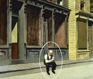
Edward Hopper "Sunday" 1926

...surrounding a shape with vast space...
Andrew Wyeth's "Christina's World" Go HERE to see
(permission is required to reproduce a Wyeth work)


...planting a shape among shapes different from itself...
Pat Weaver Watercolor


...giving psychological solitude...
Pat Weaver "Man on Bench" Watercolor

Notice in most of these paintings, several isolation strategies are used at once. No matter which scheme is used, one thing is for certain: the isolated shapes must be strategically placed, thoughtfully handled. If not, it can throw the whole painting out of kilter and cause the image to stick out like a sore thumb.

Saturday, August 2, 2008

A Single Unifying Device

Ultimate unity is a blank canvas according to the would-be clever artists who have exhibited blank canvases as their "art". I seriously doubt these folks would really desire our conclusion. Or maybe that's their point. Is ultimate unity emptiness? I digress.

Once we put the first mark on a blank canvas, we've begun a composition. As we add marks, shapes, textures, and colors our painting teeters between harmony and chaos. No matter the size of the painting or the subject, we are doing a balancing act from stroke one. One way to prevent chaos or disjointedness from taking over the painting is to have a single unifying device undergirding the whole work.

Unity means oneness, or sense that things belong together and there are many clever ways to keep a painting unified without losing freshness, excitement and spontaneity.

One popular and satisfying device is subduing intensity of color throughout. Anders Dorn comes to mind as an artist who used this scheme as a constant. Look at his painting "Woman Dressing". Every color he has used, in one way or another, contains its complement to reduce intensity. The overall effect is a feeling of unity, a sense that it all belongs together.

Anders Zorn Woman Dressing Oil 1893
(click on image for truer color)


Now, look what happens if we intensify Zorn's colors, taking away the complement (I risk blasphemy!).

The subtleness is gone. A harshness appears, but something still holds it together. Ah ha. There's another unifying device--hue. Look back at the original and you'll see that almost all the colors have some yellow hue in them. Now that's clever. But it's another way for achieving unity.


Another highly effective unifying device, light from positive merging into light from negative, is used by Richard Schmid in "Weaver" ( right). This is what James Gurney has called shapewelds. It works in reverse, too, with darks from the negative merging with darks of the positive. Remember Schmid's "Pansies" from our Image Trap discussion? This is acheived by allowing edges to disappear between a light portion of a subject and the light around it or by blending the edge of a shadow side of an image with dark in the area around it.

Sometimes the subject itself gives us the unifying device we need. In Pat Weaver's watercolor painting "We've Got Rhythm", the repetition of shapes, colors and sizes of the musicians, their instruments and their music stands do the job. Repeating the same shape and size risks boredom or becoming static, but Pat's use of strong value contrast between shapes keeps the piece interesting and exciting.


I would be remiss if I didn't mention using notan as a unifying device. Review my two posts about notan here and here

Finally, controlling what happens to edges of shapes is one of the most important and too often overlooked unifying devices. Richard Schmid , through his writing and videos, is responsible for making me aware of the power of edges. Look at these two examples by him:

When we paint landscapes, if we give distinct edges to buildings, tree trunks and other outdoor shapes, we risk making the painting feel jerky, the objects in the landscape feel isolated. Schmid's controlled softened edges throughout enable the building and trees to merge with the grounds and sky and feel like there's atmosphere between them. He is probably more conscious of how he handles edges than any single concern in his painting process.

Another place where edges can get problematic is in figure painting. Look how Schmid has subtly blended the hairline into the forehead and face as well as softened the outer edge of the hair into the background, all enabling us to feel the space around the person. He does the same kind of edge control along all the shapes of the clothing, arms and spinning wheel--all giving unity of the figure with the space that surrounds her.

If we were living during the Italian Renaissance, we would know this atmospheric handling of edges to be sfumato .

Spend some time looking at paintings by realistic painters who are among the greats and you will find in each some unifying device. Sometimes it's a single device, sometimes a combination, but even when used in combination, one device will most likely be more apparant than the others.

Saturday, July 26, 2008

Those Dratted Intervals

Go here. The painting is "Carriage House" by Marc Hanson, one of the finest landscape painters around. Marc, himself, raised the question about whether the painting being divided in half is troublesome. We would not question the beauty of this piece. The superb craftsmanship, masterful drawing, sensitive interpretation, deep conviction and a presentation of one of the most beautiful patterns of dappled light I've seen anywhere. But why would he ask the question?

It's not that rules should dominate or that we must be slave to principles, it's to do with the rhythms within the human body and what we feel we need to see or hear in a work of art. It's all about rhythms which are all about intervals.

An interval is a space between two things or a period of time between two events or a pitch between two tones or a degree between two values or colors or intensities. When many intervals are equally spaced, we have a type of staccato response, but when two or three or even four intervals are equally spaced, we feel both bored and restive.

In music, a series of quarter notes without any variation drives us looney. In painting, equally spaced images or divisions feel abnormal, unresolved. We feel ambiguity. We want more space in one shape and less in another. We want a rhythm that is most akin to our heartbeat or our walking pattern or our breathing. We want what nature wants and provides all around us: patterns made from unequal intervals. And it's within nature that we find our most ingenious principles of composing. And that's the reason "blah, blah, blah" is so expressive.

Friday, July 4, 2008

Rules?

Artists tend to be mavericks, tend to reject rules of any kind. It's the creative side of our nature to question assumptions, to extend beyond the accepted, to test many waters, to argue. Without our rebel side, no worthwhile art would exists at all. No good music, no decent paintings, no important poetry. None of the good stuff that holds our attention. Music that we can listen to repeatedly, paintings that we keep going back to, poems that we tend to read again and again--they simply could not exist without disregard for status quo.

Then what about these rules of composition that many artists reject, but seasoned artists hold dear? They are not rules at all, but principles. There's a vast difference: a rule is fixed, a principle is flexible. A rule is man-made, a principle is the cause of an effect. A rule assumes a bias, a principle is a fundamental truth.

Our principles for visual composing are the results of observations made by artists over ions. They are our guidelines within which there are limitless possibilities for variation, expansion, alterations and elaborations. These principles are not static, but organic. They are like the gravity that holds us to the earth.

The posts to follow will be my thoughts about visual composing. I hope you enjoy the ride.