Welcome to Compose. There's lots of stuff here, all about composing paintings.

Current entries appear in Dianne's weekly newsletter.


Showing posts with label Composition. Show all posts

Tuesday, September 19, 2017

Is a Focal Point Necessary

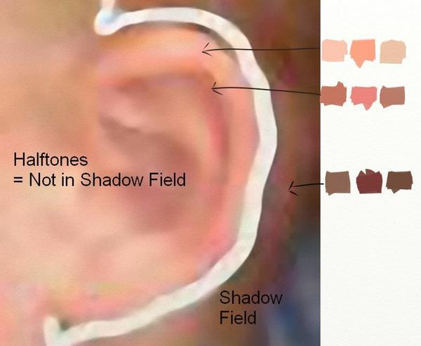
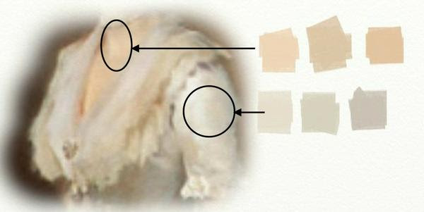
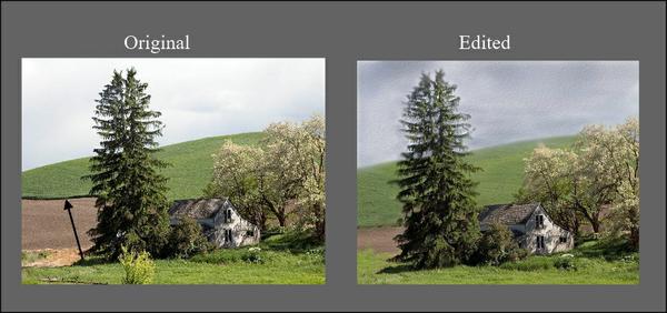
Does every painting need a focal point? Not always, say some professionals, but others consider it an absolute requirement. In fact, many artists take focal points for granted, including them in a composition without thought for whether or not a successful painting might need such a thing. So what is a focal point and why do we use it?
Also called a center of interest, a focal point is the area of emphasis around which the rest of a painting is centered or something in strong contrast that pulls the viewer's eye into the painting. But sometimes an artist will have other intentions and abandon the focal point altogether
We’re all familiar with the work of action painter, Jackson Pollock. Because of the nature of his painting process—distributing drips and splashes with repeated movement throughout the canvas—Pollock’s later work does not have a focal point. Instead, we are engaged by the endless maze of paint, a pattern created by movement such as we see in his Number 8, 1949
A different kind of intention—that of repeating a single image with variations set in a tic-tac-toe grid—is found in Andy Warhol’s Marilyn, another work where there is ot really a focal point. 
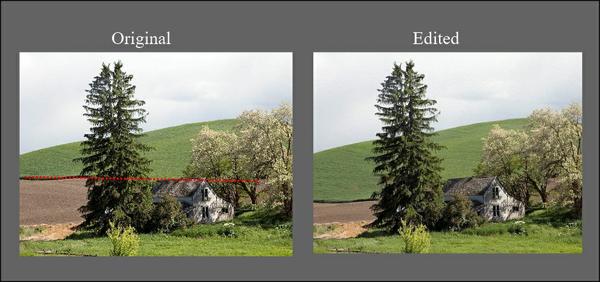
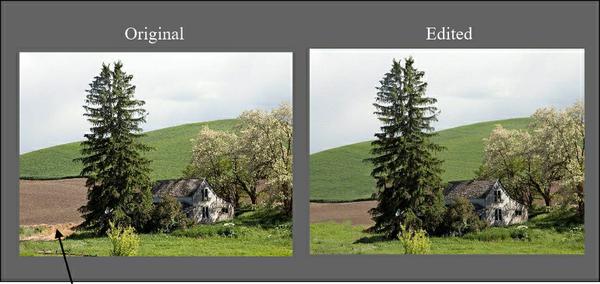
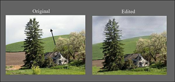
 Non-objective painter Piet Mondrian arranged and repeated squares and rectangles into compositions that leave us in question of whether there is a focal point. In Broadway Boogie Woogie, below, there seems to be a focal point in the upper right quadrant of his painting—the yellow rectangle inside the red square, sandwiched on top and bottom by the blue rectangles--but we are left in question.
So far our examples have been from historical masters of various abstract movements, so do we conclude that only in more conceptual painting does the focal point not apply?  Not so quick:  our Impressionist hero, Claude Monet, did a little focal point deleting himself.  Take a look at his painting, Poplar Trees
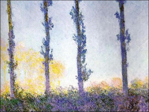
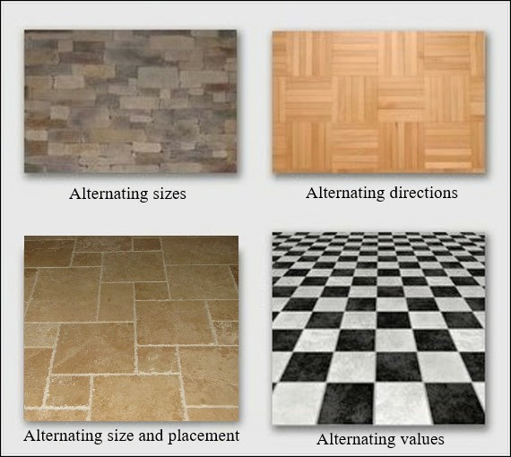
The alternation of trees and sky in this painting make the entire piece the focus. We see then that the question of focal point has nothing to do with whether a painting is non-objective or realistic, but whether the images are ordered so that every inch of the painting is important to the whole.

Wednesday, July 19, 2017

What Do We Know About Shadows

If I tell you that in your painting your occlusion shadows are missing, would you know what I'm saying? 
We talk a lot about lights, but do we give enough attention to shadows?  I have a notion that if we know what to look for, we're most likely to see it.  Once we see it, we can decide how to use it in our work.  But if we don't see it, we won't consider it at all.  Consequently, our work might go lacking. 
Look at the images in this photo. 
The apple on the left works fine, but shadows are out of kilter in the one on the right.  Let's break it down into two crucial areas and show how the shadow parts missing can put it back together again 
  1. Form Shadow--All areas on a shape turning away from the light source.
  2. Cast Shadow--Any shadow caused by the light being blocked.
Notice how where the stem comes out of the apple the Form Shadow merges with the Cast Shadow cause by the opposite edge of the opening.

  1. Core Shadow--That part of a form shadow closest to where it begins to turn away from the light source.  The Core Shadow is caused by the reflective light within the Form Shadow.
  2. Occlusion Shadow--That tiny area where the shape touches a surface within which all light is shut out.
Here are our apples with all their shadows in the right places, feeling much better now. 
Image

Saturday, May 27, 2017

The Fluidity of Hue

​​​​​​​
 If you buy a new car, one question you'll get is "what color is it?".  The lay person will identify color by a single hue, but the artist sees the fluidity of hue--how it changes on a single image depending on the location of its light source and what's being reflected onto its surface.
I found a photo of a new red Honda and sampled various areas of it. Here are the results I found.
Next, I did the same sort of sampling with a photo of a red tomato. 
In both examples, notice how the hue changes according to where it lives in shadow or not in shadow areas.  Add to that other colors it might be reflecting from its environment.  Sages of old advise us that we see what we look for.  If we're looking for red tomato, we will limit what we see.

Saturday, April 29, 2017

Magic of Alternating Brushstrokes

Have you heard of alternation? A rarely discussed design tool, alternation can sometimes be the very method you need for moving the viewer’s eye through your painting, or making dull areas interesting.  It means a sequence of changes in direction. 
Here are some examples we see every day. 
When painting, there are many ways to use alternation.  The most dynamic is alternating brushstrokes.  Among our contemporary painters, one who is a master of brushstroke alternation is Qiang Huang.  Let's take a look at his "Demo at Huntsville 2016 1"
Here are two sections from Qiang's background.  Look at the alternation of stroke directions, then glance back at the whole painting and notice how those sequences of alternating stroke direction give movement to the painting.
Here's a similar analysis of Qiang's pear on the right. 
If you remove your attention from the imagery in Qiang's demo and focus only on his alternating brushstrokes, you will see how much energy just his brushstroke alternating gives to this piece.   

Saturday, April 1, 2017

Getting to Know Color as a Language

What are these colors?
Image
If your answers are mauve, tan,and olive green, you are not speaking the color language
Begin here:  Color is a language within itself.  It has three major parts of speech--hue, value and intensity--as well as temperature which gets created by hue and intensity.  Once we get to know each of these components of color, we can create any color we want just by asking three questions.
    1.  What is the hue?
    2.  What is the value?
    3.  What is the intensity?
The questions can be asked in any order.  But what do they mean? 
Hue
Image
The color wheel was invented to help us work with hue.  We can recognize hue if we call it by its color name such as red-violet, yellow-orange, yellow-green.  We can know these like a parent knows the face of a child.  We can see them in our minds when their names are called.  Committing this to memory is the first step towards getting to know the language. 
Intensity
Image
 The intensity (or chroma) of a color is the degree of saturation of its hue.  The color wheel shows the hues at 100% hue saturation. An absolute gray has zero saturation.  When any hue's complement (the hue opposite it on the wheel) is mixed into it, the saturation decreases--becoming more neutral-- causing a lower intensity.  Complements neutralize each other just like an acid neutralizes an alkali.  Changing the intensity doesn't change the hue although it might change the value.  Note:  The labels intensity and chroma are interchangeable.
The swatches at the beginning are all reduced intensity.  The first one we might have called mauve is actually middle-intensity red-violet.  The easiest way to label an intensity is to use the words low(almost neutral), middle (slightly neutral) and high (highly saturated).
Value
Image
Value (also called tone) is the degree of light or dark within a color.  We show it in a scale to help discern it.  Unfortunately, color scientists have screwed up the numbering of this system.  Earlier systems use 10 to indicate the darkest value (that's the one I learned), but more recent systems use 10 to indicate the lightest value. 

The number matters only in so far is it helps to distinguish degrees of value.  A better way to communicate the language of value is to call it high(light), mid-tone(middle) or low(dark). 
And Here's How the Language Works
Image

Thursday, March 16, 2017

In Praise of Halftones

Our moon can help us understand the language we use when looking for halftones.
Image
We don't see it in a full moon, but it's there in all its other phases.  It's called the terminator--that area where the earth blocks the sun's rays from the moon, throwing it into shadow. 
Image
In the visual arts world, we use that term to indicate any area turning away from light into shadow.  It's in that illuminated side of all things where we find our halftones.  Call it the light side of the terminator or, as I like to call it, the not-in-shadow field.
When we can differentiate not-in-shadow fields from shadow fields, we can more clearly know how to interpret them.  We use the word "fields" to indicate a general area either being lit or being in shadow.  In the photo below, I've drawn a terminator between those two major fields of the child's head. 
Image
It's in the halftone not-in-shadow fields where we find the most brilliant and definitive colors.  Look at the colors I found in just the child's ear and compare them to those I found in the shadow field back of his head.
Image
One of the joys of being a painter is discovering those hidden jewels that were there all along:  we just didn't know how to look for them. 

Saturday, March 4, 2017

Finding the Magic of Halftones

​​​​​​​
In the visual arts world, there is a lot of confusion about halftones.
Halftones are found wherever images are illuminated.  Shadow tones are everywhere else.  We can grasp the concept more easily if we look at what happens to a sphere in direct light.
 It is within these magical areas of light where we find nuances--subtle changes in light values and in color temperature--that can give real depth to our work.  Master painters like John Singer Sargent had a eye for translating these, a skill that enabled him to do this portrait of Mrs. Henry White.
They seem insignificant, but even the tiniest change in value and/or temperature can make a big difference.  And we can learn to see these by closely looking for them. 
Once we find them, we can paint them.  And once we learn to do that, we can find ways to exaggerate and manipulate them in all kind of creative ways.  But seeing comes first.  Once we see it, we never forget it.

Saturday, February 18, 2017

How Edges Influence Our Paintings

Look at this abstract composition.  Notice that all the shapes' edges are sharp.  How our eyes move over the piece is determined more by location of shapes and their value contrast with their surroundings.
Let's change that up a bit and throw all the edges out of focus.  Notice how you react to that--we want something to be in focus:  Anything!
Now in this next design, pay attention to where your eyes go first.  Do they migrate to that dark triangle on the right?  The only shape that's in focus?  I bet they do. 
 
How do your eyes perceive this one with all but three shapes in focus?  Scan backwards now and notice the difference in your response to each design.  The shapes, colors, values and placement are the same.  Only the handling of the edges is different. 
Here's one more.  How would you handle the edges in this one to make the design more pleasing to you?    
 
Whether our designs are realistic images or abstract, how we handle the edges of all our shapes will influence the perception of the total piece.  All these examples play only with soft and sharp edges.  Other choices are broken, jazzed, lost, gradated--possibilities are limited only to the imagination.  What's important is that we notice what we are doing and find ways to use edges to strengthen our compositions. 

Thursday, January 12, 2017

Getting Rid of Eye Sores Before Beginning a Painting

Here's a photo I found on Pixabay. 
Image
 If I happened upon this scene while out looking for a subject to paint, I'd probably set up my easel and get to work.  But to begin working without looking for potential eye sores would be a recipe for an inferior piece before even getting started.  
For one thing, that line where the grassy hill ends and the field begins forms a tangent with the roof of the house. I'd want to move that edge down.
Image
 That clump of dirt to the left of the tree feels out of place.  I think I would delete that.
Image
The little light green bush in front is too isolated and adds clutter to an already busy scene.  It's got to go. 
Image
There's too much space on the left between the tree and the left edge AND that space is too much the same width of the tree.  I'll crop that. 
Image
 For such a busy scene, the value contrast is too strong.  To calm that down, I'll darken the sky a bit.  This will help make the light on the house the focal point.
Image
That really dark edge between the grassy hill and the field is too harsh, splitting that area and causing it to attract too much attention.  It needs to be subdued. 
Image
That takes care of most of the stuff that is visually incoherent.  From this point, I could choose to begin with this design or I could crop to a different format.
Image
In the crop on the left (as well as in the uncropped piece). I'm still bothered by the space of that hill being about the same width as the sky space. In the crop on the right, the widths of the tree and house are a bit too similar, but I can adjust that while composing the painting.   (Remember, we set the design, but the real composing begins with oubrushwork.)
What's important when we are selecting a subject for painting is that we look at one thing at a time and that we are willing to edit and rearrange for the best design so that when we begin composing, we have a head start.  

Saturday, August 6, 2016

A Way to Choose Colors for Modulation

To modulate is to make a gradual change within whatever is being modulated. In music, a single chord can modulate to another key just by passing through a chord both keys have in common.  In painting, one way we can modulate color is to use this same principle--move from one color to another THROUGH a hue each has in common.
Within this image of a fall tree, we can see greens reflecting onto the orange leaves. 
Image
One way to modulate this in paint is to use the hue both green and orange have in common:  yellow.  We'll take our color from the small sample I have circled.
Image
Image
 In the example above, I've modulated in a high intensity.  If we change the intensity, the modulation looks more realistic for the shadowed areas.
Image
But the one thing we've not yet mentioned is VALUE.  For modulation of hues and intensities to be successful, it works better for colors being modulated to be in the same value range.  Give it a try.    

P. S. This principle of modulating with a hue both colors have in common is perfect for any two colors that are not both primary colors.  If you want to modulate two primary colors, simply mix one into the other at the SAME value and intensity.  You'll be modulating through their secondary hue.  
Image


NEWS AND UPDATES!
Our August Series of Video Tutorials
If you feel like you're in a wrestling match when working with color, this new series of video tutorials might be just what you are looking for.  I've focused the series on two of our most difficult colors with which artists work:  greens and yellows.  This week's lesson Tacking Greens hones in on how to modulate greens by varying their intensity and hue within local value areas.
What You Can Expect When You Become My Student
When we're filming the video tutorials, I have you in mind.  I have learned to think of the camera as my classroom filled with students eager to learn the concepts with which I'm working while giving that particular lesson. Those decades of teaching college and in my own art school prepared me for this.

When you purchase a video lesson, you become my student, but you become a member of a virtual classroom as well.  We have set up the Forum on Facebook for you to interact with others as well as get reinforcement from me. Today's technology allows me to talk directly to you via video on Facebook, a free service included when you purchase any video lesson, whether download or DVD.  

Friday, March 2, 2012

Counterpoint

 What do the melodies of "Three Blind Mice" and "Row, Row, Row Your Boat" have in common?  Answer:  they can be sung in a round.  Two distinct tunes can work together at the same time without conflicting with each other.   (Don't we wish our Congress could learn to do that!)  The method of juxtaposing two or more voices in music is called counterpoint.

We use counterpoint in painting, too, but it works differently than in music.  Instead of each part moving parallel and independent of the other, in painting elements move in opposing directions, each balancing the other. A vertical will counter a horizontal and vice versa; a diagonal will counter another diagonal moving in an opposite direction.


 John Singer Sargent was a master of counterpoint.  In his painting A Hotel Room, the verticals in the background are counter balanced by the horizontals on the floor.

Richard Schmid is another painter who often uses counterpoint.  Whereas Sargent has applied a horizontal to counter verticals, Schmid, in Wildflowers, uses opposing diagonals:  the tilt of the large flower on the left is countered by the tilt of the smaller one on the right.


Counterpoint in painting works to give visual stability.  Georges Braque, who with Picasso invented the Cubist movement in painting, depended upon counterpoint as a major composing strategy.  Without it his geometric breakdown of images would have had no grounding.

Georges Braque    "Bottle and Fishes"    1910
Uses primarily horizontal/vertical counterpoint
Georges Braque  "Still Life with Mandola and Metronome: "  1909
Uses primarily diagonal counterpoint
Georges Braque   "Pedestal Table"  1909
Uses horizontal/vertical and multple diagonals in counterpoint
Counterpoint as an organizing strategy has been used for as long as artists have been composing.  Very simply stated, a  horizontal calls for a vertical, a vertical calls for a horizontal, and a diagonal calls for a another one in the opposite direction.  The abstractionists knew this.  Many times it was the primary principle holding their pieces together.

I sometimes wonder whether today's artists should learn to paint abstractly as a prerequisite to learning realistic painting.  Take away the image and one gains an appreciation for composition because that's all we have left to work with.  Add the image to a well composed piece and chances are you've got a strong painting.

***********************