Welcome to Compose. There's lots of stuff here, all about composing paintings.

Current entries appear in Dianne's weekly newsletter.


Sunday, January 22, 2017

A Matter of Focus

Do you pay close attention to what your eyes are seeing? Try this little game:
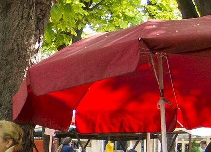
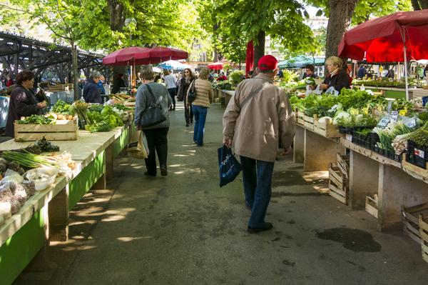
Looking at the photo below, take note of all the things that are red, then go to the next paragraph below the picture..
Image
Now without looking at the picture, list all the things that are blue. (Shameless disclosure:  I lifted this idea from someone else, but I don't remember who.)  If our vision is narrowed to one thing we are looking for, we're likely to miss other things.  We see what we expect to see and little else.
A new painting idea can cause the same thing to happen.  Suppose we decided to do a painting of that red umbrella to the far right. 
Image
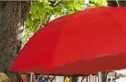
 If we just dove in to paint a red umbrella, something like this could happen. 
Image
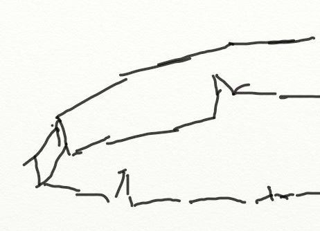
If it did, it would be because our focus is on "red umbrella."  We might have missed those basic shapes we see because we didn't focus on the shapes. 
Image
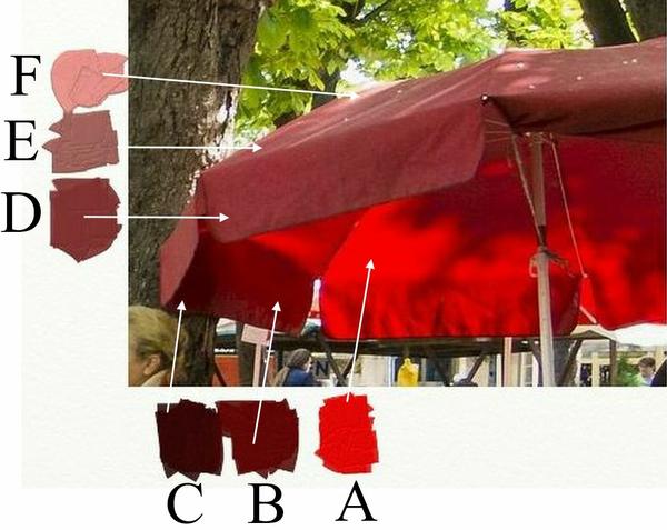
Focusing on the idea of "red", we might have missed those variations in color where very little of the umbrella is actually red, rather several variations of red in light and dark values. Look at the differences among A, B, C, D, E, and F. 
Image
We're better off not to focus on red umbrella at all, not even to have any expectations around "red umbrella."  When once we find a subject, we're more likely to have success if we forget all about what it is and focus our attention on asking what shapes do we see, what colors to we see, what textures...and so on.  We WILL paint what we see, it's just a matter of where we focus.
Saturday, January 14, 2017

Small Changes in Value Contrast Can Give Clarity

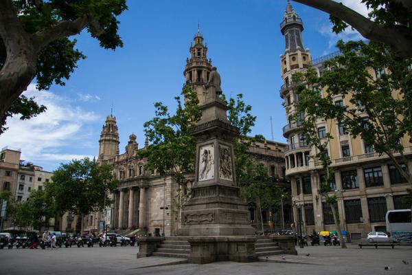
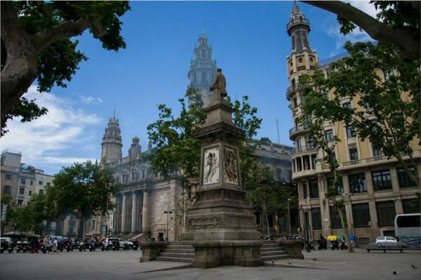
A scene might call to be a subject for painting, but will have so much going on it has no clarity.  Scenes found in historical cities often do that, but so to other subjects.  The photo below caught my eye as typical.  The foreground monument wants attention, but is visually fused with the background structures.  Can it be given clarity?  Let's find out.
Image
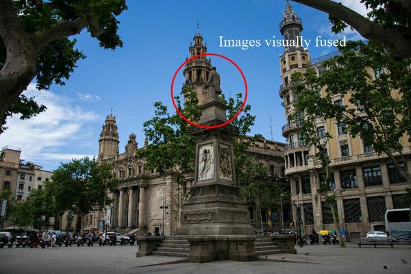
First, let's look at what's causing the visual fusion (resulting in confusion). 
Image
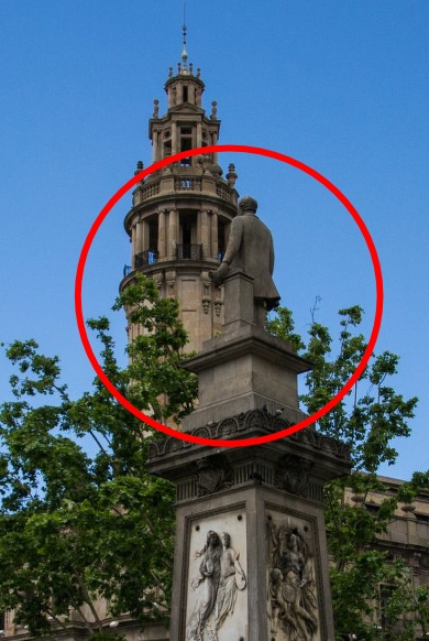
We can see clearly the background structure and the foreground statue each contain the same degree of value contrast.  That is why they are visual fused.
Image
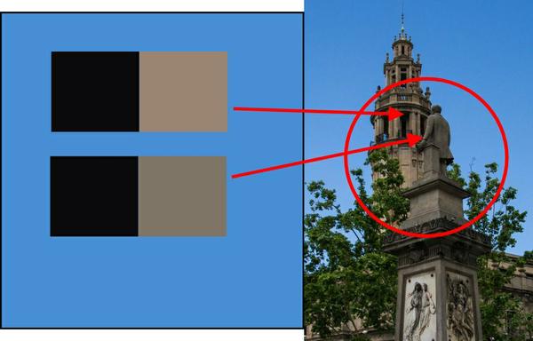
I've taken samples from the darkest darks and the lightest lights in each image, confirming how close the value contrast is in each. 
Image
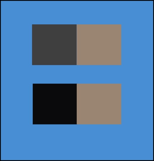
To give that area visual clarity, we can reduce the contrast in the background structure. The illustration below shows you what will happen.  Look at it and notice to which set of squares your eye sees first.  Answer (of course):  the stronger contrasted set. 
Image
Applying that principle to this scene, here's what happens. 
Image

Thursday, January 12, 2017

Getting Rid of Eye Sores Before Beginning a Painting

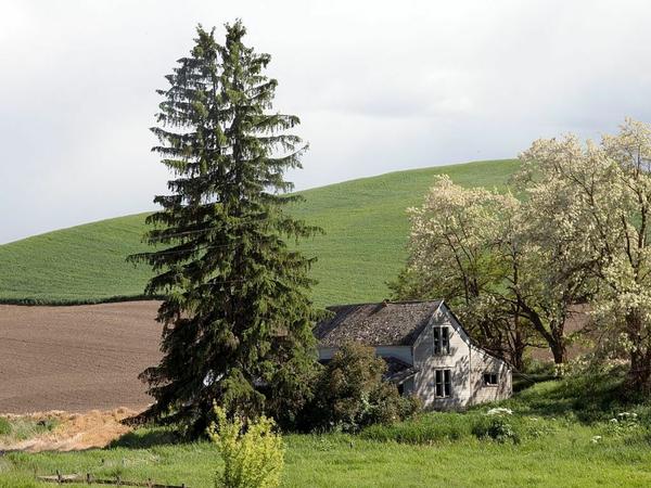
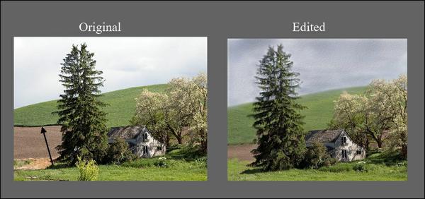
Here's a photo I found on Pixabay. 
Image
 If I happened upon this scene while out looking for a subject to paint, I'd probably set up my easel and get to work.  But to begin working without looking for potential eye sores would be a recipe for an inferior piece before even getting started.  
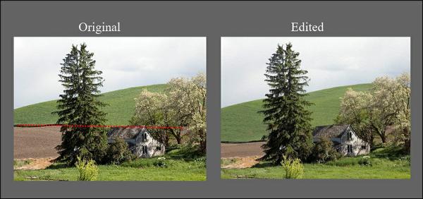
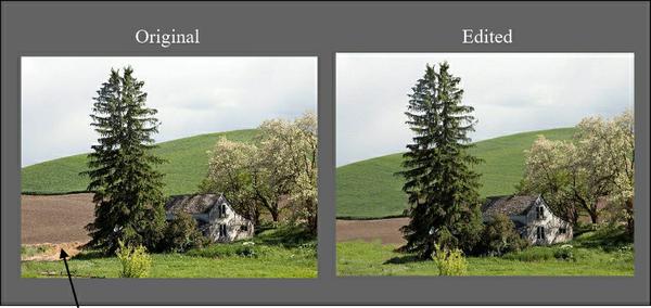
For one thing, that line where the grassy hill ends and the field begins forms a tangent with the roof of the house. I'd want to move that edge down.
Image
 That clump of dirt to the left of the tree feels out of place.  I think I would delete that.
Image
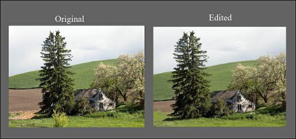
The little light green bush in front is too isolated and adds clutter to an already busy scene.  It's got to go. 
Image
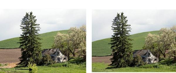
There's too much space on the left between the tree and the left edge AND that space is too much the same width of the tree.  I'll crop that. 
Image
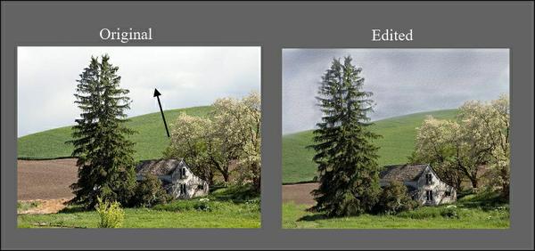
 For such a busy scene, the value contrast is too strong.  To calm that down, I'll darken the sky a bit.  This will help make the light on the house the focal point.
Image
That really dark edge between the grassy hill and the field is too harsh, splitting that area and causing it to attract too much attention.  It needs to be subdued. 
Image
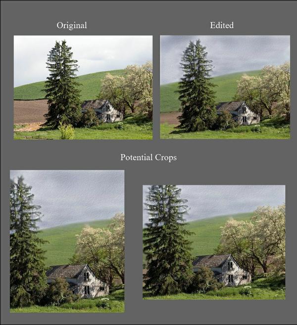
That takes care of most of the stuff that is visually incoherent.  From this point, I could choose to begin with this design or I could crop to a different format.
Image
In the crop on the left (as well as in the uncropped piece). I'm still bothered by the space of that hill being about the same width as the sky space. In the crop on the right, the widths of the tree and house are a bit too similar, but I can adjust that while composing the painting.   (Remember, we set the design, but the real composing begins with oubrushwork.)
What's important when we are selecting a subject for painting is that we look at one thing at a time and that we are willing to edit and rearrange for the best design so that when we begin composing, we have a head start.