 |
| Carolyn Anderson Untitled |
 |
| Qiang Huang Demo at Sacramento |
 |
| Joe Paquet "Green Sea" |
 |
| Jennifer McChristian "Smoking Sugar" |
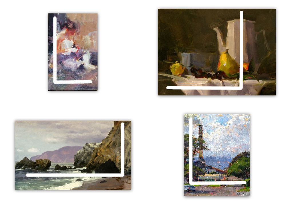
Every genre has a host of methods for dealing with space. Individual artists seem to gravitate towards using particular strategies that fit their personal sensibilities. Some poets, for example, find their most authentic expression through the sonnet while others are more at home with haiku: a simple three part poem of seventeen sound units can be every bit as powerful as fourteen lines in iambic pentameter. Painters, too, select divisions of space that best communicate their ideas.
All four of the paintings above use the same kind of spatial division--in each of them, areas occupied by the most activity make up one major shape while the background for that activity occupies the other. I find it intriguing that in two of these paintings, even though their subject matter is entirely different, there is an almost identical spatial division.
I have abstracted from these two paintings that spatial division and put it into Diagram A below. The dark area represents main activity and the light shape represents background.
I have abstracted from these two paintings that spatial division and put it into Diagram A below. The dark area represents main activity and the light shape represents background.
 |
| Diagram A |
Can you find the two paintings from which I abstracted these patterns?
The two remaining paintings share the same principle in a reverse pattern. They, too, employ totally different subjects. Here are abstract diagrams for these two works:
 |
| Diagram B |
If you chose Anderson and McChristain for Diagram A, you are correct, leaving Diagram B as abstractions from Paquet and Huang.
All four of these paintings follow the L-shape composing strategy, meaning the artists have arranged the activity so that our eyes are guided through an L or reverse L directional path.
Subjects we consider for painting have a multitude of inherent qualities, giving us abundant choices of how we will compose them into our paintings. We artists select what we will include and choose how we arrange and interpret what we see to express our response to the subjects. The beauty of this is its power for giving artists so many options for manifesting their individual differences.
5 comments:
I did choose the "L" shape! Very simple division of space, and powerful.
The Anderson painting is great - and perhaps the simplest of the four.
Dianne, what impact on the viewer's eye is preferable...the tall portion of the 'L' on the right or left side? I've seen discussions about needing the 'stopper' on the right to keep someone in the painting.
Vicki,
There does need to be something at the end of the L's horizontal to keep the eye in the painting. Notice how Anderson uses the triangular arrangement of light shapes whereas the other three artists use shapes towards the end of the L. There are probably other clever ways to pull this off, but these two are more common.
Vicki,
I didn't finish answering your question. Whether the tall portion of the L is on the right or the left depends upon the subject. Neither is more preferable than the other as long as the work is kept in balance.
Your tutorial and tips have been useful to me and I can't find any other way to thank you for that aside from visiting your blog every day!
Post a Comment