Our tendency is to think of visual rhythm being made by flowing lines, but intervals create rhythm likewise. Whereas in music an interval is the time lapse between two notes, in painting it's the space between two edges. Combine several intervals into a pattern and you've got rhythm. The space between is as important to the rhythm as are the notes or the edges themselves.
Three kinds of spacing create a painting's intervals--the space between a shape’s edge and the outer edge, between any two shapes within the painting, and within a single shape itself. When these spaces are too much alike, the painting can suffer, but unequal intervals will create an interesting rhythm.
Karin Jurick's "Lounge Act" uses all three of these visual intervals.
 |
| Karin Jurick "Lounge Act" Click on image for larger view |
When setting up a painting's composition, there are two kinds of intervals that can get tricky, especially in a landscape: one is how we divide the space between earth and sky; the other, how we space repeated images, especially verticals.
Joe Paquet's "Moonrise, Lake Carlos" beautifully illustrates a compelling earth/sky division.
 |
| Joseph Paquet "Moonrise, Lake Carlos: Oil |
 |
| Notice three more smaller intervals within the short ones. |
That tendency of the brain to space things equally requires the artist to be even more alert when dealing with repeated verticals such as tree trunks and fence posts. In his painting, "First Greens," Colin Page has handled this problem adroitly by paying attention, not only to unequal spacing when he placed his tree trunks, but by how he tilted them as well.
 |
| Colin Page "First Greens" Oil |
In this notan of Page's painting, notice the variation in size of the space between the tree trunks from bottom to top as well as the width of the trunks themselves--beautiful intervals throughout.
 |
| Notan of Page's "First Greens" |
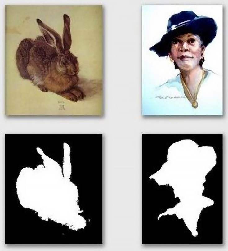
Take a look at the intervals created by Albrect Durer and Pat Weaver.
 |
| "The Hare" Albrecht Durer 16th century "Woman in Hat" Pat Weaver 21st century |
In each of these examples, it's the variation of the interval that keeps a composition convincing and entertaining. Only if the intention is about repetition, such as the familiar chess board, does repeated intervals become a tool rather than a flaw in a composition. Andy Warhol exploited repeated intervals in a number of his works. Remember "Campbell Soup Cans"?
 |
| Andy Warhol Campbell Soup Cans 1962 |
************************
1 comment:
Dianne, you've done it again! You've explained a complex compositional idea so simply and directly. I'll be thinking of rhythm while I'm painting in the future, thanks to you! Not to mention the multitude of other gems you have explained so clearly.
Thank you, thank you for sharing with us so generously!
Post a Comment