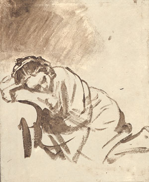
I've always been intrigued by how much can be said with so little when the saying of it is in the hands of a master. There are volumes contained in Emily Dickenson's simple lines, The soul selects its own society, Then shuts the door... or in the simple Rembrandt drawing of a woman sleeping. Ten simple words describing an entire mode of living; less than three dozen strokes expressing a human in restful sleep.
 |
| "A Woman Sleeping" Rembrandt van Rijn c.1655 |
Let’s dust off the economy principle: say more with less. It is easy for the artist to get caught up in multiple images and excessive details, but doing so can cause a feeling of disorganization or visual confusion. Sometimes the work is stronger because of what was left out rather than what was included: when we provide just enough information for the brain to become engaged, we can enable the viewer to participate, to mentally fill in what is not there.
Let's look at how economy is used by three artists from three different time periods.
Jan Vermeer, 17th c. Dutch painter, utilized economy by simplifying value range and shape patterns. Take a look at the simplicity of shapes and values in his Young Woman with a Water Pitcher.
 |
| Jan (Johannes) Vermeer Young Woman with a Water Pitcher c. 1660 |
In the close up below, we can see more clearly how each shape is defined by a simple light and a simple dark, uncluttered with details. Not only that, but if you squint you can see how the value areas are simplified: rather than a wide range of darks, all darks are closely related in value. The same is true with his lights. Squinting reveals a clear light/dark pattern of shapes.
 |
| John Singer Sargent A Parisian Beggar Girl c.1880 |
In this close up, the movement of brushstrokes is as evident as the shapes themselves, yet clean and simple enough not to overpower the shapes they are describing.
 |
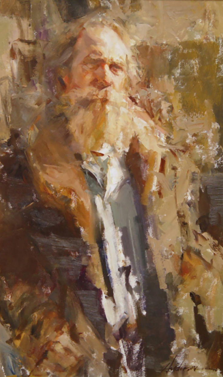
| Carolyn Anderson Portrait of a Man c.2008 |
In the boxed areas, look at how the hair and both shoulders merge into the background: three examples of how adroitly Anderson simplifies with lost edges.
Even though their work spans more than three hundred years Vermeer, Sargent and Anderson are like-minded artists when it comes to knowing how to use economy, showing us how masters utilize the familiar old adage: less is more.
__________________________________


2 comments:
Dianne, I have been reading Harold Speed's drawing book lately - he also urges economy. He says that too much naturalistic detail entails a loss of power (his almost exact words). He compares it to a "perfect" engine - if you made an engine where all the pieces fit *exactly* it wouldn't run, there would be no play (or dither as he calls it) to allow movement. He says the same is true of art that seeks too much perfection in details. Until I read that, I don't think I had realized that art is as much in what you don't say as in what you say.
Enjoyed the post! Thank you for giving to the community and helping others.
Hello Diane, I love this post. I recently attended a workshop put on by Dawn Emerson. She said that she tries to reduce description in her art from a novel to a short story to a poem to a haiku. That really stuck with me-- in fact I now have it posted on the wall of my studio!
Impact through simplicity. I love that concept. Thank you for sharing!
Post a Comment