Go here. The painting is "Carriage House" by Marc Hanson, one of the finest landscape painters around. Marc, himself, raised the question about whether the painting being divided in half is troublesome. We would not question the beauty of this piece. The superb craftsmanship, masterful drawing, sensitive interpretation, deep conviction and a presentation of one of the most beautiful patterns of dappled light I've seen anywhere. But why would he ask the question?
It's not that rules should dominate or that we must be slave to principles, it's to do with the rhythms within the human body and what we feel we need to see or hear in a work of art. It's all about rhythms which are all about intervals.
An interval is a space between two things or a period of time between two events or a pitch between two tones or a degree between two values or colors or intensities. When many intervals are equally spaced, we have a type of staccato response, but when two or three or even four intervals are equally spaced, we feel both bored and restive.
In music, a series of quarter notes without any variation drives us looney. In painting, equally spaced images or divisions feel abnormal, unresolved. We feel ambiguity. We want more space in one shape and less in another. We want a rhythm that is most akin to our heartbeat or our walking pattern or our breathing. We want what nature wants and provides all around us: patterns made from unequal intervals. And it's within nature that we find our most ingenious principles of composing. And that's the reason "blah, blah, blah" is so expressive.
Saturday, July 26, 2008
Sunday, July 20, 2008
Avoiding Tangents
A tangent is bothersome touching. You might call a tangent the painting's harassment because it creates an uneasiness within the viewer, even if unconsciously. Tangents happen when...
 ...the edges of two shapes touch
 ...the edges of two shapes touch
Solution: Either overlap the shapes or put some space between them.

...one shape overlaps and intersects the apex of another
Solution: Shift one shape or the other so there is no overlap at the apex.

...a vertical shape aligns with the apex of another shape
Solution: Shift your vantage point.
 ...the edge of a shape touches the edge of your painting
Solution: Either crop inside the image, suggesting the rest of the image is outside the picture, or bring it comfortably INSIDE the picture.


...a shape is cut in half at the edge of the painting
Solution: Either bring the entire image inside the picture plane or crop in a place other than the halfway point of a symetrical shape or at a joint of an animal or person.
.
...a closed shape hugs a corner
Solution: Either find another way to crop the image or lose some of the edge so that the negative space merges into the positive.

...one shape overlaps and intersects the apex of another
Solution: Shift one shape or the other so there is no overlap at the apex.

...a vertical shape aligns with the apex of another shape
Solution: Shift your vantage point.
 ...the edge of a shape touches the edge of your painting
Solution: Either crop inside the image, suggesting the rest of the image is outside the picture, or bring it comfortably INSIDE the picture.


...a shape is cut in half at the edge of the painting
Solution: Either bring the entire image inside the picture plane or crop in a place other than the halfway point of a symetrical shape or at a joint of an animal or person.
.

...a closed shape hugs a corner
Solution: Either find another way to crop the image or lose some of the edge so that the negative space merges into the positive.
(If you have problems with knowing where to crop,
I recommend an article written by Katherine Tyrrell.)

...The edge of a horizontal shape hides behind a vertical shape.
Solution: Either have shape behind follow through and be visible on the other side of the vertical shape or put some space between them.

...the edge of one shape aligns or continues with the edge of another.
Solution: Change the vantage point so that edges of different shapes don't align.
 ...a vertical shape appears to be growing out of the body of an animal or person.
Solution: Place an interfering shape or value or change the value or color. The solution to this problem will depend upon the subject. The idea, though, is to change it somehow so that the background shape is shifted to the distance.
 ...The edge of a frontal shape is aligned with the edge of a background shape. (Example: backs of cows here align with horizontal of creekbed)
Solution: Change your vantange point or simply raise or lower the horizontal.
I'm sure there are other tangents, but these are the major ones that plague us. It's a good idea, while our work is in-progress, to occasionally step back and scan it for tangents. They can sneak in on us without the least warning.
Saturday, July 19, 2008
Placing Our Images: Golden Section and Thirds
There's something aesthetically pleasing about a golden section. It is so aesthetically harmonious that for centuries, artists have used it for placing their centers of interest and other important images. It's based on a ratio of 1 to 1.618 which is found in growth patterns in nature as well as designs in plants, sea creatures and an abundance of natural images. Look at how a golden rectangle is formed by adding a golden section to a square:

Make a square. Find the half-way point on its bottom
edge. Place the point of the compass there and the pencil
of the compass in the upper left corner.

Draw an arc that extends in alignment with the
bottom edge. That's the ratio that creates the golden section.

Extend the bottom edge to the end of the arc, then
complete the golden rectangle. This new rectangle now has the ratio of 1 (vertical) to 1.618 (horizontal). The original square is also the rectangle's rabatment.

Here I've divided the horizontal into thirds. Look at how close in size the
thirds are to the golden section.
We don't need to figure the golden rectangle or find the golden section for placing our images though. There are two easy systems which will enable us to get our images in that aesthetically pleasing location without all the figuring just by eyeballing.
One is the called the "eyes of the rectangle," illustrated in the top diagram below; the other, "rule of thirds" illustrated in the bottom diagram. The "eyes" are found by drawing a line from corner to corner, then locating the spot half-way between the center and any corner. The thirds are obviously done by dividing both long and short sides into thirds. At the intersections are where images get placed.


These sweet spots are very close to the golden section and often occur at the rectangle's rabatment. Look at the following three examples by nineteeth century European artist Anders Zorn. Using the methods above, you can find how Zorn placed his important images within the area of the rabatment, the eyes and/or the thirds of the rectangle.

Anders Zorn, Impressions of London
1890,Watercolor


Anders Zorn, Baking the Bread
1889, Oil

Anders Zorn, The Thorn-brake
1886, Watercolor
Wednesday, July 16, 2008
Placing Our Images: Rabatment
Once we've learn how to stay out of the image trap, it's a good thing to know how to place our images for the strongest impact and the most interesting composition. But first, we need to address the cardinal rule about placement: the yolk of a fried egg floats in the middle. Avoid the fried egg syndrome and keep your center of attention OUT of the MIDDLE of your painting. The masterful composer might ingeniously place important images in the middle and make it work, but nine times out of ten, placement in the middle spells disaster.
Painters can rely on several sound strategies for finding a good placement. One of these is called the rabatment of the rectangle. The rabatment is the square found on either side of a rectangle by taking the short side and making a square out of it. For each horizontal rectangle, there is a right rabatment and a left rabatment. Placing the most important images or activity within either of these squares creates a structure that enables the viewer's eye to sense the structure and perceive it as harmonious .
 "Committee Meeting" Watercolor on Paper
Copyright 2007 Dianne Mize
Click on image for larger verson.
Above in my watercolor painting of jaybirds, notice how I've placed the two conversationalists within the left rabatment and the onlooker outside of it.
To experiment with using the rabatment for your placement, begin by doing a drawing free-floating on the page without a format around it. For this exercise, I'll be using the drawing on the lower right of my sketchbook page.
 Create a view-finder whose vertical side is the same length as the vertical height of your drawing. Then, make the horizontal a length which will give you a standard proportion. Example: if your drawing is 3 inches high, your viewfiender might be 3" x 5". Within that viewfinder, the 3" x 3" square of space on the right and on the left are your rabatments.
 Now, place the viewfinder over the drawing so that the major idea of the drawing fits into that square portion of space. Now you see how a rabatment works. (You can click on each image for a larger version.)
 This would be the plan for your painting. Pretty neat stuff, huh?
Painters can rely on several sound strategies for finding a good placement. One of these is called the rabatment of the rectangle. The rabatment is the square found on either side of a rectangle by taking the short side and making a square out of it. For each horizontal rectangle, there is a right rabatment and a left rabatment. Placing the most important images or activity within either of these squares creates a structure that enables the viewer's eye to sense the structure and perceive it as harmonious .
 "Committee Meeting" Watercolor on Paper
Copyright 2007 Dianne Mize
Click on image for larger verson.
To experiment with using the rabatment for your placement, begin by doing a drawing free-floating on the page without a format around it. For this exercise, I'll be using the drawing on the lower right of my sketchbook page.
 Create a view-finder whose vertical side is the same length as the vertical height of your drawing. Then, make the horizontal a length which will give you a standard proportion. Example: if your drawing is 3 inches high, your viewfiender might be 3" x 5". Within that viewfinder, the 3" x 3" square of space on the right and on the left are your rabatments.
 Now, place the viewfinder over the drawing so that the major idea of the drawing fits into that square portion of space. Now you see how a rabatment works. (You can click on each image for a larger version.)
 This would be the plan for your painting. Pretty neat stuff, huh?
Sunday, July 13, 2008
Avoid The Image Trap: Find A Pattern and Nail It
Image traps usually hit when a bunch of stuff is in the same scene. Here is a photo, a raw image, full of potential image traps.
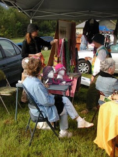

Of course we could edit out the background cars and even the tent overhead. That would help some, but we'd still have a bunch of objects to deal with. One of the best ways to stay out of the trap is to find a pattern of darks and lights and sketch all those into a flat four-value pattern where like values connect. If we break the photo down into a four-value pattern, we get this:

or you might increase the feeling of shadow by doing this:

or you might increase the feeling of light by doing this:


or you might increase the feeling of shadow by doing this:

or you might increase the feeling of light by doing this:

So what has happened is that all the shadows have been reduced to two values of connecting darks and all the areas in direct light are reduced to two connecting light values. In the two dark values, there is one dark and one mid-dark; in the two lights, one where the light his totally white and one where it's light-mid. If, when painting, we think of color as color value rather than as hue, we'll weld those images together and avoid the image trap.
Each color we see possesses a hue (the color name), an intensity (the color's brilliance or lack of neutrality), a value (dark to light), and a temperature (warm or cool). When we are concentrated only on the color name (red, yellow, and all that), we fall into the image trap, but when we think of the color as to what value it is, we're most likely to avoid the trap.
Richard Schmid illustrates this principle beautifully in his painting "Orange Pansies".
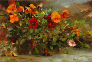
"Orange Pansies"
Oil on Canvas
Richard Schmid
Notice how the pansies in direct light are a lighter, brighter orange whereas those in shadow are a darker orange. Notice how where the foliage is mostly in shadow, the values of greens are kept in dark range whereas the greens in direct light are a lighter value. Notice also that the foliage in shadow is a cooler green whereas in light, the green is warmer, more intense.

In this posterized version, I've dropped "Orange Pansies" to four values. You can see how Schmid keeps a strong connected dark pattern with just a single accent of strong light. Yummy. His mid-darks are dominate, carry the day, with the darkest darks just playing the role of accenting. Then the mid-lights connect together as a supporting pattern with that one lightest-light and a few scattered spots of it as accent. The mid-dark oranges take on the same value range as their surrounding greens. Notice that.


No image trap here. But then, he IS the master, isn't he.
Friday, July 11, 2008
Avoiding The Image Trap: Trust Your Light
On the mast of my easel I have scribbled these words: squint-observe-select-aim-stroke. I know that whatever's in front of my eyes has within it all the information I need to lead me toward a good painting. It's a matter of learning how to see what is actually there.
Artists who continually fall into the image trap limit their attention to what they assume about the appearance of the image. If it's a red umbrella in sunlight, it gets painted red and shaped like an umbrella whereas in the raw image, the eye might not see that much red at all. Actually there might be strong pinks or oranges or even white in direct light and perhaps purples or even greens or blues in the shadows. Values in one shape might be similar to those in an adjacent shape and each might be merging with the surroundings both in light and in shadow.
To fix our attention on the paths that light and shadow are making is to allow us to discover things we otherwise would have missed. If there is a light pattern moving throughout the scene from background to image or image to image, we might capitalize on that visual quality rather than focusing on just the definition of the image. Look what a delightful path of light Pat Weaver found at a racetrack in Kentucky.
 Pat Weaver
"Lookin' For A Winner".
Watercolor on Paper
Pat has set the human images within a strong path of dark (you might even call it a shadow path) and celebrated their activity with pools of light flowing in and out from figures to spaces around the figures. Rather than encapsulate each figure with defined edges, she has allowed the light to merge from figures to their surroundings with grace and fluid gesture. The contrast of the strong dark path enhances the brilliance of the light.
When James Gurney speaks of "shape welding", he's talking about this sort of thing where we find similar values among adjoining shapes and merge those values without defining an edge. To look for these things and to paint them is to shift our attention away from the image, finding surprises and excitement that can lift us right out of the image trap toward a successful painting.
When James Gurney speaks of "shape welding", he's talking about this sort of thing where we find similar values among adjoining shapes and merge those values without defining an edge. To look for these things and to paint them is to shift our attention away from the image, finding surprises and excitement that can lift us right out of the image trap toward a successful painting.
Wednesday, July 9, 2008
The Image Trap
Probably the one thing that causes repeated mediocre and poor paintings is what I call the "image trap". The artist is so concerned with the images in the painting that image take priority over sound composition. Things get painted as individual pieces in local color rather than being related to the whole, considering how color masses behave in light and shadow.
A term I'm using these days is "raw image". Not very elegant, but to me it conveys images out there before they're ever touched by the artist. We select images within their environments to carry our content (or as some say, concept). They are why we're doing the painting to begin with, but if those very images are painted out of context with how light and shadow behave the painting feels disjointed, fragmented, disconnected.
There are many ways to put images in a creative context which visually connects them and, at the same time, enhances their purpose. All these methods are the heart of what good composing is all about. Any single set of raw images contains potential for a profound, mediocre or poor painting. That's why the painter learns strategies to stay out the image trap, therefore strengthening the quality of the painting.
During the next few days, I will talk about staying out of the image trap and keeping a painting connected without making it boring.
Sunday, July 6, 2008
Value: Composing With Notan
I address value--light and dark--in the beginning of these discussions because I believe it to be the mother of all elements, even more fundamental than color. (Hawthorne and Hensche probably just took a tumble in their graves.) It's because of light that we see color. Turn down the lights and things become dim, turn them off and you can't see a thing. So it makes profound sense to me that light/dark reside over all visual elements.
Our surroundings make sense to us because of how light hits their images causing consequent shadows. We can reduce these lights and shadows to black and white and it will make a visual thought, show us a visual structure where darks connect and light carries a path within and around the darks . And this will give us the Notan of the scene.
On a piano there is middle C which is the center of the notes available on the piano keyboard. Notes to the left of middle C are lower in tone, notes to the right are higher. Light and dark notes can be similar, but because the value range in nature is so vast, we get a better grasp to limit value notes to 10 where 1 is the lightest or highest and 10 is the darkest or lowest, 5.5 would be equal to middle C.

higher key
or lower key .
.
Notan is only one way of guaranteeing a successful value structure, but it's also a surefire way of getting a strong design within which to compose a painting. Go here then here to see I use notan.
Our surroundings make sense to us because of how light hits their images causing consequent shadows. We can reduce these lights and shadows to black and white and it will make a visual thought, show us a visual structure where darks connect and light carries a path within and around the darks . And this will give us the Notan of the scene.

Photo to notan
Notan, pronounced "no tan", is a Japanese concept meaning "light dark". It is related to yin yang where yang is light and yin is dark. One way to give solid structure to a painting is to do just that--designate all lower value notes to black, all higher notes the white. I used the word "notes" because if we can use music as an analogy and we can easily understand the vocabulary of value.On a piano there is middle C which is the center of the notes available on the piano keyboard. Notes to the left of middle C are lower in tone, notes to the right are higher. Light and dark notes can be similar, but because the value range in nature is so vast, we get a better grasp to limit value notes to 10 where 1 is the lightest or highest and 10 is the darkest or lowest, 5.5 would be equal to middle C.
Using this system of thinking, we can find our true pattern of lights and shadows if we create a notan, placing value notes 1-5.5 in the white areas and notes 5.5-10 in the blacks.

This is most easily done in a tiny drawing no bigger than 1" x 2". When creating the drawing, we can decide whether we want the light pattern as we perceive it to be or if we want it
higher key

or lower key
 .
.From here, we can create our painting, keeping our color values one-ish to five-ish where the notan indicates light and five-ish to ten-ish where it indicates dark, referring back to our source, whether plein air or photo, for the colors we want to use.
Notan is only one way of guaranteeing a successful value structure, but it's also a surefire way of getting a strong design within which to compose a painting. Go here then here to see I use notan.
Saturday, July 5, 2008
The Language
 When we paint, we communicate through a rich visual language. Images speak, yes, but how we present them influences what they say. In their raw form each is in a context of a unique light and/or shadow. We can paint the image in strong light, in weak light, in strong shadow, in weak shadow. We can make the image light and it's surroundings dark, make it dark
  with it's surroundings light, make it include both lights and darks in a variety of surroundings. The same image repeated in a variety of lighting will communicate
differently. The element of our language making this happen we call "value". You know that. But had you considered it as a part of your language's vocabulary?
Our language's vocabulary includes value, hue, intensity, temperature, shape, size direction, lineand texture. These are the elements with which we "speak" as painters.
Friday, July 4, 2008
Rules?
Artists tend to be mavericks, tend to reject rules of any kind. It's the creative side of our nature to question assumptions, to extend beyond the accepted, to test many waters, to argue. Without our rebel side, no worthwhile art would exists at all. No good music, no decent paintings, no important poetry. None of the good stuff that holds our attention. Music that we can listen to repeatedly, paintings that we keep going back to, poems that we tend to read again and again--they simply could not exist without disregard for status quo.
Then what about these rules of composition that many artists reject, but seasoned artists hold dear? They are not rules at all, but principles. There's a vast difference: a rule is fixed, a principle is flexible. A rule is man-made, a principle is the cause of an effect. A rule assumes a bias, a principle is a fundamental truth.
Our principles for visual composing are the results of observations made by artists over ions. They are our guidelines within which there are limitless possibilities for variation, expansion, alterations and elaborations. These principles are not static, but organic. They are like the gravity that holds us to the earth.
The posts to follow will be my thoughts about visual composing. I hope you enjoy the ride.
Subscribe to:
Posts (Atom)