Welcome to Compose. There's lots of stuff here, all about composing paintings.

Current entries appear in Dianne's weekly newsletter.


Showing posts with label Color Wheel. Show all posts

Saturday, October 26, 2019

Clarifying Color Wheels

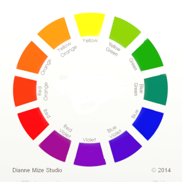
These days there is a lot of confusion about color wheels.  Why are there so many?  Which one is the "correct" one?  Why bother with a color wheel anyway?
Before I go further, we should get clarity on some terms:  Primary Colors are hues from which all other hues can be mixed; Secondary, a hue visually mixed with two primaries; Tertiary, a hue visually mixed with a primary and a secondary.
     Now, here we go:
 
THREE MAJOR WHEELS (SYSTEMS)
Even though many color systems have popped up over the decades since Isaac Newton designed our first color wheel, there are three major color systems most popular among artists of all genres today.

THE TRADITIONAL WHEEL
Also referred to as the Newton Wheel, although it is a variation of Isaac Newton's  original wheel of the 18th century, the traditional wheel is based on three primaries perceived as yellow, red, and blue; three secondaries that are visual mixtures of two of the primaries, and six tertiaries, visual mixtures of a primary and a secondary.
 
THE MUNSELL WHEEL
Developed by Albert Munsell in the early 20th century, this system perceives a wheel based on five primaries and five secondaries.  Each secondary is a visual mixture of two primaries.
 
CYMK (aka YURMBY) WHEEL
The term "Yurmby" is (I think) coined by James Gurney.  It consists of six hues, all perceived to be primaries: yellow, red, magenta, blue, cyan and green-- thus the acronym "yurmby". It's the same model known as CYMK, a system created for color printers. (For more info, go HERE )
    
 
WHICH ONE TO CHOOSE
When we examine these three systems, it is notable that each feels like an effort to come up with the fewest hues from which all other hues can be mixed. However, each is  based on a different perception of hue.  For example, Munsell sees purple more red than Newton and the CYMK renames some of the hues.
Which one is best to use?  Well, that depends upon which artist you ask. James Gurney would say the Yurmby (CYMK) whereas Richard Schmid would say the Traditional. Richard and I are about the same age, so each cut our teeth on the Traditional wheel and we each handle color mixing right well. James was born almost 2 decades later, so he leans towards the more modern wheel, and he, too, is a good color mixer.
     Truth is, it doesn't matter. They all work out the same when mixing pigments. Each artist adapts the wheel that works best for them.  With that in mind, don't get all caught up by the dogma of any of us.  You can walk into a gallery where paintings are done based on each system and not be able to tell which system was used for any one of them.
Just find yourself a wheel that feels right and learn to think with it

Sunday, August 13, 2017

A Glimpse into Color Schemes

To begin with, I dislike using the word "scheme" when discussing anything art related. Bad behavior of humans have given the word a negative connotation, but I don't find any word in the Thesaurus that is a good substitute, so "scheme" it is. 
Historically, French Impressionist Claude Monet most likely has explored color schemes more thoroughly than anybody. We know that he did dozens of paintings of haystacks, each exploring varying light effects of color.  Here are three examples, each showing below the color scheme found in the painting.
COLOR SCHEME EXPLAINED
A color scheme is any limited palette that has some kind of relationship on the color wheel.  The relationship can be that all scheme colors have one primary hue in common, it can be how colors are spaced out on the wheel or it can be temperature related, such as all cool or all warm hues.   
Schemes can be made up of two, three or four colors.  Those made of three colors are call triads and those made of four, tetrads.  A two-color scheme usually consists of complements.
CUTTING TO THE CHASE
So what does this have to do with the artist who just wants to paint without being encumbered with all the theory.  We could ignore it all together, but we might miss out on some fun if we did.  What if we take a page from Monet?  If you cursor back and study the three paintings we show of Monet's haystacks, we'll see that Monet looked for the color, then enhanced what he saw within a scheme.  He kept the value structure he saw, but reinterpreted the color.  Just imagine what could be experienced if we tried doing that!

Saturday, April 1, 2017

Getting to Know Color as a Language

What are these colors?
Image
If your answers are mauve, tan,and olive green, you are not speaking the color language
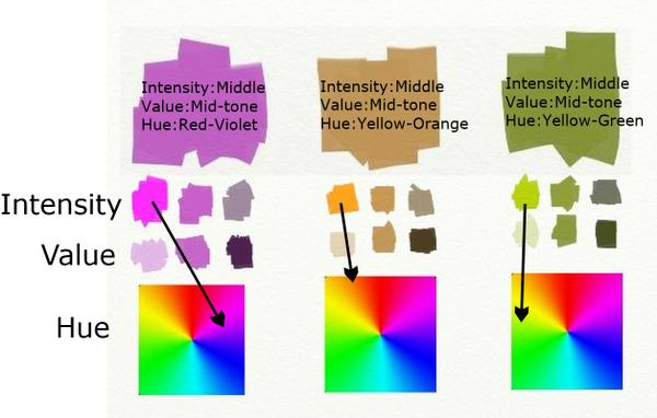
Begin here:  Color is a language within itself.  It has three major parts of speech--hue, value and intensity--as well as temperature which gets created by hue and intensity.  Once we get to know each of these components of color, we can create any color we want just by asking three questions.
    1.  What is the hue?
    2.  What is the value?
    3.  What is the intensity?
The questions can be asked in any order.  But what do they mean? 
Hue
Image
The color wheel was invented to help us work with hue.  We can recognize hue if we call it by its color name such as red-violet, yellow-orange, yellow-green.  We can know these like a parent knows the face of a child.  We can see them in our minds when their names are called.  Committing this to memory is the first step towards getting to know the language. 
Intensity
Image
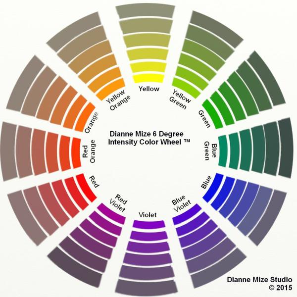
 The intensity (or chroma) of a color is the degree of saturation of its hue.  The color wheel shows the hues at 100% hue saturation. An absolute gray has zero saturation.  When any hue's complement (the hue opposite it on the wheel) is mixed into it, the saturation decreases--becoming more neutral-- causing a lower intensity.  Complements neutralize each other just like an acid neutralizes an alkali.  Changing the intensity doesn't change the hue although it might change the value.  Note:  The labels intensity and chroma are interchangeable.
The swatches at the beginning are all reduced intensity.  The first one we might have called mauve is actually middle-intensity red-violet.  The easiest way to label an intensity is to use the words low(almost neutral), middle (slightly neutral) and high (highly saturated).
Value
Image
Value (also called tone) is the degree of light or dark within a color.  We show it in a scale to help discern it.  Unfortunately, color scientists have screwed up the numbering of this system.  Earlier systems use 10 to indicate the darkest value (that's the one I learned), but more recent systems use 10 to indicate the lightest value. 

The number matters only in so far is it helps to distinguish degrees of value.  A better way to communicate the language of value is to call it high(light), mid-tone(middle) or low(dark). 
And Here's How the Language Works
Image

Saturday, April 23, 2016

Thinking with a Color Wheel

Learning to think with a color wheel can take a lot of guess work out of getting the right color while painting.  First, we train ourselves to call colors we see by their hues rather than common names. For example, some might name the color of these stacked rocks beige, but what hues do we see?
 

If identifying the hues eludes you, hold up a color wheel next to the subject.  Close your eyes for a few seconds then, open your eyes and without thinking, name the wheel's hues that feel closest to the subject's hue.  Don't allow yourself to THINK about it.  Just respond.

  
Test It
     Rarely do we see hues at their fullest saturation, so we might need to make some adjustments.  If we don't have a tube color of the intensity we need, our next move is to reduce the saturation with a complement.  Here are the steps I suggest for testing out the hues you named.
Step 1:  Find a tube color closest to hue.
Step 2:  If it is darker than the subject, adjust its value with white.
Step 3:  Find a tube color closest to its complement.  If you don't have that color, mix it.  
Step 4:  If the mixture is darker than the subject's hue, raise its value with white.
Step 5:  Gradually bring the complement mixed in Step 4 into the value adjusted mix in Step 2.  That should tell you if your correctly named the hue.

color wheel  

After a series of experiences like this, we can automatically read a color by the wheel.  The payoff is that while painting, when we see a color about which we are uncertain, we can "think with the color wheel" and easily find it.

Saturday, April 16, 2016

Setting Up a Limited Palette

Let's play with color.  The photo below has in it a number of colors.  Coming up with a limited palette scheme for this can take us on an enlightening adventure.  


A limited palette that follows a scheme has inherent harmonizing potential.  But knowing how to find that scheme can be challenging.  Here's a four-step process I use:

1.  Identify visible hues
     
The major hues I see (top to bottom) are blue, yellow-green, yellow and orange.

2.  Begin with one or two hues you see.  I'm choosing two--blue and yellow that I can combine for a third hue I see, yellow-green.
Blue + yellow=green, giving me a range from yellow to yellow green to green to blue green to blue.
 

So it looks like both Ultramarine Blue and Hansa Yellow Light could be candidates to yield at least three hues I see--blue, yellow and yellow-green.  

3. Find these chosen hue's complements
The complement of blue is orange, so I can add to the palette
Quinacridone Burnt Orange (a good candidate because mixed with hansa yellow light, it will produce the oranges I see plus provide a range of darks)
The complement of yellow is purple, possibly Dioxozine Purple. (This will give a range from yellow to yellow ochre to brownish purple to purple as well as a good range of values).

4.  Test the scheme
     By doing these steps, I've come up with a possible limit palette scheme of blue, orange, yellow and purple--two sets of complements that, when I plot them on the color wheel, show up as a double split complementary scheme.  JOILÀ!

A double split complementary scheme is any two sets of complements formed from colors on either side of a single set of complements.
Mixing with these complements plus white, I can get the lower intensity hues I see, especially in the vase and on the rock window casing.
    Just to be sure, I squeeze out onto the palette these choices along with white and explore all the possible hue, value and intensity mixes I can come up with from various combinations of Ultramarine Blue, Hansa Yellow Light, Quinacridone Burnt Orange, Dioxazine Purple and Titanium White.  THERE'S where I begin to see potential.

EPILOG
   If you'd like to learn more about ways to work with color schemes, take a look at Series 10, four video tutorials on Transposing Color found HERE.

Saturday, June 25, 2011

Understanding Intensity in Color

Color contains three attributes:  hue, its location in the spectrum;  value, how much light or dark it holds, and intensity (also called chroma) or the saturation of hue within the color.

Look at this graphic.  The colors are full saturated even though one hue merges into another.   
 Fully saturated means the hue is not neutralized by a complement.  The hues closest to the center are darker in value, but they remain as saturated as their lighter versions close at the edge.  All these hues are at their highest intensity.

Here's the same example with some of the saturation taken away or neutralized, each having a bit of its complement mixed into it.


The hues remain the same, but the intensity is slightly lowered, a bit more neutralized.

And here it is again with all the hues totally neutralized.  Notice that with the hues totally neutralized they disappear and the intensity is gone, but the values remain.  
So, why is this important to a painter?

Being aware of the complexities of color and knowing how to manipulate them opens up for the painter an abundance of options so that the ability to see nuances increases both in observing and in making decisions.

Saturday, May 7, 2011

One Idea, Many Variations

How many variations can you put on a theme?

Turkish pianist Fazil Say shows us how Mozart, being both playful and naughty, took "Twinkle, Twinkle Little Star" and did this:

 
Similarly, visual artist Pat Weaver has put more than two dozen twists on a single theme, a container of flowers.  Go HERE for a moment and take a look.  (Don't forget to come back.)

Just as composers like Mozart often elaborate on a simple tune, it's not unusual for a visual artist to explore a single idea in an array of works, each complete within itself, yet having its own unique take on the chosen theme.  One way to do this is to play with the color key like Pat Weaver has done.

Look at two of Pat's still life paintings:

Still life paintings by artist Pat Weaver
You can see that one of these painting's key registers on the warm side of the Color Wheel while the other falls in on the cool side.

But look what happens in this one:

Pat has used two keys in her pot of geraniums and with a sweet twist:  most of her green notes (green being on the cool side) are predominately a warm green whereas her red (red being warm) notes are on the cooler side of red.  

If you listen to all the spins Mozart put on "Twinkle, Twinkle..." you can hear how each dances around the tune, yet retains our recognition of it.  Pat Weaver's many variations on "flowers in a container" each carries a specific use of color giving it a singular interpretation and expression.

Each of these creators took a given and found multiple ways to expand it into something new and unique.

Saturday, April 23, 2011

It's Set in the Key

This is my vacation piece.  I'll be on medical sabbatical for a little while getting my right hand--my dominant one--repaired and recuperated.

Meanwhile, this is fun:

2700 years ago a Greek philosopher named Pythagoras standardized musical tuning into a system he called the Circle of Fifths.   It was he who diagrammed the relationship of our twelve major keys, an invaluable tool for composers and musicians in Western music.

 Within Pythagoras' Circle of Fifths, we can locate any key and find its related chords.  Here's how it looks:

The Circle of Fifths designed by Pythagoras in the 6th century, BC
(Disclaimer:  This particular design of Pythagoras diagram is posted on several internet sites.  It is unclear to whom it should be credited.)

To see how this works, locate C on the circle.  Glance to the left of C and you'll see F, look to the right to find G.  C, F and G are the three major chords in the key of C.  In the little circle underneath them are the minor chords related to the key of C.

Now here's the fun part: four hundred years ago the traditional Color Wheel was diagrammed  by Sir Isaac Newton.  This wheel also is a twelve-part unit.
The traditional Color Wheel as designed by Sir Isaac Newton in the 1600's.
No different from the Circle of Fifth's importance to musicians, the Color Wheel is the work horse of visual artists.  The more a musician learns about the Circle of Fifths, the richer the music can be, and the more a visual artist learns about the Color Wheel, the more fertile the possibilities are in painting and design.

And not unlike how a composer sets a musical piece in a key, the artist has the ability to set the key of a painting, giving it the same sort of unity as a key gives a piece of music.

Left   "Weaver" by Richard Schmid
   Right   In a Moscow Cafe"  by Robert Genn

The paintings above are similar in that each features a person engaged in doing something, but their major difference is their key.   Robert Genn's has keyed his piece in cool colors (colors in the bluish range) whereas Richard Schmid's painting is keyed in warm colors (colors in the yellow/red range).

Here is how each is positioned on Newton's Color Wheel:

Schmid and Genn paintings each placed in their key of colors. 

What's so much fun about all this is the similarity between the two diagrams we artists and musicians depend upon and the many parallels in the ways they are used.

And once my hands are working again, I plan to explore this in upcoming tutorials.  Meanwhile, enjoy this thought:  however you look at it, everything is connected.