Welcome to Compose. There's lots of stuff here, all about composing paintings.

Current entries appear in Dianne's weekly newsletter.


Friday, September 23, 2016

The Magic of Gradations

Gradation is a seamless transition between opposites.  Light changes slowly to dark, repeated images continuously become larger or smaller, one color gently unfolds into another. It all appears to change before our eyes, to become something different from what we "know" images to be.
Actually, nothing changes at all.  The mechanics of our eyes cause us to see these things happening.  We know a tree trunk to be a tree trunk, but we see its characteristics according to how we perceive light's behavior from our unique viewpoint.  Examine how Colin Page interpreted his perception of value gradation caused by the light and shadow within his painting, Growing Tall.
Image
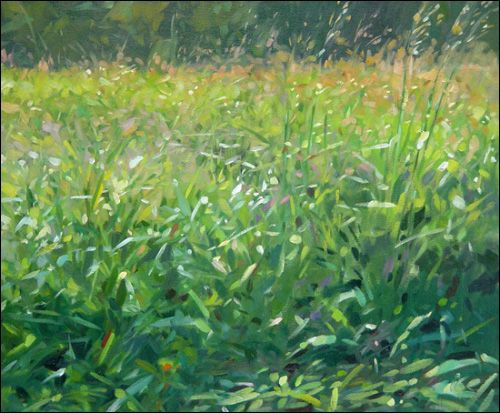
When we squint our eyes at his painting, we see a gradation of light flooding over a field of tall grasses, but if he had been positioned to the right or left, he would have shown us something entirely different.  Add to that, within Colin's value gradation creating distance, but there are smaller value gradations within that shadowed area in front.  Without these, his painting would be a lot less energetic. 
Image
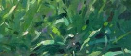
It is within those internal smaller gradations found in the overall big ones where we can create the most magic within our paintings.   We just have to look beyond the obvious to find them.

Saturday, September 10, 2016

Our Creative Current

When we are fully immersed in the act of creating, there is a space within us where all that we are and all that we know come together into a oneness. We become so completely absorbed in what we are doing that we lose awareness of time and place.  When we stay present there, not allowing ourselves to be distracted or to resist what is happening, we create freely and from wholeness. Here, we lose all self-consciousness: we are totally engaged in the act of doing.  I call this experience our creative current.  It is the place within us from which we are free to create and, therefore, from which we grow and evolve. (From my book, Finding Freedom to Create, p. 5)
The creative current doesn't discriminate.  It worked for Michelangelo 600 years ago the same way it worked for Tom Glavine just twenty years ago.  All that it requires is focus and attention.  That's it.
Image
Michelangelo Buonarroti     Studies for The Libyan Sibyl       Red Chalk on Paper


Image
Hall of Fame, Former Atlanta Braves Pitcher-Tom Glavine 
The neat thing about the current is that we can use it for tiny steps of learning or practicing as well as being deeply involved in large projects. For example, if you want to learn to do notan drawing, you can choose a subject, focus on just shadows in a subject and give full attention to only shadow without noticing what the subject is and before you know it you're in the current.  You WILL do a notan drawing.  You won't be able to avoid doing so.  
Image
Like an electrical current whose voltage flows across a wire, the creative current flows across an intuitive path that we access when we are totally focused within the act of creating, whether practicing, performing,  composing, or constructing.  We all have access to it.  Using it is a matter of letting go of any fear or rational questioning or doubt.   
Whatever the endeaver--whether practicing exercises from my composing lessons, learning a new brushstroke, honing a new technique or simply responding directly to a plein air landscape, to allow yourself to enter and stay in your creative current will create growth and confidence like nothing else.

Saturday, September 3, 2016

Why Does SCALE Matter?

Not long ago, a student asked me how to decide what size to make an image in a painting. For today's composing tip, I want to share with you the answer I gave.  The size we make our images strongly effect how they communicate to their audience.  Let's explore that idea by looking at what some other artists have done with size.
Below are six paintings, each showing the human subject in a different scale as it relates to the format and surrounding images. Notice how each puts you, the viewer, at a unique distance from the person depicted in the painting. That distance helps determine how you relate to the subject in the painting.
Image
Feel how far you are from the people in painting 1 as compared with the people in painting 4. Sense how close you are to the subject in painting 3 as compared with 6. In painting 2, notice the extent to which the environment is important to the person portrayed as compared with painting 5. 
These comparisons show that each of the above painting places a different kind of emotional and relational emphasis on subject. Whereas painting 6 brings us right into the little girl's thoughts, painting 2 is as much about the market and street as about the person making a selection at the market.  Painting 3 makes us feel more like an observer from the street whereas in painting 5, we could be conversing with the subject.
 
So, when we compose, the closer we want our audience to be to the subject, the larger the image of the subject becomes in our painting. The more important we want the surroundings to be to the subject, the smaller the subject becomes as compared to other things in the painting.  Think about the subject's relationship with the audience, how you want the audience to feel about the subject, and that will clue you in on the size the subject should be.