Welcome to Compose. There's lots of stuff here, all about composing paintings.

Current entries appear in Dianne's weekly newsletter.


Saturday, February 18, 2017

How Edges Influence Our Paintings

Look at this abstract composition.  Notice that all the shapes' edges are sharp.  How our eyes move over the piece is determined more by location of shapes and their value contrast with their surroundings.
Let's change that up a bit and throw all the edges out of focus.  Notice how you react to that--we want something to be in focus:  Anything!
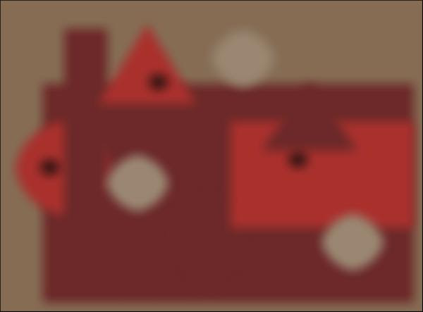
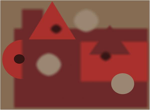
Now in this next design, pay attention to where your eyes go first.  Do they migrate to that dark triangle on the right?  The only shape that's in focus?  I bet they do. 
 
How do your eyes perceive this one with all but three shapes in focus?  Scan backwards now and notice the difference in your response to each design.  The shapes, colors, values and placement are the same.  Only the handling of the edges is different. 
Here's one more.  How would you handle the edges in this one to make the design more pleasing to you?    
 
Whether our designs are realistic images or abstract, how we handle the edges of all our shapes will influence the perception of the total piece.  All these examples play only with soft and sharp edges.  Other choices are broken, jazzed, lost, gradated--possibilities are limited only to the imagination.  What's important is that we notice what we are doing and find ways to use edges to strengthen our compositions. 

Sunday, February 12, 2017

Your Edges Can Give Expression to Your Painting

An edge in a painting is like a pause between two musical phrases:  it marks the ending of one shape and the beginning of another. The two sides of any edge can be isolated from each other or transitioned into each other, depending upon how the artist has handled the painting of the edge itself.
Whereas sharp edges bring shapes to an abrupt halt, calling our attention to them, soft and lost edges enable shapes and images to flow from one area of the painting to another. The soft edge makes a gentle transition, but in the lost edge, we don't see a break between where one shape begins and the other one ends. 
Here's a challenge for you:  Examine this little painting by Qiang Haung and find all the lost edges, soft edges and sharp edges.
 Now, look specifically at just the sharp edges you found.  Notice how your eye migrates to them.  Next focus on the soft edges.  Notice how they create a transition from one area to another.  Finally, the lost edges.  Imagine how stilted the painting would be if these were clearly defined rather than being lost. 
Our eyes want to participate, to become involved in paintings we view.  We want to be challenged, not spoon fed. When an artist uses just enough sharp edges to bring us into the painting, then employs soft and lost edges, our eyes become involved.  We feel like we've been invited to become a part of what the painting is all about. 

Sunday, February 5, 2017

The Trap of Painting by Formula

How do you paint a tree?  That's a generic question painting teachers get all the time.  Books are written and videos made on How To Paint a--(You name it.)   
Three points:
  1. To memorize a formula is tedious and affords you only one way of rendering an image
  2. If you learn to paint by formulas, you will not be able to paint what your eyes are perceiving. The formula will blind you.
  3. If you are not painting your own perception, but instead are depending upon a formula to render an image, you greatly thwart your individual expression and style.    
When judging art shows, I have seen many skillful paintings that did not make visual sense because the artist was painting by formula rather than from perception.  Below is a photo typical of what can happen.  Do you see the discrepancies? 
An artist can be so intent on describing each individual image that he or she will not notice the effects of the light source.  Notice that the cast shadow from the orange is from one light source while the cast shadow from the candlestick is from another. Also, the light on the orange is more dispersed than that cast on the candlestick
.  
I used the two photos above to construct our first picture. The photo on the left shows a more focused light source coming from the right.  The one on the right shows a brighter, more dispersed light source coming from the left. Each photo is a different interpretation of the still life, but within each all images are in context with the light source.   We can show that when we paint from our perception rather than a formula.
Where an image is located, its relationship to other images, the artist's vantage point, the kind of and direction of the light source--all these influence how you perceive images.   No formula will interpret that, but your perception will.