Welcome to Compose. There's lots of stuff here, all about composing paintings.

Current entries appear in Dianne's weekly newsletter.


Tuesday, December 5, 2017

Musings about a Master Artist

American painter Richard Schmid has an intuitive eye for design. Those of us who know Richard's work never tire of viewing the same painting every day of our lives, no matter which one it is.  What is that quality in a master artist?  
Take the painting above, for example.  It's more than just beautiful, although beauty is undeniably present.  It's not just technique even though Schmid is a technical master, but so are others whose work can seem lifeless.  Neither is it his decades of training and experience.  It's much more and I think Schmid himself gives us a few clues in his own words.
From his book, Alla Prima II, he says this to his readers: 
"When choosing your subjects, never worry about greatness or significance or your place in history. Let your subject come from within you and be an honest act of sharing."
Later on he says:
"You are the sum of your choices.  Your job then is to make sure your ideas about what to paint are not wholly based upon either the acceptable or the taboo, but arise instead from what honestly fascinates and stirs you....your task is to get in touch with yourself.  Find out what moves you, what you believe in, and what you truly understand about life."
Perhaps THAT's why Richard's paintings always sing.  They come from his authentic voice.

Working Rules Rather than Following Them

We've been taught that 2x2=4.  But that's not all the story:  2x2=1+3 as well. 2x2 also equals 5-9 and 24/6.  It's a matter of how you think about it.  It's attitude.  To insist that 2x2 is always 4 is to hold a restrictive and resistant attitude.  The same is true for principles of composition.
To resist learning composing principles because they are too difficult to deal with or because you fear they will stifle your creativity is the same as declaring that 2x2 always equals 4.  But what if I told you that there's another way to look at it.  What if there is a way to work a principle rather than follow it.
Let's play with this idea.  Look at this J.M.W. Turner painting done in his early 20's. 
 Alum Bay, Isle of Wight     Joseph Mallord William Turner    1795
If Turner had looked at the scene as content for working a principle rather than images to paint, he might have switched his vision from the scene to an exercise in aerial perspective.  His intention then might have been how to keep images up close defined and in strong value contrast while allowing distant images to become less distinct and in close value contrast.   
We can extract that intention and apply it to a scene like this portion of Lake Erie. 
Rather than duplicate the scene, if we use it to find a way to keep images up close defined and in strong value contrast while allowing distant images to become less distinct and in close value range, we will have used aerial perspective as a tool rather than have followed it as a rule
Using this approach, we can add ways to solve the problem more creatively.  For example, your intention could be this:  Find a way to keep images up close defined and in strong value contrast while allowing distant images to become less distinct and in a close value range, using a complementary limited palette. 
When we take ourselves through this kind of problem solving as exercises, we don't have to worry about principles because we give ourselves the experience that enables using them without thinking.  They become a part of our tool kit.

How to Find Your Style

My favorite segment of the radio show, Performance Today, is the Piano Puzzler.  Pianist and composer, Bruce Adolphe re-writes a familiar tune in the style of a classical composer. A listener on the phone then tries to name the hidden tune and the composer whose style Bruce is mimicking. 
What is there about a composer's style than can be identified when mimicked with a tune the composer did not write?  Can the same be done with visual artists' styles?  And where does style come from anyway?

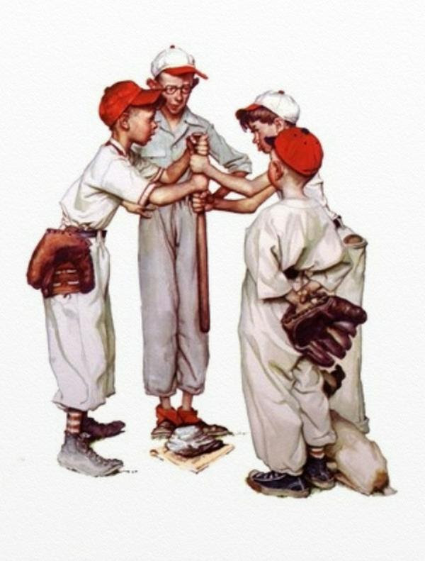
Do you recognize by its style the artist who did this painting?

What about this one?   
Let's try one more.  Can you tell by the style who did this painting? 
Some many things go into each individual's style of painting, but considering skill level, the most significant thing that causes a style is the artist's listening to that inner voice that says "this is the way that feels natural to me."  Too often, that voice gets drowned out by a desire to succeed or a desire to be popular or a desire to fit in the current trend, among other things.   
Consider this:  If any of the artists above had allowed the desire for success or the current trend or the drive to fit in, or anything other than their inner voice to determine the style of their work, we would not know about them today.

Saturday, October 14, 2017

The Power of Understatement

Edges are boundaries that form shapes.  One of the most powerful tools artists have available is the ability to suggest these boundaries rather than stating them definitively--the lost or softened edge.   It's powerful because it engages the viewer by suggestion rather than spelling out everything in complete detail.  Our attention goes to defined areas first and our gestalt fills in where edges are lost or softened.  The work becomes more about expression and less about definition.
Here's the complete story of a duck in water with all edges defined.

In this next version, we've lost an edge at the bottom left where values of the duck and of the water are similar, we've softened edges in most areas except for the duck's head.  Now, close your eyes for a moment, then look at this version.  Do you notice how your attention goes first to the head?   Do you feel a more expressiveness in the image?
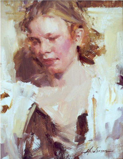
Many of our contemporary artists make use of losing edges to give greater unity to their work and to make their work more expressive.  Carolyn Anderson is notable among these.  Here's an example of one of her portraits. 
Notice how the light values from the background merge into the light values of the subject's clothing and neck area.  Anderson has given us just enough clues to allow our gestalt to complete the story.

Tuesday, September 19, 2017

Is a Focal Point Necessary

Does every painting need a focal point? Not always, say some professionals, but others consider it an absolute requirement. In fact, many artists take focal points for granted, including them in a composition without thought for whether or not a successful painting might need such a thing. So what is a focal point and why do we use it?
Also called a center of interest, a focal point is the area of emphasis around which the rest of a painting is centered or something in strong contrast that pulls the viewer's eye into the painting. But sometimes an artist will have other intentions and abandon the focal point altogether
We’re all familiar with the work of action painter, Jackson Pollock. Because of the nature of his painting process—distributing drips and splashes with repeated movement throughout the canvas—Pollock’s later work does not have a focal point. Instead, we are engaged by the endless maze of paint, a pattern created by movement such as we see in his Number 8, 1949
A different kind of intention—that of repeating a single image with variations set in a tic-tac-toe grid—is found in Andy Warhol’s Marilyn, another work where there is ot really a focal point. 
 Non-objective painter Piet Mondrian arranged and repeated squares and rectangles into compositions that leave us in question of whether there is a focal point. In Broadway Boogie Woogie, below, there seems to be a focal point in the upper right quadrant of his painting—the yellow rectangle inside the red square, sandwiched on top and bottom by the blue rectangles--but we are left in question.
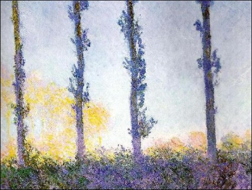
So far our examples have been from historical masters of various abstract movements, so do we conclude that only in more conceptual painting does the focal point not apply?  Not so quick:  our Impressionist hero, Claude Monet, did a little focal point deleting himself.  Take a look at his painting, Poplar Trees
The alternation of trees and sky in this painting make the entire piece the focus. We see then that the question of focal point has nothing to do with whether a painting is non-objective or realistic, but whether the images are ordered so that every inch of the painting is important to the whole.

Wednesday, September 6, 2017

The Miracle of Sunlight

Those of us fortunate enough recently to have experienced the total eclipse of the sun felt the awe of its light contracting, disappearing, reappearing, then expanding.  We watched the sky and images around us take on evolving color changes that became almost too much to comprehend.  No camera could record what the human eye experienced and the exhilarating rush it sent throughout our being. 
Ever since the Impressionists became aware of what happens to color as the sun changes position and how our location to the sun determines how we see color, artists have discovered a vast array of methods for expressing the effects of direct sunlight.  Many follow in the path of Claude Monet who was the first to explore these changes multiple times within a single subject.  For Monet, the content was color, not the images. 
Below are three from his thirty (or more) studies of haystacks.  Look at them slowly and notice the differences in color Monet found within the same areas of the scene.
What Monet's work proved, and what we can prove to ourselves, is that local color is little more than a platform for light to do its miracles.  The light source means everything to what we perceive upon and within that local color. Look at the colors I found in these pumpkins whose local color we would call orange.

Sunday, August 13, 2017

A Glimpse into Color Schemes

To begin with, I dislike using the word "scheme" when discussing anything art related. Bad behavior of humans have given the word a negative connotation, but I don't find any word in the Thesaurus that is a good substitute, so "scheme" it is. 
Historically, French Impressionist Claude Monet most likely has explored color schemes more thoroughly than anybody. We know that he did dozens of paintings of haystacks, each exploring varying light effects of color.  Here are three examples, each showing below the color scheme found in the painting.
COLOR SCHEME EXPLAINED
A color scheme is any limited palette that has some kind of relationship on the color wheel.  The relationship can be that all scheme colors have one primary hue in common, it can be how colors are spaced out on the wheel or it can be temperature related, such as all cool or all warm hues.   
Schemes can be made up of two, three or four colors.  Those made of three colors are call triads and those made of four, tetrads.  A two-color scheme usually consists of complements.
CUTTING TO THE CHASE
So what does this have to do with the artist who just wants to paint without being encumbered with all the theory.  We could ignore it all together, but we might miss out on some fun if we did.  What if we take a page from Monet?  If you cursor back and study the three paintings we show of Monet's haystacks, we'll see that Monet looked for the color, then enhanced what he saw within a scheme.  He kept the value structure he saw, but reinterpreted the color.  Just imagine what could be experienced if we tried doing that!

Wednesday, July 19, 2017

What Do We Know About Shadows

If I tell you that in your painting your occlusion shadows are missing, would you know what I'm saying? 
We talk a lot about lights, but do we give enough attention to shadows?  I have a notion that if we know what to look for, we're most likely to see it.  Once we see it, we can decide how to use it in our work.  But if we don't see it, we won't consider it at all.  Consequently, our work might go lacking. 
Look at the images in this photo. 
The apple on the left works fine, but shadows are out of kilter in the one on the right.  Let's break it down into two crucial areas and show how the shadow parts missing can put it back together again 
  1. Form Shadow--All areas on a shape turning away from the light source.
  2. Cast Shadow--Any shadow caused by the light being blocked.
Notice how where the stem comes out of the apple the Form Shadow merges with the Cast Shadow cause by the opposite edge of the opening.

  1. Core Shadow--That part of a form shadow closest to where it begins to turn away from the light source.  The Core Shadow is caused by the reflective light within the Form Shadow.
  2. Occlusion Shadow--That tiny area where the shape touches a surface within which all light is shut out.
Here are our apples with all their shadows in the right places, feeling much better now. 
Image

Wednesday, July 5, 2017

What Does It Mean for an Artist to Practice

The famous Polish pianist and composer, Ignacy Jan Paderewski, is known for saying, "If I miss one day of practice, I notice it. If I miss two days, the critics notice it. If I miss three days, the audience notices it.”
We read about dancers spending hours working behind the scenes, we see baseball players doing their routines prior to a game, and we know musicians go through many hours honing their skills.  What do visual artists do out of sight to enhance their skills and creative expression?
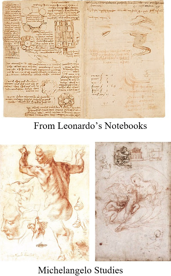
Prowling through the notebooks of Leonardo, seeing Michelangelo's preliminary sketches, and reading Delacroix's journal give us insights into their behind the scenes work.  We discover that a lot of working out of ideas and germinating preceded every work they produced.
Image
These were not done for us to admire centuries later.  Rather, they were the creative process in action, raw energetic explorations, discoveries and rehearsals for what was to come.  These were their behind the scenes workouts.
What are your workout routines?  Share with us on our Facebook Forum.  Most of mine happen in my sketchbook.  Here are a couple of excerpts along with the resulting painting.

Thursday, June 22, 2017

The Space Between Makes Things Work

Thirty spokes converge on a hub
The space between them
Make the wheel work...
Translation of lines from Verse 11, Tao Te Ching by Lao Tzu
No matter how technically well done a painting is, its intervals can make or break its dynamics. An interval is the distance between two or more edges. Those might be inside a shape, between shapes or from shape to the edge of a painting.  To illustrate, here's Albrecht Durer's etching, Hare
 Intervals are important because they give rhythm to our paintings.  It works the same as in music:  When a tune's rhythm lacks variation, we grow tired of it.  In visual art, if our spaces between edges are too much the same size, the work feels boring.
The boring factor is one reason why it's a good idea not to place an isolated or important image in dead center of a painting.  That's not a rule, but a factor of human perception that links into why it's the space in between that makes things work. 
Image

Sunday, June 18, 2017

Rediscovering a Forgotten Tool

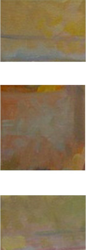
Are you able to guess what these three excerpts from a painting might be describing?
Image
What if I told you they are all describing a white wall.  No way?  Well, take a look at this:

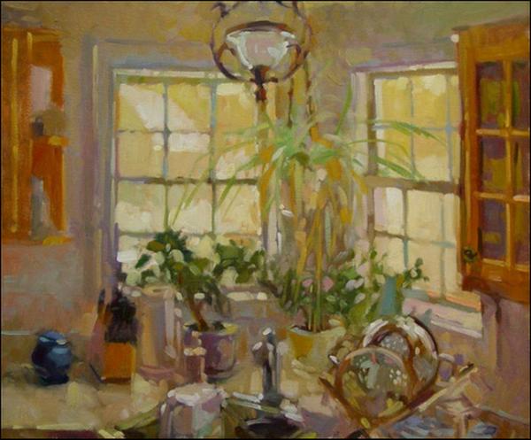
painting by Colin Page
Image
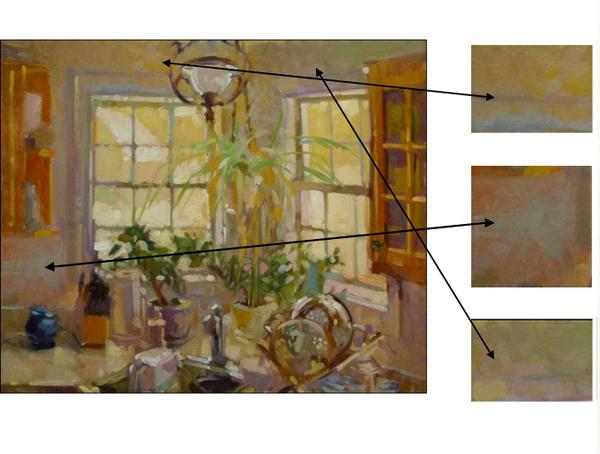
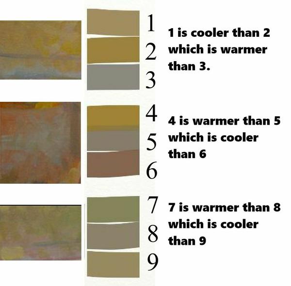
The painting is by Colin Page, a painter adroit at working with temperatures of color.  In this painting, it is the alternation of warm and cool that creates the vibrancy and rhythm we feel in the piece. Here's a brief analysis of what we are seeing:
Image
And that is alternating warm and cool.  
Alternation is somewhat a forgotten tool, a principle long used by master artists to give life and rhythm to their works.  It's a way of switching gears in between thoughts, of staggering where the temptation might be to repeat. We can use it with any of the visual elements as well as with our brushstrokes.  It's an exciting principle that can add just vigor in the most unexpected ways.  

Saturday, May 27, 2017

The Fluidity of Hue

​​​​​​​
 If you buy a new car, one question you'll get is "what color is it?".  The lay person will identify color by a single hue, but the artist sees the fluidity of hue--how it changes on a single image depending on the location of its light source and what's being reflected onto its surface.
I found a photo of a new red Honda and sampled various areas of it. Here are the results I found.
Next, I did the same sort of sampling with a photo of a red tomato. 
In both examples, notice how the hue changes according to where it lives in shadow or not in shadow areas.  Add to that other colors it might be reflecting from its environment.  Sages of old advise us that we see what we look for.  If we're looking for red tomato, we will limit what we see.

Thursday, May 25, 2017

Temperature Shifts

Here is something we see quite often these days, thanks to lighting designers' awareness of the color temperature from light sources.
For decades, even centuries, artists have been concerned with the color temperature of light in their studios.  North light is preferred because it is cooler and yields less dramatic shifts as the sun's position changes.  However, today's lighting options allow us to control the color and distribution of light in our work areas.  Most artists prefer 5500K+/- as ideal and most akin to natural light.
Regardless of our efforts, we cannot control the lighting under which our work will be seen once it goes to its new home.  But we can control the value and temperature relationships within the painting.  If we have those relationships right, the painting will read true under any kind of light.  To illustrate, here is a scene under four different temperatures of light.
Underneath each photo, I have sampled three areas:  the grass in shadow, the sky, and the grass in light.  When we visually compare these isolated samples, the effect of the color temperature of light is obvious.  The relationships does not change even though the color temperature does.  Seeing and translating that relationship is the task of the artist.  Mainly, it's seeing what's there as opposed to your left brain telling you what's there.  It's seeing, not knowing.

Saturday, April 29, 2017

Magic of Alternating Brushstrokes

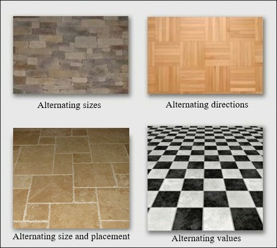
Have you heard of alternation? A rarely discussed design tool, alternation can sometimes be the very method you need for moving the viewer’s eye through your painting, or making dull areas interesting.  It means a sequence of changes in direction. 
Here are some examples we see every day. 
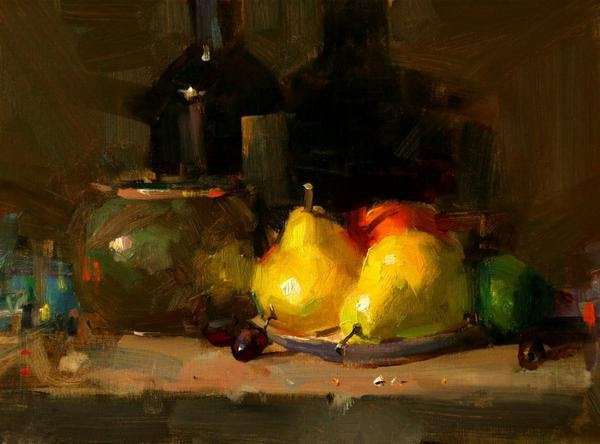
When painting, there are many ways to use alternation.  The most dynamic is alternating brushstrokes.  Among our contemporary painters, one who is a master of brushstroke alternation is Qiang Huang.  Let's take a look at his "Demo at Huntsville 2016 1"
Here are two sections from Qiang's background.  Look at the alternation of stroke directions, then glance back at the whole painting and notice how those sequences of alternating stroke direction give movement to the painting.
Here's a similar analysis of Qiang's pear on the right. 
If you remove your attention from the imagery in Qiang's demo and focus only on his alternating brushstrokes, you will see how much energy just his brushstroke alternating gives to this piece.