Welcome to Compose. There's lots of stuff here, all about composing paintings.

Current entries appear in Dianne's weekly newsletter.


Showing posts with label Pat Weaver. Show all posts

Friday, October 28, 2011

And There Was Light

Chiaroscuro.  It's pronounced key-air-row-skew-row, but what does it mean?

Artists who exercise the chiaroscuro principle play with what happens when a unique light strikes an image.  Parts of the image seem to leap forth into the light while others recede into shadow,  like in this painting by Mary Whyte.

 "Before There Were Wings"   Watercolor    Mary Whyte
This term itself came out of Italy and goes as far back as the early 1400's.  The word literally means light-dark and most accurately describes how a particular light-and-shadow influences the way we see images.

So chiaroscuro relates specifically to illumination and how an artist translate it into a painting or drawing.

Chiaroscuro is as effective in a monochromatic (single color) painting as in one using multiple colors.  This monochromatic 17th century painting by George de la Tour receives its illumination from a candle.

"St. Joseph"  George de la Tour  circa 1642    

But this 21st century multi-colored still life by Qiang Huang receives illumination from a narrow light source outside the painting.

Qiang Huang          Oil Demo
Click on image for larger view

Both are in chiaroscuro.  In both it is the direction and strength of the light that give meaning to the content of the painting.

Our language is organic.  Terms originate somewhere in time then their definitions evolve as we humans become  conscious of their mechanics.  Until the 21st century, art history authorities kept to a close-knit definition of chiaroscuro, limiting it to figurative and still life forms and a single light source.  More modern understandings of the concept include the total interplay of light and shadow, no matter what the subject is.

Today we can say that Jennifer McChristian's "Marche aux Puces" is in chiaroscuro...

Marche aux Puces     Oil   Jennifer McChristian

...or that Pat Weaver's watercolor of a cow is in chiaroscura...

Watercolor    Pat Weaver
...just as accurately as we can say that Rembrandt's "Man in a Golden Helmet" is in chiaroscuro.

"Man in a Golden Helmet"   c. 1650   Rembrandt van Rijn

When I was a student in the sixties, chiaroscuro was on moth balls.  It was an antiquated term associated with works of the past, delegated to the pages of stuffy art history books whose authors guarded its definition as if it were untouchable.  Today, it is a vibrant tool capable of bringing life to a painting.

Sometimes we do well to jar from the annals their embedded notions and ask ourselves anew:  what does this really mean?


Saturday, May 7, 2011

One Idea, Many Variations

How many variations can you put on a theme?

Turkish pianist Fazil Say shows us how Mozart, being both playful and naughty, took "Twinkle, Twinkle Little Star" and did this:

 
Similarly, visual artist Pat Weaver has put more than two dozen twists on a single theme, a container of flowers.  Go HERE for a moment and take a look.  (Don't forget to come back.)

Just as composers like Mozart often elaborate on a simple tune, it's not unusual for a visual artist to explore a single idea in an array of works, each complete within itself, yet having its own unique take on the chosen theme.  One way to do this is to play with the color key like Pat Weaver has done.

Look at two of Pat's still life paintings:

Still life paintings by artist Pat Weaver
You can see that one of these painting's key registers on the warm side of the Color Wheel while the other falls in on the cool side.

But look what happens in this one:

Pat has used two keys in her pot of geraniums and with a sweet twist:  most of her green notes (green being on the cool side) are predominately a warm green whereas her red (red being warm) notes are on the cooler side of red.  

If you listen to all the spins Mozart put on "Twinkle, Twinkle..." you can hear how each dances around the tune, yet retains our recognition of it.  Pat Weaver's many variations on "flowers in a container" each carries a specific use of color giving it a singular interpretation and expression.

Each of these creators took a given and found multiple ways to expand it into something new and unique.

Saturday, April 9, 2011

The Power of a Repoussoir

What do I do if I want to get your attention?

In his popular Fifth Symphony, Beethovan gets our attention with a precise da/da/da/DUM.  And Welsh poet Dylan Thomas opens one of his poems, "And death shall have no dominion."  Not so unlike these attention grabbers, Andrew Wyeth in "Christina's World" does this:
"Christina's World"   Egg Tempera    Andrew Wyeth  
The female image in Wyeth's painting is a repoussoir in action:  it captures our attention and leads us to the distant images.
re·pous·soir
  [ruh-poo-swahr]  
(From Dictionary.com)

What fascinates me about this device is its flexibility, its potential for free expression within a traditional pattern, one that yields unity while bringing us into a painting.  (In case you'd like a more in-depth definition, I explained how repoussoir works in one of my Empty Easel articles a couple of years ago.)

 I particularly enjoy paintings whose notan (see last week's post) is interlocked within a repoussoir.  When I see this working in a painting, it reminds me of an Italian sonnet , a device that acts like a repoussoir:  two major parts where the first is an argument, the second a resolution.

Paintings employing a repoussoir within the notan  pattern have two major parts as well:  one overall light or dark value usually anchored at the bottom of the painting leading the eye to an opposite value anchored at the top.


Anchored at the bottom of each of the three paintings above is a major light leading our eyes to an important dark area anchored at the top.   Richard Schmid does this in his landscape painting on the right, I used in my painting of squirrels on the upper left, and Pat Weaver does a similar thing in a painting of people on the lower left.

If as you look at each of these paintings you squint your eyes,  you can see this happening.  You experience in each piece a repoussoir built within a notan pattern,  three totally different paintings each saying entirely different things, but employing the same device:  a visual sonnet.  Now, that's captivating!

Note:  If you'd like to receive these tutorials by email, sign up in the left column at the top.  And if you'd like me to do a tutorial on some individual composing principle or problem, let me know in the comments section below.

Saturday, January 17, 2009

And Then There Is Shape

What is a shape?

Try this. A shape is an area enclosed with edges, specific or implied. That's my definition.

I could not believe it. I checked the definition in my trusty old 1960 edition of Webster's New World Dictionary and I found garbley-gook. Then I got curious and started Googling for a definition. Same thing. Even dictionary.com has no clear definition for shape.

Aside from the definition, let's try to understand shape as it pertains to us as artists. First of all, important for artists to know is that every shape has two parts: the space occupied by the shape and the space around the shape. You can't have one without the other. Think about it.
Above is the famous "Hare" by Albrecht Durer along side a portrait by Pat Weaver. Both have in common an acute observation of the shape itself as well as the space around the shape. That's what makes both shapes interesting to look at, even in silhouette.
Look at the silhouette images in reverse. Switch your attention to the black shapes. Notice how interesting each black shape is on its own. Beyond being aware of both shape and the space around it, each artist has made these shapes interesting by careful observation of their edges and how the edges relate to both sides--the shape and its surrounding space.

But before we dwell on that, let's explore some nomenclature.

Since the early 20th century, shapes that occupy space have been called positive shapes whereas the space surrounding a shape is called negative space. I've always objected to these labels and I'm not alone: efforts abound to find more definitive labels, but none seem to stick. So, we will let it stay for now and use the historical labeling. (If any of you has a suggestion for how we might rename these shapes, please leave them in Comments. Thanks.)

Okay, that tells us one characteristic of shapes. The other is that they fall into two catagories--geometric shapes and organic shapes. Loosely defined, geometric shapes are those with precise edges such as a circle, square, triangle, rectangle and so on. Organic shapes are all the others, shapes whose edges are more random. In painting we are likely to be dealing with both.

And here is where the discussion gets tricky: we can know all this about shapes, but using shapes dynamically in our painting and drawing is a bit different from just knowing about them. So how can we make that happen?

Use acute observation and sensitive interpretation. Just that. Rather than look at a shape and call it a rock, for example, first look for the underlying geometric shape that forms its structure, then study intensely the variations of the edges because these variations are what create the real character of the shape.

Next, look closely at the value and textural relationship of both sides of a shape's edge. Sometimes the negative will be blending right into the positive, sometimes there is a softness between the two and sometimes there is a distinct division.

In my judgement, Charles Reid is one of the best shape-makers among our 20/21st century artists.
Charles Reid "Claire" Watercolor on paper

Reid begins each of his paintings by doing a careful contour drawing to discover and anchor the shapes and their relationships to one another. When he begins his painting, he is constantly shifting between negative and positive, sometimes causing edges between the two to be lost; other times, creating a softness between them and at others, showing distinct sharpness to the edges. What results is a lively painting that continues to invite the viewer to return to it.

For me personally, Reid's paintings are like Chopin piano works--I want to revisit them over and over again. I think that desire to keep looking at a art work is one of the marks of its strength and success. And when an artist is truly tuned in to the characteristics of each shape, a lot is bound to get translated into the resulting work.

Try this. Visit websites of artists like Reid, Jennifer McChristian, Richard Schmid, Carolyn Anderson, Robert Genn and others whose work is strong. List the ways they handle shapes in light of this discusssion, then try some of those techniques yourself and watch the world open up.


Saturday, November 15, 2008

Balancing Harmony

Nothing grates on the human nervous system like a dominance of dissonance. And so a good sense of harmony is as paramount to a painter as it is to a musician.

Harmony means agreement, a fitting well together and being in tune. Although utilizing similarities is a tool for achieving harmony, it does not mean that everything must be similar. It does mean that differences are balanced so that they fit and are in tune with one another. Look at this painting by Kevin MacPherson.
Differences are made by contrasts. In this painting, MacPherson has contrasted the vertical of the figure with the horizontal of the table as well as the lights along the woman's arm and behind her head with the dark of her hair. He has created harmony by weaving these differences together with a dominance of warm harmonious light and soft, loose edges which keep shapes fitting well together.

In the painting below by Richard Schmid, we see a similar way of achieving harmony.
The contrasts are warm against cool, light against dark, busy street vs. quiet distance. As is his particular mastery, Schmid has finely tuned the cools and warms so that they feel as if they're being lit by the same source. This alone can weave harmony into contrasting elements of a painting. In addition, though, Schmid has carefully crafted the edges so that they fit rather than isolate. How we handle our edges can go a long way toward giving harmony to our work, but being faithful to the temperature of the light source is crucial.

We are all aware of creating harmony by repetition of similar colors throughout such as Pat Weaver has done with the color red in the watercolor below. And we see in Weaver's painting repetition of shape and size and two other harmony-getting schemes.And we're familiar with using analogous colors to create harmony, such as Colin Page has done with blues to greens to yellow-greens in the painting below.
In fact, repeating any one of the visual elements can work as a harmonizing scheme, but to keep that scheme from producing boredom by including too many similarities, contrasts and variations are necessary.

Without a doubt, many contrasts and similarities can be used while retaining harmony within the entire piece simply by carefully crafting edges and keeping the painting's light temperature consistent. And these can be achieved by carefully observing the subject and being faithful to what the eye sees as its unique characteristics.

Saturday, August 30, 2008

Avoiding Percy's "Sore Thumb"

After my “Isolation” post on August 8, I received a request from one of my students asking about how to use isolation without ending up with a sore thumb. She wants to know “How does one determine when to use it and use it effectively within a given subject? What particular things are to be avoided?”

First, why would we isolate anything in the first place. In the delightful Percy’s Principles of Composition, Marvin Bartel’s first principle is “Avoid a sore thumb,” which is where the concern about isolation begins. So why take the risk?

Keep in mind that isolation is a strategy to set a thing apart, detach it, give it solitude. It is available to us, but we would not want to use in every painting we do--unless you're Edward Hopper :). We would use it only if we want to call attention to something really important to the meaning of the whole painting or if we want a special emphasis somewhere in the painting.

When Hopper isolated, his entire painting centers on whatever was isolated. So how did Hopper, the master of effective isolation, manage to avoid a sore thumb every time? Look his Hotel Window.

The seated woman is what the painting is about. Hopper has isolated her by creating the extremely light face, hands and legs within a dark surrounding and by locating her within a large empty space. But he has used two strategies to keep her from being a sore thumb: (1) he’s kept the value of her clothing very close to the values surrounding her, (2) he’s tied in the light of her face, hands and legs with the accents of light around the window and on the drapes as well as the very light walls and painting hanging on the wall.

Now, with apologies to Mr. Hopper, I’m going to change that and make her clothes bright red.

See, now it’s a sore thumb.

Okay, (and Mr. Hopper, I'm SO sorry!), I’m going to change it another way by taking out the light accents, by darkening the walls and removing the painting.

See, it’s a sore thumb again. So that tells us that another way to unify the isolated image to prevent the "sore thumb" syndrome is by repeating elsewhere in the painting something contained within the image or repeating something from the rest of the painting inside the isolated image. My apologies to Mr. Hopper, rest is soul, but my thanks to him for mastering isolation, making it possible for us to study what he did.

Now to the other reason we might want to isolate: to place a special emphasis somewhere in the painting. Look once again at Pat Weaver's little still life painting.

The red apple is a strong emphasis isolation. It isolates because it's totally different in color and in value from the onions in the painting, yet it is within the surroundings of similar subjects, is quite similar in size and shape to the onions, and the dark of its shadow blends with the dark on the plate while the highlight gets repeated all the other whites appearing in the painting. I called it strong emphasis because it is NOT what the painting is about, but equally important to the other subjects in the painting. Now with most hearty apologies to Pat, I'm going to change it to show you why this works.

Now it IS a sore thumb. The only relationship is size and shape, but because of the intensity of the red, it isolates severely. Now I'll do the opposite.

It loses interest altogether. We see by this change what an important role that red was playing. So, here a strong emphasis was key to the success and strength of the whole painting.

We don't have to be able to label strategies and principles in order to make good paintings. In fact, if we get too preoccupied with these, we can stifle the life out of our art work, but to develop a wisdom about aesthetics enables us as painters to put an extra sensitivity and graciousness in our work.

In this age with open acceptance of the "anything goes" attitude, I believe artists need to take the lead toward higher aesthetic standards. That's a good reason to know isolation

Friday, August 8, 2008

Isolation as a Tool, But Be Careful

It's always fascinated me how some artists have a knack for making paintings that stop you in your tracks. Sometimes it's the nature of the subject, other times it's the way the subject was handled, but most likely what caught our attention is both. To make us look twice and hold our attention, one tool used by many clever artists is isolation.

To isolate is to set a thing apart, detach it, give it solitude. In painting, we isolate by...

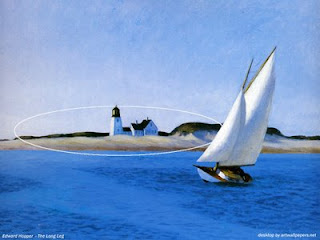
...closing a shape off with hard edges..
Edward Hopper "The Long Leg" 1935

...placing a light or bright shape among dark surroundings
or a dark shape among bright surroundings...
Edward H0pper "Pennsylvania Coal Town" 1947

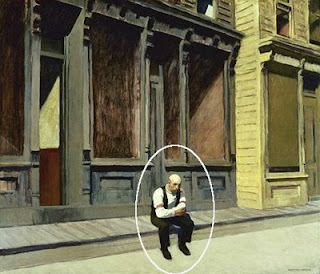
...locating a small shape in a large area of a different nature...
Edward Hopper "Sunday" 1926

...surrounding a shape with vast space...
Andrew Wyeth's "Christina's World" Go HERE to see
(permission is required to reproduce a Wyeth work)


...planting a shape among shapes different from itself...
Pat Weaver Watercolor


...giving psychological solitude...
Pat Weaver "Man on Bench" Watercolor

Notice in most of these paintings, several isolation strategies are used at once. No matter which scheme is used, one thing is for certain: the isolated shapes must be strategically placed, thoughtfully handled. If not, it can throw the whole painting out of kilter and cause the image to stick out like a sore thumb.

Saturday, August 2, 2008

A Single Unifying Device

Ultimate unity is a blank canvas according to the would-be clever artists who have exhibited blank canvases as their "art". I seriously doubt these folks would really desire our conclusion. Or maybe that's their point. Is ultimate unity emptiness? I digress.

Once we put the first mark on a blank canvas, we've begun a composition. As we add marks, shapes, textures, and colors our painting teeters between harmony and chaos. No matter the size of the painting or the subject, we are doing a balancing act from stroke one. One way to prevent chaos or disjointedness from taking over the painting is to have a single unifying device undergirding the whole work.

Unity means oneness, or sense that things belong together and there are many clever ways to keep a painting unified without losing freshness, excitement and spontaneity.

One popular and satisfying device is subduing intensity of color throughout. Anders Dorn comes to mind as an artist who used this scheme as a constant. Look at his painting "Woman Dressing". Every color he has used, in one way or another, contains its complement to reduce intensity. The overall effect is a feeling of unity, a sense that it all belongs together.

Anders Zorn Woman Dressing Oil 1893
(click on image for truer color)


Now, look what happens if we intensify Zorn's colors, taking away the complement (I risk blasphemy!).

The subtleness is gone. A harshness appears, but something still holds it together. Ah ha. There's another unifying device--hue. Look back at the original and you'll see that almost all the colors have some yellow hue in them. Now that's clever. But it's another way for achieving unity.


Another highly effective unifying device, light from positive merging into light from negative, is used by Richard Schmid in "Weaver" ( right). This is what James Gurney has called shapewelds. It works in reverse, too, with darks from the negative merging with darks of the positive. Remember Schmid's "Pansies" from our Image Trap discussion? This is acheived by allowing edges to disappear between a light portion of a subject and the light around it or by blending the edge of a shadow side of an image with dark in the area around it.

Sometimes the subject itself gives us the unifying device we need. In Pat Weaver's watercolor painting "We've Got Rhythm", the repetition of shapes, colors and sizes of the musicians, their instruments and their music stands do the job. Repeating the same shape and size risks boredom or becoming static, but Pat's use of strong value contrast between shapes keeps the piece interesting and exciting.


I would be remiss if I didn't mention using notan as a unifying device. Review my two posts about notan here and here

Finally, controlling what happens to edges of shapes is one of the most important and too often overlooked unifying devices. Richard Schmid , through his writing and videos, is responsible for making me aware of the power of edges. Look at these two examples by him:

When we paint landscapes, if we give distinct edges to buildings, tree trunks and other outdoor shapes, we risk making the painting feel jerky, the objects in the landscape feel isolated. Schmid's controlled softened edges throughout enable the building and trees to merge with the grounds and sky and feel like there's atmosphere between them. He is probably more conscious of how he handles edges than any single concern in his painting process.

Another place where edges can get problematic is in figure painting. Look how Schmid has subtly blended the hairline into the forehead and face as well as softened the outer edge of the hair into the background, all enabling us to feel the space around the person. He does the same kind of edge control along all the shapes of the clothing, arms and spinning wheel--all giving unity of the figure with the space that surrounds her.

If we were living during the Italian Renaissance, we would know this atmospheric handling of edges to be sfumato .

Spend some time looking at paintings by realistic painters who are among the greats and you will find in each some unifying device. Sometimes it's a single device, sometimes a combination, but even when used in combination, one device will most likely be more apparant than the others.