Welcome to Compose. There's lots of stuff here, all about composing paintings.

Current entries appear in Dianne's weekly newsletter.


Showing posts with label Light and Shadow. Show all posts

Saturday, October 1, 2016

Fall Colors in Shadow

Try this.  Looking at this photo, squint your eyes so that all the details go away, stare and hold it for a few seconds. 
Image
Notice that within those luscious colors, what you are seeing is mostly in shadow?.  
Image
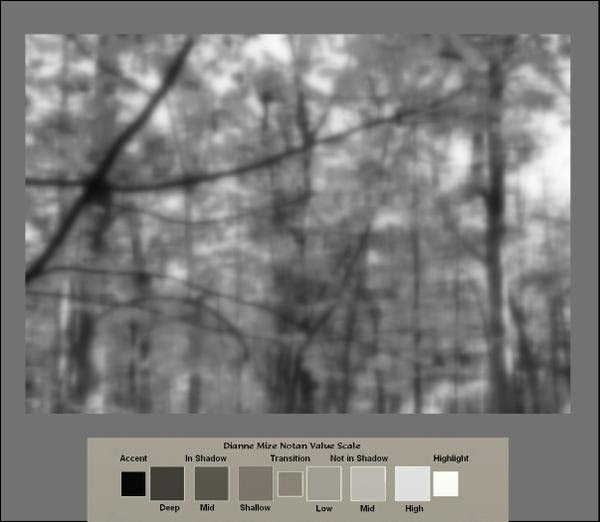
Even though the colors are striking, the brightness we see is mostly pieces of sky visible through the foliage.   All the shadowed areas are easier to discern if we take away the color.  
Image
 If you compare the mid-to-dark areas of the value scale to the blurred monotone photo, it become obvious how minimal the light is in the scene.  At the same time, if we pluck any one of those leaves and look at individually, it would appear something like this.
Image
Here's a closeup view of one of the sections. Notice the difference in the color of the leaf above not in shadow and the leaves below in shadow.
Image
Once we recognize that an area of color is in shadow, we know immediately that regardless of how brilliant it seems to us, the only way we can interpret it accurately is to reduce the value and intensity of hues we recognize.  Here are some suggested combinations for you to play with to make that discovery. 
Image

Friday, February 3, 2012

Shadows Speak

If on a dark night the lights go out, there we are in total darkness unable to see a thing.  But can you imagine the dark going out? The impact would be the same--without dark, we can see no more than without light. To see we have to have both light and dark working in concert.  (Now, there's a metaphor!)

Light comes from a source, but its absence is the origin of darkness.  Without light darkness floods in from every direction, but darkness is given form called shadow when a light source is cast upon an object. Not only does shadow help define the object's shape, but it extends beyond that shape continuing in the direction of the light beams to create a cast shadow.  Even when light is diffused the location of shadows tell us the direction of the light's source.  In the photo below, faint shadows beneath the bird inform us that there is some light above it.


But when light is not diffused, we see two distinct images for each shape in it's path:  the object itself and its cast shadow. Direct light beams cause the cast shadow to bend and travel along the contours of anything in its path.  That shadow tells us the angle of the light beams, the shape of the object casting the shadow, and the contours of the surface on which the shadow is cast.

"Samwise"   Terracotta sculpture   Howard G. Hanson

It's the cast shadow that tells the story of this snow covered landscape.


If we switch our attention from the fact of snow and images in the snow towards the shadows themselves, we realize that it's those shadows that tell us about a slight incline of the driveway,  a rise on the right side and a drop-off on the left, that somebody has been walking in the snow and that there are trees nearby.

In fact, often the cast shadows will tell us about their surroundings without their images being visible.  Look at Karin Jurick's painting of a bike rider.


Now look at it (forgive me Karin) without the biker.


If while constructing a painting we ignore the specifics of a cast shadow, whether caused by direct or diffused light, we lose an important essence of the story that those particulars tell and we cause the painting to communicate that something is missing.   Rather than being added as an afterthought, carefully crafted cast shadows integrated into the painting from the beginning become an essential part of the painting's story.

Friday, October 28, 2011

And There Was Light

Chiaroscuro.  It's pronounced key-air-row-skew-row, but what does it mean?

Artists who exercise the chiaroscuro principle play with what happens when a unique light strikes an image.  Parts of the image seem to leap forth into the light while others recede into shadow,  like in this painting by Mary Whyte.

 "Before There Were Wings"   Watercolor    Mary Whyte
This term itself came out of Italy and goes as far back as the early 1400's.  The word literally means light-dark and most accurately describes how a particular light-and-shadow influences the way we see images.

So chiaroscuro relates specifically to illumination and how an artist translate it into a painting or drawing.

Chiaroscuro is as effective in a monochromatic (single color) painting as in one using multiple colors.  This monochromatic 17th century painting by George de la Tour receives its illumination from a candle.

"St. Joseph"  George de la Tour  circa 1642    

But this 21st century multi-colored still life by Qiang Huang receives illumination from a narrow light source outside the painting.

Qiang Huang          Oil Demo
Click on image for larger view

Both are in chiaroscuro.  In both it is the direction and strength of the light that give meaning to the content of the painting.

Our language is organic.  Terms originate somewhere in time then their definitions evolve as we humans become  conscious of their mechanics.  Until the 21st century, art history authorities kept to a close-knit definition of chiaroscuro, limiting it to figurative and still life forms and a single light source.  More modern understandings of the concept include the total interplay of light and shadow, no matter what the subject is.

Today we can say that Jennifer McChristian's "Marche aux Puces" is in chiaroscuro...

Marche aux Puces     Oil   Jennifer McChristian

...or that Pat Weaver's watercolor of a cow is in chiaroscura...

Watercolor    Pat Weaver
...just as accurately as we can say that Rembrandt's "Man in a Golden Helmet" is in chiaroscuro.

"Man in a Golden Helmet"   c. 1650   Rembrandt van Rijn

When I was a student in the sixties, chiaroscuro was on moth balls.  It was an antiquated term associated with works of the past, delegated to the pages of stuffy art history books whose authors guarded its definition as if it were untouchable.  Today, it is a vibrant tool capable of bringing life to a painting.

Sometimes we do well to jar from the annals their embedded notions and ask ourselves anew:  what does this really mean?


Saturday, April 9, 2011

The Power of a Repoussoir

What do I do if I want to get your attention?

In his popular Fifth Symphony, Beethovan gets our attention with a precise da/da/da/DUM.  And Welsh poet Dylan Thomas opens one of his poems, "And death shall have no dominion."  Not so unlike these attention grabbers, Andrew Wyeth in "Christina's World" does this:
"Christina's World"   Egg Tempera    Andrew Wyeth  
The female image in Wyeth's painting is a repoussoir in action:  it captures our attention and leads us to the distant images.
re·pous·soir
  [ruh-poo-swahr]  
(From Dictionary.com)

What fascinates me about this device is its flexibility, its potential for free expression within a traditional pattern, one that yields unity while bringing us into a painting.  (In case you'd like a more in-depth definition, I explained how repoussoir works in one of my Empty Easel articles a couple of years ago.)

 I particularly enjoy paintings whose notan (see last week's post) is interlocked within a repoussoir.  When I see this working in a painting, it reminds me of an Italian sonnet , a device that acts like a repoussoir:  two major parts where the first is an argument, the second a resolution.

Paintings employing a repoussoir within the notan  pattern have two major parts as well:  one overall light or dark value usually anchored at the bottom of the painting leading the eye to an opposite value anchored at the top.


Anchored at the bottom of each of the three paintings above is a major light leading our eyes to an important dark area anchored at the top.   Richard Schmid does this in his landscape painting on the right, I used in my painting of squirrels on the upper left, and Pat Weaver does a similar thing in a painting of people on the lower left.

If as you look at each of these paintings you squint your eyes,  you can see this happening.  You experience in each piece a repoussoir built within a notan pattern,  three totally different paintings each saying entirely different things, but employing the same device:  a visual sonnet.  Now, that's captivating!

Note:  If you'd like to receive these tutorials by email, sign up in the left column at the top.  And if you'd like me to do a tutorial on some individual composing principle or problem, let me know in the comments section below.

Saturday, October 18, 2008

Bad Photo Reference--Good Painting

Let's face it. There are times when we must work in the studio using resource material although, I agree, the best reference material is on location. But we'd be terribly limited as artists if we reserved our painting hours for when being on location is possible. So, what if you're in the studio with a yin to paint a certain subject, but all you have are poor photo references. Let's assume the composition is absolutely terrible. What now?

Of course the first thing is to pin down the idea. Why this particular subject? Here's an example of a not-so-good photo.What caught my attention--the idea or concept--is the squirrel at the foot of the tree scratching himself. So the first thing to do is to crop to the idea. Well, that's a little better, but what I've got to do next is to find a decent composition. One approach is to see if any visual path or pattern is suggested or even a hint toward one. Here's what I found.
Along side the movement of the tail a vertical path begins. It moves with the squirrel's cast shadow underneath his belly then on the other side to the left. Follow the arrows in the diagram.

Okay, this suggests to me that I might captilize on that movement and create either an "S" path or a reversed "C" path. One way to determine that is to heighten the contrast on the computer. If I do that, I get this.
Ah ha. I can use the dark of the tree's base and indeed create an "S" path.
The next step is to draw. Study the patterns of shadow and light and play around with the composition. Here's a double page from my sketchbook where I did just that though from other photos, but taken the same time as this one.

And here's a little watercolor painting that followed.
Sometimes there is absolutely nothing in a photo from which a composition can be pulled. In that case either abandon the idea completely or super-impose a composition. I will address that subject in next week's post.

Meanwhile, if you have a suggestion for a compositional topic you'd like me to discuss, leave a message.

Sunday, July 13, 2008

Avoid The Image Trap: Find A Pattern and Nail It

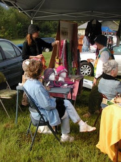
Image traps usually hit when a bunch of stuff is in the same scene. Here is a photo, a raw image, full of potential image traps.
Of course we could edit out the background cars and even the tent overhead. That would help some, but we'd still have a bunch of objects to deal with. One of the best ways to stay out of the trap is to find a pattern of darks and lights and sketch all those into a flat four-value pattern where like values connect. If we break the photo down into a four-value pattern, we get this:


or you might increase the feeling of shadow by doing this:


or you might increase the feeling of light by doing this:


So what has happened is that all the shadows have been reduced to two values of connecting darks and all the areas in direct light are reduced to two connecting light values. In the two dark values, there is one dark and one mid-dark; in the two lights, one where the light his totally white and one where it's light-mid. If, when painting, we think of color as color value rather than as hue, we'll weld those images together and avoid the image trap.

Each color we see possesses a hue (the color name), an intensity (the color's brilliance or lack of neutrality), a value (dark to light), and a temperature (warm or cool). When we are concentrated only on the color name (red, yellow, and all that), we fall into the image trap, but when we think of the color as to what value it is, we're most likely to avoid the trap.

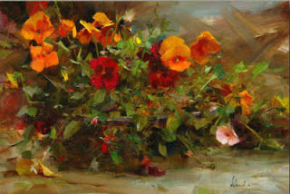
Richard Schmid illustrates this principle beautifully in his painting "Orange Pansies".


"Orange Pansies"
Oil on Canvas
Richard Schmid

Notice how the pansies in direct light are a lighter, brighter orange whereas those in shadow are a darker orange. Notice how where the foliage is mostly in shadow, the values of greens are kept in dark range whereas the greens in direct light are a lighter value. Notice also that the foliage in shadow is a cooler green whereas in light, the green is warmer, more intense.


In this posterized version, I've dropped "Orange Pansies" to four values. You can see how Schmid keeps a strong connected dark pattern with just a single accent of strong light. Yummy. His mid-darks are dominate, carry the day, with the darkest darks just playing the role of accenting. Then the mid-lights connect together as a supporting pattern with that one lightest-light and a few scattered spots of it as accent. The mid-dark oranges take on the same value range as their surrounding greens. Notice that.


No image trap here. But then, he IS the master, isn't he.


Friday, July 11, 2008

Avoiding The Image Trap: Trust Your Light

On the mast of my easel I have scribbled these words: squint-observe-select-aim-stroke. I know that whatever's in front of my eyes has within it all the information I need to lead me toward a good painting. It's a matter of learning how to see what is actually there.

Artists who continually fall into the image trap limit their attention to what they assume about the appearance of the image. If it's a red umbrella in sunlight, it gets painted red and shaped like an umbrella whereas in the raw image, the eye might not see that much red at all. Actually there might be strong pinks or oranges or even white in direct light and perhaps purples or even greens or blues in the shadows. Values in one shape might be similar to those in an adjacent shape and each might be merging with the surroundings both in light and in shadow.

To fix our attention on the paths that light and shadow are making is to allow us to discover things we otherwise would have missed. If there is a light pattern moving throughout the scene from background to image or image to image, we might capitalize on that visual quality rather than focusing on just the definition of the image. Look what a delightful path of light Pat Weaver found at a racetrack in Kentucky.

Pat Weaver
"Lookin' For A Winner".
Watercolor on Paper
Pat has set the human images within a strong path of dark (you might even call it a shadow path) and celebrated their activity with pools of light flowing in and out from figures to spaces around the figures. Rather than encapsulate each figure with defined edges, she has allowed the light to merge from figures to their surroundings with grace and fluid gesture. The contrast of the strong dark path enhances the brilliance of the light.

When James Gurney speaks of "shape welding", he's talking about this sort of thing where we find similar values among adjoining shapes and merge those values without defining an edge. To look for these things and to paint them is to shift our attention away from the image, finding surprises and excitement that can lift us right out of the image trap toward a successful painting.

Wednesday, July 9, 2008

The Image Trap

Probably the one thing that causes repeated mediocre and poor paintings is what I call the "image trap". The artist is so concerned with the images in the painting that image take priority over sound composition. Things get painted as individual pieces in local color rather than being related to the whole, considering how color masses behave in light and shadow.

A term I'm using these days is "raw image". Not very elegant, but to me it conveys images out there before they're ever touched by the artist. We select images within their environments to carry our content (or as some say, concept). They are why we're doing the painting to begin with, but if those very images are painted out of context with how light and shadow behave the painting feels disjointed, fragmented, disconnected.

There are many ways to put images in a creative context which visually connects them and, at the same time, enhances their purpose. All these methods are the heart of what good composing is all about. Any single set of raw images contains potential for a profound, mediocre or poor painting. That's why the painter learns strategies to stay out the image trap, therefore strengthening the quality of the painting.

During the next few days, I will talk about staying out of the image trap and keeping a painting connected without making it boring.