In July my intentions were to write to this blog when there was an occasional available moment, but there has been no time for that. Howard is a poet and before becoming so ill had just finished compiling a manuscript of recent poetry for publication. There was no energy nor time left to seek out publishers so we both decided to publish it as a website. That has been the project of my focus since early summer. And it's been worth it. Now Howard's poetry is available at howardghanson.com and we both are so proud of the project.
Already having lived six months longer than expected by the doctors and still in the care of hospice, Howard continues to inspire me with a human spirit totally unaware of how fragile a body it lives in. We continue to cherish life rather than grieve impending death, laughing generously and enjoying one another's presence.
Monday, October 19, 2009
Saturday, July 11, 2009
Update and More Immediate Plans
It has now been three months since hospice became a way of life in our home. Howard is a real trooper, demanding in every way quality of life and refusing to be bedridden regardless of so very much loss of independence. Care must be constant, but already there have been multiple gems in moments of struggle. And laughter continues to play a key role in our lives.
There is no time or energy to paint, not yet. But I have decided, beginning next week, to resume my tutorials on this blog even though Bagatelles and Meanderings will remain on hold for a while. I have relinquished my writer's position on Empty Easel, at least for the time being. Dan has graciously offered for me to resume those tutorials whenever I can, but I won't be doing that any time soon.
Meanwhile, I look forward to getting my thought processes artward. Stay tuned.
Sunday, April 12, 2009
A Brief Time Off Line
Dear Friends,
I wanted to let you know that I have not disappeared, but I will be off-line for some time to come. My soul mate and life partner of the past 28 years is now in the care of Hospice here in our home, and this is where my focus and energies currently are. Until I can get back to painting and blogging, do enjoy what's already here.
Thanks for your visit.
Dianne
Saturday, March 28, 2009
The Complete Picture
Early on in my teaching career, I encountered a chart by Ocvirk, Bone, Stinson and Wigg in a text entitled Art Fundamentals, Theory and Practice. The chart was suppose to be a visual diagram of how our principles and elements work together, but I found it lacking so undertook to revise and redesign it. That process lasted for many, many years and still is not over today.
I used the chart as a "cheat sheet" when doing composition lessons with my students and continue to use it today with my critique group, Second Tuesday Art Guild. I introduced it to this blog once before, but am giving it an encore because next week I want to begin a series of tutorials on its contents. So for this week, here's the chart for you to ponder. Beginning next week, we will break it down, flesh it out and pull together how it includes so much of everything that goes into a good painting.
THINK CHART FOR VISUAL COMPOSING
Copyright, 2008 * Dianne Mize
“We construct images, we compose art work.”
The ACTION principles (Things we do to compose)
Select and Place (Rule of Thirds--Golden Mean—Rabatment—Notan, etc.)
Gradate or Modulate
Alternate
Contrast
We do this…
Vary
Repeat
Make similar
Elaborate
Economize
Isolate
Overlap
Juxtapose
Find Angle of Light/Shadow
Find and Use Perspective
Create Dominance
(and more)
The Elements (Our Vocabulary)
Color:
Value
Hue
…with these
Intensity
Temperature
Shape
Size
Direction
Line
Texture
The RESULTS (What We Get)
Pattern to avoid randomness
Balance to prevent one-sidedness
Order to negate chaos
…to get these.
Harmony over discord
Rhythm rather than static
Proportion to avoid lopsidedness
Movement or Transition as opposed to Aimlessness
Form to avoid distortion
Focal Point versus not sure where to look
Emphasis rather than erratic
Eye Path in favor of spottiness
Toward our ULTIMATE GOALS
Unity to avoid divisiveness, fragmentation (We want the work to hold together)
Purpose to negate aimlessness (We want the work to have meaning)
Saturday, March 21, 2009
Free To Create: The Big Eight
If you've been keeping up with this blog, you know that for the past eight weeks, I've been addressing individually our visual vocabulary, the elements. I've tried to show how each can play its own role in our painting not unlike parts of speech in the spoken language.
We don't need to know what a noun is to ask for a refund, nor do we need to know what a verb is to spend the refund once we get it. English speaking people can communicate very well without knowing a thing about the structure of the English language. But once we DO know how these parts of speech work, we can use them to express ourselves more adequately.
It's called communication. As artists we're involved in a two-sided activity: on the one side we express ourselves--on the other, we communicate what we have expressed. No matter how poorly we have expressed it, something gets communicated even if it's total confusion.
But the better we understand the tools with which we work, the more in control we are with what they can do. The bigger reward, though, is this: the better we understand our tools, the freer we are to be creative with them.
Now, there's a lovely Springtime thought!!!
A noun names -- a shape defines
A pronoun stands in--size relates
A verb acts -- value structures
A pronoun stands in--size relates
A verb acts -- value structures
An adjective defines -- hue describes
An adverb modifies -- temperature harmonizes
A preposition links--a line leads
A conjunction connects--direction controls
An interjection accents--texture intrigues
A preposition links--a line leads
A conjunction connects--direction controls
An interjection accents--texture intrigues
We don't need to know what a noun is to ask for a refund, nor do we need to know what a verb is to spend the refund once we get it. English speaking people can communicate very well without knowing a thing about the structure of the English language. But once we DO know how these parts of speech work, we can use them to express ourselves more adequately.
It's called communication. As artists we're involved in a two-sided activity: on the one side we express ourselves--on the other, we communicate what we have expressed. No matter how poorly we have expressed it, something gets communicated even if it's total confusion.
But the better we understand the tools with which we work, the more in control we are with what they can do. The bigger reward, though, is this: the better we understand our tools, the freer we are to be creative with them.
Now, there's a lovely Springtime thought!!!
Saturday, March 14, 2009
Temperature: The Harmonizing Element
It's confusing to look at nature and determine whether the visual temperature is warm or cool. Yet master artist Richard Schmid is adamant (and I agree) that the temperature of the light is our most important harmonizing element because it effects all the colors illuminated by it.
But even Schmid admits that determining what we see as warm or cool can be tricky. Here are his own words:
"Generally speaking (and only generally), sunlight is warm. Consequently, the more overcast the sky, the cooler your light will be. Mother Nature is very tricky though. She can throw you a curve when you least expect it. Trust your eye always. " (Taken from Schmid's website FAQ page)
Now, trusting our eyes look at this:
 In our discussion about value I emphasized that we see because of light. A simple concept, but the heart of every decision we make when painting. Now we go one step further: every light source has a color, therefore a temperature--it is either warm, cool or neither. Forget about the "neither" and assume as an artist you're dealing with either warm or cool.
Both photos above show the same batch of lemons, yet the photo on the left is in warm light and the one on the right in cooler light. Visual temperatures are cooler when they are bluer, warmer when they are redder or yellower.
Now look at this:
 The ball is blue (well, of course it is !) Blue is the coolest of colors, but notice where a warmer light hits the blue ball most directly, the color appears warmer. That same blue appears cooler as it moves into shadow. I've isolated these with samples across the top to make it easier to see. (You might have recognized that I used this same illustration in an Empty Easel tutorial about color.)
The reverse happens when a color is illuminated by a cool light.

Let's look at our lemons again--the ones in cool light. Now let's zoom into a shadowed area and sample it. The results are in the rectangle on the upper right edge.
Joila! The shadowed areas are warmer (more orange) than those more directly in light.
Perhaps this simple principle is the most important one to remember when dealing with temperature and color. Our natural tendancy--indeed, some have taught--is to always make shadows cooler, but in painting it's best not to live by rules other than always let your eye tell you what your looking at.
As a general rule of thumb, though, if you shift your eyes between light and shadow of an area, you WILL see a difference in temperature between the two. One will be cooler, the other will be warmer. Most likely, if the shadow is warmer then the light source is cool. If the shadow is cooler, the light source is warm.
Oddly, if you direct your painting choices by keeping this in mind, the painting should feel in tune or in harmony with itself.
And so, the conclusion we always come to is teach yourself how to see, then trust your eyes.
Saturday, March 7, 2009
Intensity: The Baffling Element
In the classroom, intensity was always the one element or concept that boggled the minds of my students. Folks got the value thing--it seemed easy enough to comprehend that a color gets lighter or darker depending upon whether it is in light or shadow. Hue was easy--regardless of whether we used the traditional triadic wheel or the Munsell wheel, students found naming the colors and organizing color schemes easy enough to deal with.
But when we hit the intensity idea, brakes were applied and tires started squealing. So how do we mortals wrap our minds around intensity?
But when we hit the intensity idea, brakes were applied and tires started squealing. So how do we mortals wrap our minds around intensity?
Look at this strip of two colors.
 These are the same hue, the same value, but of differing intensities. What is the hue? There's one clue. If you can look at a color and FIRST name its hue, THEN name its value, you might be able--afterwards-- to name its intensity. But how do you name an intensity?
I think that's part of the problem. Intense/neutral. These are the pairs. Neutral has no color at all--theoretically, this is. It's gray. Every single color under the sun can lose its color identity (hue) when totally neutralized by its complement. It can nearly lose its identity when mixed with gray, black or white.So, theoretically a color is most intense at its spectrum color where it has in it neither complement nor gray, black or white. With these added, though, it is either very intense, somewhat intense, somewhat neutral or almost neutral. So our language then is high intensity, middle intensity, low intensity or neutral.

 Looking at a diagram of the spectrum (above) and the three colors underneath it, it's easy to see that all three hues are red-orange. The first is a bit browner, the second a bit rustier and the third closer to spectrum red-orange. So how do we know their intensity? The third is obviously closer to the spectrum.
Oranges, reds and purples get rustier or browner, yellows and yellow-oranges get more ochre, greens become olive, blues look grayer. So if you call the first color a brownish-orange, then you know it's more neutral.
Try this: let's look at Martin Figlinski's painting "Beach Path, Grayton Beach".
 "Beach Path, Grayton Beach" (c) Artist Martin Figlinski

The three swatches above are sampled from Martin's painting. Take them one at a time, left to right. Name the hue, now the value, now the intensity. Use the language for naming the intensity as simply "high, middle, low" or "highish, middle, lowish". Doesn't need to get more complicated than that.
Go to the end of this post for the correct answers.
Let's do the same thing with Carol Marine's "Orange Parade"
 "Orange Parade" (c) Artist Carol Marine
 After we learn to name the intensity, we should be able to become conscious of it when we see it. So rather than call an old unpainted barn gray, we'd call it low-intensity, mid-value bluish-violet, for example.
Seeing and recognizing the hue will go a long way towards labeling the intensity. So remember, if you see it brownish or rust, it's probably red-violet, red, red-orange or orange; if it appears to be ocher, it's most likely yellow-orange or yellow or even yellow-green; if it seems more olive, it's green, if it seems gray either has no hue or it might be blue. These are examples of what you might expect, but don't depend upon them: rather, fix your eyes on the hue first. Once you name it, the value and the intensity should be easy.
Leave me a note in the comments section and tell me how this works for you.
Answers:
Figlinski samples: (1) left, blue-violet/light/low, (2)red-violet/light/low (3)red-orange/dark/low
 These are the same hue, the same value, but of differing intensities. What is the hue? There's one clue. If you can look at a color and FIRST name its hue, THEN name its value, you might be able--afterwards-- to name its intensity. But how do you name an intensity?
I think that's part of the problem. Intense/neutral. These are the pairs. Neutral has no color at all--theoretically, this is. It's gray. Every single color under the sun can lose its color identity (hue) when totally neutralized by its complement. It can nearly lose its identity when mixed with gray, black or white.So, theoretically a color is most intense at its spectrum color where it has in it neither complement nor gray, black or white. With these added, though, it is either very intense, somewhat intense, somewhat neutral or almost neutral. So our language then is high intensity, middle intensity, low intensity or neutral.

 Looking at a diagram of the spectrum (above) and the three colors underneath it, it's easy to see that all three hues are red-orange. The first is a bit browner, the second a bit rustier and the third closer to spectrum red-orange. So how do we know their intensity? The third is obviously closer to the spectrum.
Oranges, reds and purples get rustier or browner, yellows and yellow-oranges get more ochre, greens become olive, blues look grayer. So if you call the first color a brownish-orange, then you know it's more neutral.
Try this: let's look at Martin Figlinski's painting "Beach Path, Grayton Beach".
 "Beach Path, Grayton Beach" (c) Artist Martin Figlinski
The three swatches above are sampled from Martin's painting. Take them one at a time, left to right. Name the hue, now the value, now the intensity. Use the language for naming the intensity as simply "high, middle, low" or "highish, middle, lowish". Doesn't need to get more complicated than that.
Go to the end of this post for the correct answers.
Let's do the same thing with Carol Marine's "Orange Parade"
 "Orange Parade" (c) Artist Carol Marine
 After we learn to name the intensity, we should be able to become conscious of it when we see it. So rather than call an old unpainted barn gray, we'd call it low-intensity, mid-value bluish-violet, for example.
Seeing and recognizing the hue will go a long way towards labeling the intensity. So remember, if you see it brownish or rust, it's probably red-violet, red, red-orange or orange; if it appears to be ocher, it's most likely yellow-orange or yellow or even yellow-green; if it seems more olive, it's green, if it seems gray either has no hue or it might be blue. These are examples of what you might expect, but don't depend upon them: rather, fix your eyes on the hue first. Once you name it, the value and the intensity should be easy.
Leave me a note in the comments section and tell me how this works for you.
Answers:
Figlinski samples: (1) left, blue-violet/light/low, (2)red-violet/light/low (3)red-orange/dark/low
Marine samples: (1) red-orange/middle/somewhat low, (2) orange/mid-light/somewhat high, (3)orange/high/somewhat low, (4)red-orange/low/low
Saturday, February 28, 2009
Meet Munsell
Below: Color Wheel based on Munsell's Five Primaries
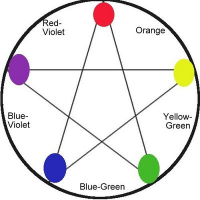
It was Sir Isaac Newton who in 1666 invented what came to be known as the triadic color wheel built on three primary colors--yellow, red and blue.
But in 1898, Albert Munsell came up with a totally new color system, one built on what he called five primaries--yellow, red, violet, blue and green. (See wheel on at top.)
We can use the Munsell color wheel to put together color schemes discussed in last week's tutorial, but with slightly different results. For example, the complement of yellow according to Munsell is blue-violet, the complement of red is blue-green, but orange remains the complement of blue. Munsell's system gives a shorter range between red and yellow than our primary triad does. Whereas the triadic wheel yield 12 colors, then, Munsell has only 10.
Actually, Munsell's arrangement on the wheel is closer to how our eyes perceive color. Try this: find a bright red sheet of paper. Stare at it for 15 seconds, then suddenly shift your eyes to a white surface and hold for 3 or 4 seconds. An afterimage will appear that is actually blue-green rather than pure green.
In fact, Munsell's system is not actually built on a wheel, but rather a sphere that shows the interconnectedness of hue, value and intensity. Our triad wheel is based on hue alone.
To understand Munsell, imagine a globe with all the colors on the surface of its equator circling like colors positioned in a spectrum. Here the are the brightest, purest possible hues. Then imagine all these same colors gradually getting lighter as they migrate upward to the north pole and likewise, gradually getting darker as they move downward to the south pole. Here's what the outside of Munsell's sphere looks like.
 Image borrowed from Albert H. Munsell, “A Pigment Color System and Notation
But there's more. The inside of the sphere toward its core illustrate how neutrals are formed. Imagine a slice across the center of the globe starting at green and ending at red-violet. Now imagine what's happening on that slice if on the green side a little bit of red-violet is added just inside the edge, then a little more as it moves toward the core, continuing until it reaches the core where it becomes totally neutral. On the red-violet side, the same thing is happening by adding a little bit of green at a time. That cross section would look something like this image I borrowed from Encyclopedia Britannica:

Inside the sphere color values get lighter as the rise to the top and darker toward the bottom. That's pretty much what the Munsell system looks like
In my mind, the Munsell system is scientific attempt to illustrate the workings of color whereas the triadic wheel is a thinking tool. There is no doubt that within the Munsell system, you could locate any color there is. It's somewhere in there, believe me. And it's fun to try to do that. In fact, it's a good way to understand the true nature of color.
But for my money, the triadic wheel is a better tool for thinking, leaving us more freedom for working out color mixtures.
You can get a more detailed explanation of the Munsell System by going HERE and for more references, go HERE.

It was Sir Isaac Newton who in 1666 invented what came to be known as the triadic color wheel built on three primary colors--yellow, red and blue.
But in 1898, Albert Munsell came up with a totally new color system, one built on what he called five primaries--yellow, red, violet, blue and green. (See wheel on at top.)
We can use the Munsell color wheel to put together color schemes discussed in last week's tutorial, but with slightly different results. For example, the complement of yellow according to Munsell is blue-violet, the complement of red is blue-green, but orange remains the complement of blue. Munsell's system gives a shorter range between red and yellow than our primary triad does. Whereas the triadic wheel yield 12 colors, then, Munsell has only 10.
Actually, Munsell's arrangement on the wheel is closer to how our eyes perceive color. Try this: find a bright red sheet of paper. Stare at it for 15 seconds, then suddenly shift your eyes to a white surface and hold for 3 or 4 seconds. An afterimage will appear that is actually blue-green rather than pure green.
In fact, Munsell's system is not actually built on a wheel, but rather a sphere that shows the interconnectedness of hue, value and intensity. Our triad wheel is based on hue alone.
To understand Munsell, imagine a globe with all the colors on the surface of its equator circling like colors positioned in a spectrum. Here the are the brightest, purest possible hues. Then imagine all these same colors gradually getting lighter as they migrate upward to the north pole and likewise, gradually getting darker as they move downward to the south pole. Here's what the outside of Munsell's sphere looks like.
 Image borrowed from Albert H. Munsell, “A Pigment Color System and Notation
 But there's more. The inside of the sphere toward its core illustrate how neutrals are formed. Imagine a slice across the center of the globe starting at green and ending at red-violet. Now imagine what's happening on that slice if on the green side a little bit of red-violet is added just inside the edge, then a little more as it moves toward the core, continuing until it reaches the core where it becomes totally neutral. On the red-violet side, the same thing is happening by adding a little bit of green at a time. That cross section would look something like this image I borrowed from Encyclopedia Britannica:

Inside the sphere color values get lighter as the rise to the top and darker toward the bottom. That's pretty much what the Munsell system looks like
In my mind, the Munsell system is scientific attempt to illustrate the workings of color whereas the triadic wheel is a thinking tool. There is no doubt that within the Munsell system, you could locate any color there is. It's somewhere in there, believe me. And it's fun to try to do that. In fact, it's a good way to understand the true nature of color.
But for my money, the triadic wheel is a better tool for thinking, leaving us more freedom for working out color mixtures.
You can get a more detailed explanation of the Munsell System by going HERE and for more references, go HERE.
Saturday, February 21, 2009
Hue: The Scheming Element

Fire truck red. Sky blue. Lemon yellow. The primary hues. Most folks call them them colors, but color covers value, intensity, and temperature as well as hue. This discussion is totally about hue, the way colors appear around a typical, traditional color wheel. Hue is the name of the color.
Today, there are multiple variations on the idea of a "color wheel", but if a person understands the traditional triadic wheel built on the primary colors yellow-red-blue, none of the others are really necessary. And it really is the simplest way to understand hue.
Studying hues aside from value, intensity and temperature helps us understand how colors relate to and effect one another.
First, there are the color schemes:
A color scheme is a limited selection of hues that will appear in the painting. The artist finds ways to adapt everything in the paintings so that these colors are the major ones appearing. They might vary in value, intensity or temperature but they will not veer away from the designated hues.
The traditional schemes are primary, secondary, tertiary, analogous, complementary, double complementary, split-complementary. Often, though, artists invent their own schemes some of which might be variations or off-shoots of these.
Primary: Red, Yellow and Blue

Charles Reid's "Brown Jumper" is done in a primary color scheme.

Secondary: Purple, Orange and Green

Gaye Adams "White Water" is a secondary color scheme.

Tertiary Triad:

Yellow-Green, Red-Orange, Blue Violet or Blue-Green, Yellow-Orange and
 Red-Violet. Robert Genn's "Moscow Cafe" uses a
tertiary triad.
Analogous: Any set of colors located between two primaries on the wheel

Clyde Aspevig's "End of June" is done with an analogous scheme with colors located between blue and yellow.
Complementary:


Edgar Payne uses a complementary of reddish orange and greenish blue scheme in this sailboat painting. (Note: This is a close to a complementary scheme as I can find at the moment. Somebody's got a better one somewhere...)
Double Complementary:

Take one color, skip one, then pick the next. These plus their opposites create a double complement.
Morgan Weistling uses the double complements of yellow/violet and blue/orange in this lovely portrait, "Ophelia."

Split-Complementary:

Any color with both neighbors on either side of its opposite
 .
.Lili Pell uses the this scheme with green opposing red-orange and red-violet. This is not
a pure SC scheme because of the appearance of blue. Few are pure.
In next week's tutorial, I'll discuss the Munsell Color Wheel and how it is different from the traditional primary wheel. See you then.
Sunday, February 15, 2009
Value: The Supreme Element
Without value we see absolutely nothing.
 At night, if we lose electric power and there is no moonlight, you can see nothing but black. And in a snowstorm in the arctic, you can see nothing at all but white. Only where there is a distinguishable difference between light and dark do we see what's around us. The stronger the difference, the clearer we see it.
So value--the full range of lights and darks--is the most important element of all those in our visual vocabulary. It is the one upon which all others depend. Without it, the others cannot exist.
And value just might be the most often discussed element of all. So rather than explain it, let's take a look at seven ways artists use it.
(1) Value can give a paintings a key--high key, middle key and low key.


(2) Value gradation can communicate three-dimensional volume.

(3) Value contrast can show the difference between light and shadow...
 Carolyn Anderson's oil painting shows the location of the light source by how she contrasts her lights and shadows.
(4) Value can be used to create visual paths
 Jennifer McChristian's "Brown Barn" uses light from the sky, then upon the background buildings, then on the middle ground at the edge of the barn, then to the lower left corner back through the flecks of light within the barn to help route our attention throughout the painting.
(5) Aerial perspective is about creating distance with value or depth on space.
 Marc Hanson's painting shows how making background trees lighter makes them appear further back into the distance.
(6) Value can be used to create focal points
 Karin Jurick's "A Date With Art" uses the contrast of the light sculpture against the dark painting and wall to create the painting's focal point.
(7) Value can be used to control edges
 Carolyn Anderson's use of background light merging into the light on the baby's shoulder as well as the baby's hand merging into the shadows around it--both create lost edges that unify the painting and make it more intriguing.
Perhaps the best way to understand how value works is to squint and study what happens in shadow areas vs what happens in areas of light.
Saturday, February 7, 2009
Texture: The Element of Intrigue
Except for the minimalists, take any painting you like, subtract from it all texture and what do you have left?
 Clyde Aspevig "Selway River Wilderness"
 Clyde Aspevig "Selway River Wilderness"
On my knees begging forgiveness from Mr. Aspevig, here's what happens when we take away all the texture. Okay, so I had to throw it out of focus to prove my point, (and that IS a bit annoying), but the out of focus shot does give us an idea of what happens when we strip a painting of it's texture. No other element plays such a strong role in communicating the character of images or engaging the viewer's attention.
At the same time, no other element can so easily cause chaos. I dare not reach for another artist's painting to illustrate this point, but maybe the photo below will help.
 For texture to work it depends upon pattern. When no pattern is evident, texture is apt to create chaos. In the photo, where the grasses, branches and limbs become so entangled that we can't make out a visual pattern, there is confusion. And where there is confusion, there is chaos. But when textures of such a subject get rearranged into a perceptible pattern, it doesn't matter what the subject is, it can still be intriguing to look at.
So when choosing our subjects, we might very well take something chaotic and give it order just by reorganizing within it a textural pattern.
Our observation and translation of textural patterns can count strongly toward creating interesting areas in our paintings. In Lilli Pell's Into The Evening Sun (below) there are numerous intriguing textures translated from careful observation of the edges of tree limbs, sheep, foliage and grass.

But that's only one side what makes the painting intriguing. The other side is how Lilli applies her brushstrokes. Take another look at the details above, this time focus just on her brushstrokes.
How we wield our tools count as much toward the intrigue of our paintings and drawings as how we interpret the subjects. Take a little trip with me over to Katherine Tyrell's portfolio website and look at the gorgeous textures she creates with colored pencil, pen/ink and pastels. (Note: Katherine's blog Making A Mark is one of the richest resource blogs on the web, but she makes a mighty fine mark as artist, too.)
Now let's go to Colin Page's website. Click on the paintings one after another and study his brushstrokes. One more trip to watercolor painter Carl Purcell's website. Even watercolor offers numerous opportunities for creating textures with tools, something at which Carl is a master at doing.
These artists' works are among dozens on the web done by artists whose handling of their tools (as well as observations and translations) create rich and engaging textural patterns. Delete the textures from any of their works and we loose the intrigue of the artist's handwriting as well as how the artist interprets their subjects.
 Okay, so I had to throw it out of focus to prove my point, (and that IS a bit annoying), but the out of focus shot does give us an idea of what happens when we strip a painting of it's texture. No other element plays such a strong role in communicating the character of images or engaging the viewer's attention.
At the same time, no other element can so easily cause chaos. I dare not reach for another artist's painting to illustrate this point, but maybe the photo below will help.
 For texture to work it depends upon pattern. When no pattern is evident, texture is apt to create chaos. In the photo, where the grasses, branches and limbs become so entangled that we can't make out a visual pattern, there is confusion. And where there is confusion, there is chaos. But when textures of such a subject get rearranged into a perceptible pattern, it doesn't matter what the subject is, it can still be intriguing to look at.
So when choosing our subjects, we might very well take something chaotic and give it order just by reorganizing within it a textural pattern.
Our observation and translation of textural patterns can count strongly toward creating interesting areas in our paintings. In Lilli Pell's Into The Evening Sun (below) there are numerous intriguing textures translated from careful observation of the edges of tree limbs, sheep, foliage and grass.


But that's only one side what makes the painting intriguing. The other side is how Lilli applies her brushstrokes. Take another look at the details above, this time focus just on her brushstrokes.
How we wield our tools count as much toward the intrigue of our paintings and drawings as how we interpret the subjects. Take a little trip with me over to Katherine Tyrell's portfolio website and look at the gorgeous textures she creates with colored pencil, pen/ink and pastels. (Note: Katherine's blog Making A Mark is one of the richest resource blogs on the web, but she makes a mighty fine mark as artist, too.)
Now let's go to Colin Page's website. Click on the paintings one after another and study his brushstrokes. One more trip to watercolor painter Carl Purcell's website. Even watercolor offers numerous opportunities for creating textures with tools, something at which Carl is a master at doing.
These artists' works are among dozens on the web done by artists whose handling of their tools (as well as observations and translations) create rich and engaging textural patterns. Delete the textures from any of their works and we loose the intrigue of the artist's handwriting as well as how the artist interprets their subjects.
Friday, January 30, 2009
Direction: The Control Element
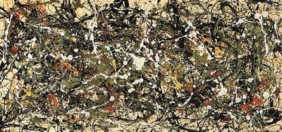
In no art form is the visual element direction more evident than in figure skating on ice. A figure skating choreograph resembles a Jackson Pollock painting with eights and circles and straight line pitches, vertical leaps...
 Figure skating choreograph by artist Larisa Gendernalik
 Paint by Jackson Pollock "Number 8"
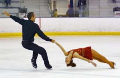 Couples Figure Skating--Photo from mahalo.com
 Figure skating choreograph by artist Larisa Gendernalik
 Paint by Jackson Pollock "Number 8"
 Couples Figure Skating--Photo from mahalo.com
I can remember many years ago a certain figure skater whose routine was not much more than a set of circles with a flying bird body formation. I thought it was quite boring at the time, but we don't see any of that these days. No indeed. Figure skating can be heart-stopping with the many multi-directional changes and leaps.
Likewise, I notice that paintings with a strong directional dynamic hold my attention much longer than those whose movement is too quiet and static. Movement is the key word here: we use the visual element direction to create visual movement. Visual movement creates visual paths. And the nature of movement can create rhythm. So a lot rides on how we use direction as a part of our visual language.

We all know what direction is. North, south, east, west, right, left, up, down, around and around--all those points to which we are constantly aiming and switching. You can't even get out of bed in the mornings without changing direction. And we use "changing direction" as a life metaphor, business metaphor, relationship metaphor, behavior metaphor.
It's role in our painting? To control the viewer's attention. That sounds pretty important, right? Okay, so what do we have available to work with. Well, we can use horizontals (right and left), verticals (up and down), diagonals (leaning), and circles ('round and 'round and 'round and 'round). The key is to use these with enough repetition to prevent chaos and enough variation to keep the viewer engaged.
So how do we create with direction? Flow and transition. Two masters come to mind: Charles Reid and Richard Schmid.
 Charles Reid "Two Views: Abby"
1. Accenting points
Charles is adroit at accenting certain points of the total composition so that our eyes want to move --make a transition--from one area to another.
I've indicated some of the major ones with little white arrows. Keep looking--you'll find more
2. Losing edges
Charles is also adroit at utilizing lost edges, another tool that enables the eye movement to flow and to transition from one area to another.
Again, I've used little white arrows to point out a few key areas. Keep looking, though, and you'll keep finding them.
3. Repeating Color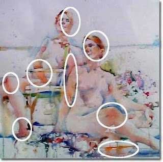
And another of Charles' real genius is his inate ability to repeat color while giving it just enough variation to keep it from being boring. I've circled a few examples here.
These repetitions of color also act both to create flow as well as make transitions.
In a cool background, Charles has used the repetition of warm colors not only to define skin tones and hair, but also to keep the eye moving in various directions.
Next we go to Richard Schmid.
 Richard Schmid "Chicken"
Likewise, I notice that paintings with a strong directional dynamic hold my attention much longer than those whose movement is too quiet and static. Movement is the key word here: we use the visual element direction to create visual movement. Visual movement creates visual paths. And the nature of movement can create rhythm. So a lot rides on how we use direction as a part of our visual language.

We all know what direction is. North, south, east, west, right, left, up, down, around and around--all those points to which we are constantly aiming and switching. You can't even get out of bed in the mornings without changing direction. And we use "changing direction" as a life metaphor, business metaphor, relationship metaphor, behavior metaphor.
It's role in our painting? To control the viewer's attention. That sounds pretty important, right? Okay, so what do we have available to work with. Well, we can use horizontals (right and left), verticals (up and down), diagonals (leaning), and circles ('round and 'round and 'round and 'round). The key is to use these with enough repetition to prevent chaos and enough variation to keep the viewer engaged.
So how do we create with direction? Flow and transition. Two masters come to mind: Charles Reid and Richard Schmid.
 Charles Reid "Two Views: Abby"
Charles is adroit at accenting certain points of the total composition so that our eyes want to move --make a transition--from one area to another.
I've indicated some of the major ones with little white arrows. Keep looking--you'll find more
2. Losing edges

Charles is also adroit at utilizing lost edges, another tool that enables the eye movement to flow and to transition from one area to another.
Again, I've used little white arrows to point out a few key areas. Keep looking, though, and you'll keep finding them.
3. Repeating Color

And another of Charles' real genius is his inate ability to repeat color while giving it just enough variation to keep it from being boring. I've circled a few examples here.
These repetitions of color also act both to create flow as well as make transitions.
In a cool background, Charles has used the repetition of warm colors not only to define skin tones and hair, but also to keep the eye moving in various directions.
Next we go to Richard Schmid.
 Richard Schmid "Chicken"
4. Guiding Brushstrokes

Richard's delicious brushstrokes are to my mind his trademark genius. Each stroke is guided with intention to define whatever subject is being painted using the careful placement and movement of the stroke.
5. Giving Attention to Edges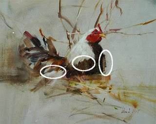

Where Charles can lose an edge, Richard can manuver it along the perimenter of the shape to show roughness or smootheness, softness or hardness, swiftness or slowness. His edges are not just perimeters--they control eye movement.
Edges contain characteristics that define the subject. Richard finds these characteristics and renders them in a way that the eye wants to pause and taste it before moving on to the next area.
Edges contain characteristics that define the subject. Richard finds these characteristics and renders them in a way that the eye wants to pause and taste it before moving on to the next area.
But perhaps the all time great master of using direction was Leonardo da Vinci. With every thing he did in a painting, he was manipulating our attention just as with every note, volumn and rhythm, Mozart was doing the same thing.
6. Positioning Your Subject
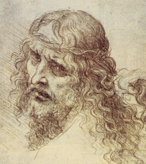 Leonardo turns the face of the Christ-figure toward the left edge, then shifts the eyes to look at the viewer while directing the flow of the hair down the shoulder to the right-hand corner.

He uses a similar ploy in his world-and-ages famous Mona Lisa where the eyes are looking at the viewer, the face is turned slightly toward the left and the hands are positioned toward the right.
Throughout time, where genius has come into play is the artists uncanny ability to notice what's available and to use it adroitly. So we're right back to last week's lesson and all those before. We hone our skills and our eyes and join them together to make it work.
6. Positioning Your Subject
 Leonardo turns the face of the Christ-figure toward the left edge, then shifts the eyes to look at the viewer while directing the flow of the hair down the shoulder to the right-hand corner.
He uses a similar ploy in his world-and-ages famous Mona Lisa where the eyes are looking at the viewer, the face is turned slightly toward the left and the hands are positioned toward the right.
Throughout time, where genius has come into play is the artists uncanny ability to notice what's available and to use it adroitly. So we're right back to last week's lesson and all those before. We hone our skills and our eyes and join them together to make it work.
Subscribe to:
Posts (Atom)