Welcome to Compose. There's lots of stuff here, all about composing paintings.

Current entries appear in Dianne's weekly newsletter.


Showing posts with label Value. Show all posts

Saturday, June 25, 2011

Understanding Intensity in Color

Color contains three attributes:  hue, its location in the spectrum;  value, how much light or dark it holds, and intensity (also called chroma) or the saturation of hue within the color.

Look at this graphic.  The colors are full saturated even though one hue merges into another.   
 Fully saturated means the hue is not neutralized by a complement.  The hues closest to the center are darker in value, but they remain as saturated as their lighter versions close at the edge.  All these hues are at their highest intensity.

Here's the same example with some of the saturation taken away or neutralized, each having a bit of its complement mixed into it.


The hues remain the same, but the intensity is slightly lowered, a bit more neutralized.

And here it is again with all the hues totally neutralized.  Notice that with the hues totally neutralized they disappear and the intensity is gone, but the values remain.  
So, why is this important to a painter?

Being aware of the complexities of color and knowing how to manipulate them opens up for the painter an abundance of options so that the ability to see nuances increases both in observing and in making decisions.

Saturday, April 9, 2011

The Power of a Repoussoir

What do I do if I want to get your attention?

In his popular Fifth Symphony, Beethovan gets our attention with a precise da/da/da/DUM.  And Welsh poet Dylan Thomas opens one of his poems, "And death shall have no dominion."  Not so unlike these attention grabbers, Andrew Wyeth in "Christina's World" does this:
"Christina's World"   Egg Tempera    Andrew Wyeth  
The female image in Wyeth's painting is a repoussoir in action:  it captures our attention and leads us to the distant images.
re·pous·soir
  [ruh-poo-swahr]  
(From Dictionary.com)

What fascinates me about this device is its flexibility, its potential for free expression within a traditional pattern, one that yields unity while bringing us into a painting.  (In case you'd like a more in-depth definition, I explained how repoussoir works in one of my Empty Easel articles a couple of years ago.)

 I particularly enjoy paintings whose notan (see last week's post) is interlocked within a repoussoir.  When I see this working in a painting, it reminds me of an Italian sonnet , a device that acts like a repoussoir:  two major parts where the first is an argument, the second a resolution.

Paintings employing a repoussoir within the notan  pattern have two major parts as well:  one overall light or dark value usually anchored at the bottom of the painting leading the eye to an opposite value anchored at the top.


Anchored at the bottom of each of the three paintings above is a major light leading our eyes to an important dark area anchored at the top.   Richard Schmid does this in his landscape painting on the right, I used in my painting of squirrels on the upper left, and Pat Weaver does a similar thing in a painting of people on the lower left.

If as you look at each of these paintings you squint your eyes,  you can see this happening.  You experience in each piece a repoussoir built within a notan pattern,  three totally different paintings each saying entirely different things, but employing the same device:  a visual sonnet.  Now, that's captivating!

Note:  If you'd like to receive these tutorials by email, sign up in the left column at the top.  And if you'd like me to do a tutorial on some individual composing principle or problem, let me know in the comments section below.

Saturday, February 28, 2009

Meet Munsell

Below: Color Wheel based on Munsell's Five Primaries
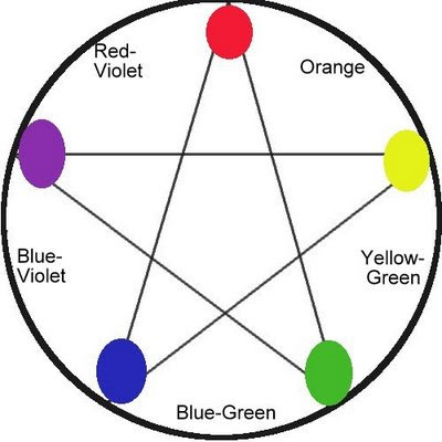
It was Sir Isaac Newton who in 1666 invented what came to be known as the triadic color wheel built on three primary colors--yellow, red and blue.

But in 1898, Albert Munsell came up with a totally new color system, one built on what he called five primaries--yellow, red, violet, blue and green. (See wheel on at top.)

We can use the Munsell color wheel to put together color schemes discussed in last week's tutorial, but with slightly different results. For example, the complement of yellow according to Munsell is blue-violet, the complement of red is blue-green, but orange remains the complement of blue. Munsell's system gives a shorter range between red and yellow than our primary triad does. Whereas the triadic wheel yield 12 colors, then, Munsell has only 10.

Actually, Munsell's arrangement on the wheel is closer to how our eyes perceive color. Try this: find a bright red sheet of paper. Stare at it for 15 seconds, then suddenly shift your eyes to a white surface and hold for 3 or 4 seconds. An afterimage will appear that is actually blue-green rather than pure green.

In fact, Munsell's system is not actually built on a wheel, but rather a sphere that shows the interconnectedness of hue, value and intensity. Our triad wheel is based on hue alone.

To understand Munsell, imagine a globe with all the colors on the surface of its equator circling like colors positioned in a spectrum. Here the are the brightest, purest possible hues. Then imagine all these same colors gradually getting lighter as they migrate upward to the north pole and likewise, gradually getting darker as they move downward to the south pole. Here's what the outside of Munsell's sphere looks like.
Image borrowed from Albert H. Munsell, “A Pigment Color System and Notation

But there's more. The inside of the sphere toward its core illustrate how neutrals are formed. Imagine a slice across the center of the globe starting at green and ending at red-violet. Now imagine what's happening on that slice if on the green side a little bit of red-violet is added just inside the edge, then a little more as it moves toward the core, continuing until it reaches the core where it becomes totally neutral. On the red-violet side, the same thing is happening by adding a little bit of green at a time. That cross section would look something like this image I borrowed from Encyclopedia Britannica:

Inside the sphere color values get lighter as the rise to the top and darker toward the bottom. That's pretty much what the Munsell system looks like


In my mind, the Munsell system is scientific attempt to illustrate the workings of color whereas the triadic wheel is a thinking tool. There is no doubt that within the Munsell system, you could locate any color there is. It's somewhere in there, believe me. And it's fun to try to do that. In fact, it's a good way to understand the true nature of color.

But for my money, the triadic wheel is a better tool for thinking, leaving us more freedom for working out color mixtures.

You can get a more detailed explanation of the Munsell System by going HERE and for more references, go HERE.

Sunday, July 6, 2008

Value: Composing With Notan

I address value--light and dark--in the beginning of these discussions because I believe it to be the mother of all elements, even more fundamental than color. (Hawthorne and Hensche probably just took a tumble in their graves.) It's because of light that we see color. Turn down the lights and things become dim, turn them off and you can't see a thing. So it makes profound sense to me that light/dark reside over all visual elements.

Our surroundings make sense to us because of how light hits their images causing consequent shadows. We can reduce these lights and shadows to black and white and it will make a visual thought, show us a visual structure where darks connect and light carries a path within and around the darks . And this will give us the Notan of the scene.

Photo to notan
Notan, pronounced "no tan", is a Japanese concept meaning "light dark". It is related to yin yang where yang is light and yin is dark. One way to give solid structure to a painting is to do just that--designate all lower value notes to black, all higher notes the white. I used the word "notes" because if we can use music as an analogy and we can easily understand the vocabulary of value.

On a piano there is middle C which is the center of the notes available on the piano keyboard. Notes to the left of middle C are lower in tone, notes to the right are higher. Light and dark notes can be similar, but because the value range in nature is so vast, we get a better grasp to limit value notes to 10 where 1 is the lightest or highest and 10 is the darkest or lowest, 5.5 would be equal to middle C.

Using this system of thinking, we can find our true pattern of lights and shadows if we create a notan, placing value notes 1-5.5 in the white areas and notes 5.5-10 in the blacks.


This is most easily done in a tiny drawing no bigger than 1" x 2". When creating the drawing, we can decide whether we want the light pattern as we perceive it to be or if we want it

higher key

or lower key .

From here, we can create our painting, keeping our color values one-ish to five-ish where the notan indicates light and five-ish to ten-ish where it indicates dark, referring back to our source, whether plein air or photo, for the colors we want to use.

Notan is only one way of guaranteeing a successful value structure, but it's also a surefire way of getting a strong design within which to compose a painting. Go here then here to see I use notan.

Saturday, July 5, 2008

The Language

When we paint, we communicate through a rich visual language. Images speak, yes, but how we present them influences what they say. In their raw form each is in a context of a unique light and/or shadow. We can paint the image in strong light, in weak light, in strong shadow, in weak shadow. We can make the image light and it's surroundings dark, make it dark with it's surroundings light, make it include both lights and darks in a variety of surroundings. The same image repeated in a variety of lighting will communicate
differently. The element of our language making this happen we call "value". You know that. But had you considered it as a part of your language's vocabulary?

Our language's vocabulary includes value, hue, intensity, temperature, shape, size direction, lineand texture. These are the elements with which we "speak" as painters.