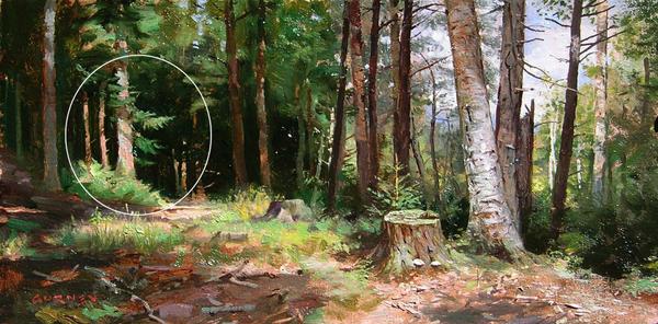
Many emerging painters complain about their values not being “clean” and most are at a loss as to what to do about it. If you’ve never heard this particular term before, having “clean values” is simply artspeak for a work of art with convincing colors and strong, visually meaningful values like in this little forest scene painting by James Gurney.
 |
Gurney’s darks, midtones and lights each play a role in defining something specific about the forest. His shadows and lights describe the position of the light source as well as its effect upon the subject, so there’s no doubt about what’s going on. Let's take a closer look at some of the mechanics at work here.
1. Meaningful Focal Point
 |
Notice how clearly defined are the lights on the tree and the deep dark shadow shapes contrasting on either side of it.
2. Clearly Rendered Shadows
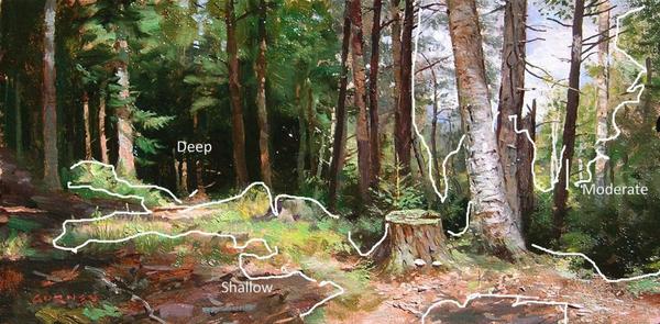 |
Look at the value, hue and intensity modulation in Gurney's moderate and shallow shadows, and how easy our eyes transition from the shallow shadows in the upper tree foliage to the deep shadows near the ground.
3. Readable Angles of Light
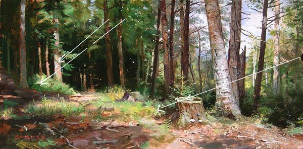 |
We have no trouble discerning the angle of the sunlight nor reading the scene as being lit from a single light source.
These composition considerations go a long way towards yielding clean values and colors, but they must go hand in hand with a few technical practices. Here are four I suggest:
1. Constantly clean your brush
Make a habit of holding a brush in one hand and a paper towel in the other. Any time you switch colors, rinse and wipe the brush by squeezing it out with the paper towel.
2. Don’t skimp on paint—cover the surface
Too little paint often results in weak color. Use adequate amounts of paint to cover the surface and avoid trying to stretch your paint by spreading it so thin that the texture of the surface comes through.
3. Avoid over-stroking and over-blending
Start thinking of your brush as a tool to shape the paint, not just as an applicator of paint. This means slow down. Be deliberate with each stroke and avoid repeating a stroke in the same spot.
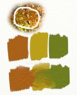
4. Find the right hue to lighten your colors
Do you reach for white each time you want to make a color lighter? Well stop.
Do you reach for white each time you want to make a color lighter? Well stop.
Adding white changes the color temperature AND the value, making the color look dramatically different. Rather than automatically reaching for white, try to find another color that will give you the value change you need without neutralizing the original hue. (Watercolor painters will know to use the water for making a value lighter.)