Welcome to Compose. There's lots of stuff here, all about composing paintings.

Current entries appear in Dianne's weekly newsletter.


Showing posts with label Design Principles. Show all posts

Thursday, January 12, 2017

Getting Rid of Eye Sores Before Beginning a Painting

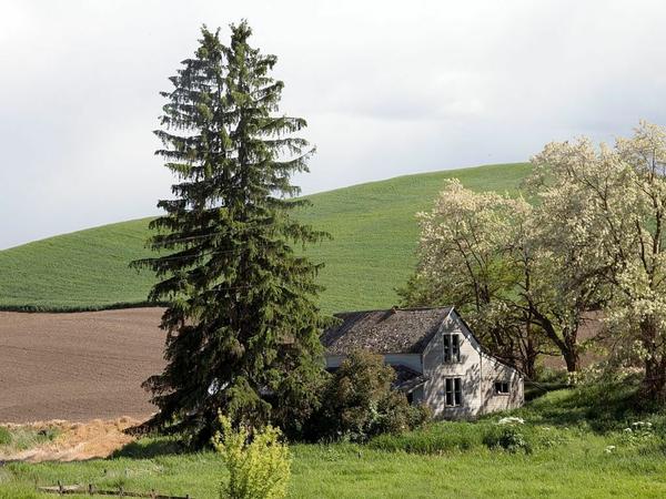
Here's a photo I found on Pixabay. 
Image
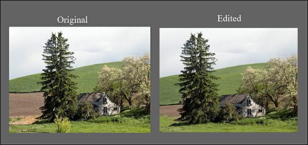
 If I happened upon this scene while out looking for a subject to paint, I'd probably set up my easel and get to work.  But to begin working without looking for potential eye sores would be a recipe for an inferior piece before even getting started.  
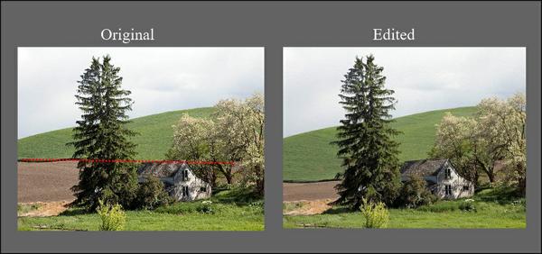
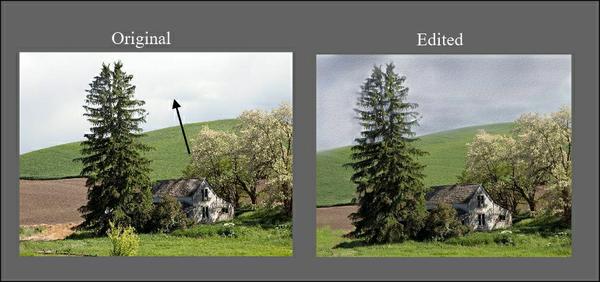
For one thing, that line where the grassy hill ends and the field begins forms a tangent with the roof of the house. I'd want to move that edge down.
Image
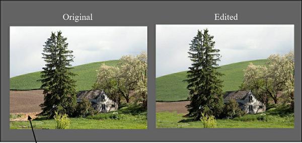
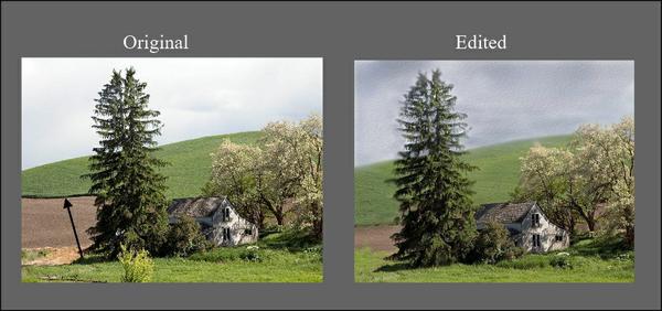
 That clump of dirt to the left of the tree feels out of place.  I think I would delete that.
Image
The little light green bush in front is too isolated and adds clutter to an already busy scene.  It's got to go. 
Image
There's too much space on the left between the tree and the left edge AND that space is too much the same width of the tree.  I'll crop that. 
Image
 For such a busy scene, the value contrast is too strong.  To calm that down, I'll darken the sky a bit.  This will help make the light on the house the focal point.
Image
That really dark edge between the grassy hill and the field is too harsh, splitting that area and causing it to attract too much attention.  It needs to be subdued. 
Image
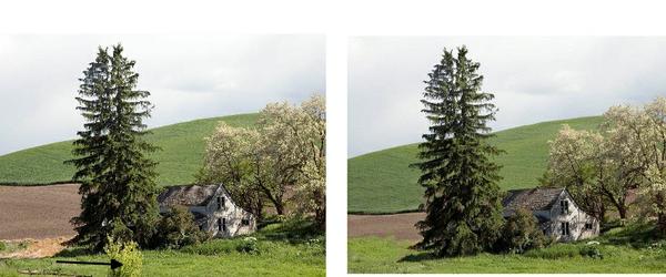
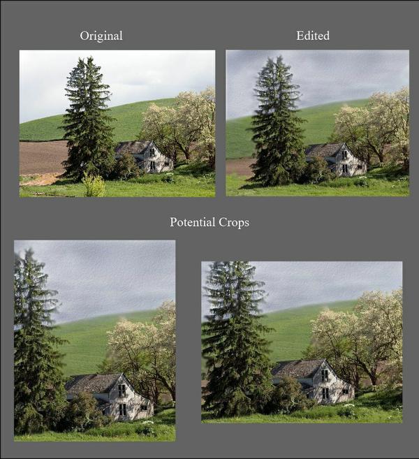
That takes care of most of the stuff that is visually incoherent.  From this point, I could choose to begin with this design or I could crop to a different format.
Image
In the crop on the left (as well as in the uncropped piece). I'm still bothered by the space of that hill being about the same width as the sky space. In the crop on the right, the widths of the tree and house are a bit too similar, but I can adjust that while composing the painting.   (Remember, we set the design, but the real composing begins with oubrushwork.)
What's important when we are selecting a subject for painting is that we look at one thing at a time and that we are willing to edit and rearrange for the best design so that when we begin composing, we have a head start.  

Friday, February 24, 2012

A Gentle Transition

To be suddenly awakened out of a sound sleep is unsettling.   In the same way, a painting that contains too many contrasting elements can feel like an assault on our senses.  But a painting can translate vibrant life in all of it’s diversity without visually invading the viewer.  One method for achieving this is gradation.

Arguably the most familiar of all the principles, gradation is a gradual transition between opposites.  Light changes slowly to dark, large continuously becomes small, one color gently unfolds into another. Any visual element—whether size, shape, direction, line, value, hue, intensity, temperature or texture—can be gradated just as it can be contrasted.

Most of us probably learned in our first drawing class that we use value gradation to make an image appear three-dimensional, but this principle is also a useful tool for unifying a painting.  An underlying value gradation ties together things that would otherwise compete.

In his painting, "Growing Tall," Colin Page has used this strategy, unifying an otherwise unwieldy subject.


page 1
Colin Page      Oil on Canvas     "Growing Tall"

There’s a lot of activity here-- titillating flecks of light, rapid directional contrasts, quick gestures—but if you squint your eyes at Page’s painting and concentrate on the darks and lights, you’ll discover an underlying gradation in value.

Page's painting in grays and blurred.

And he's used gradation in at least two other ways: look at the colors as they appear from the bottom to the top—blue-green, green, yellow green, yellow, orange—they all transition in the same order as the colors on the color wheel.

page colorwheel

Now shift your attention to the texture of the grasses. Larger, rather specific strokes appear at the bottom, and then strokes become progressively smaller and less defined as they move toward the top.

A portion of Page's painting in grays


Value, hue and texture all have been gradated, letting us be captivated by the diversity of contrasts rather than confused.

Gradation occurs naturally within the mechanics of our eyes.  Our visual perception interprets things as if they gradually change as they recede from where we are.  Things become smaller in size, lighter in value, weaker in intensity, and less distinct in texture and detail.  John Burton's painting, "Festival at La Tirana," adroitly illustrates this by exaggerating the principle.

burton
John Burton    OIl    "Festival at La Tirana"

Notice how within each subsequent figure these four elements--size, value, intensity and texture--gradually change so that the most distant figure is barely defined.

Carolyn Anderson uses the gradation principle in a similar way, but more strategically.

anderson 1

Rather than follow the gradation of subjects as we would normally perceive them, Anderson has guided our attention to where she wants us to look by more clearly defining the children on the right and the second horse from the left and gradating away from the discernible characteristics of these images so that, by power of suggestion, we can identify images in the distance even though their shapes are hardly identifiable.


Upper right section of Anderson's painting


As you can see, unlimited creative possibilities abound for using gradation as a tool in painting.  Whether the artist's goal is realism or something else, exciting and intriguing possibilities abound and more unified paintings will most likely be the results.

************
Note:  This tutorial is a revision of one I wrote for Empty Easel, September 9, 2008.

************


Friday, September 30, 2011

How One Painting Is Composed

Frequently folks want to take issue with how much composing a painter does.  But the seasoned painter knows that to get it right, it must be rightly composed.  It's not that difficult:  it's just a matter of practicing one principle at a time until it becomes a natural part of your working process.

One beautifully composed painting I discovered recently is "The Dancer," a watercolor painting by Carla O'Conner.  Today's post is about how she made this happen.

What do we see working here?

"The Dancer"  30" x 22"   Watercolor
The first thing I see is an underlying structure of triangles, one of the most powerful organizing methods available to the artist.


 Notice how the image is anchored to the painting's edges at each point a central triangle, enabling the negative shapes--those shapes outside the image-- to form their own triangles.  And look how each of these is a different size and configuration:  that's using the principle of variation.  

Next,  look at  the painting's notan.  All the darks are connected  forming a visual path guiding the eye from one area to another giving  unity to the entire piece. In quantity though, there is more light space than dark, the principle of dominance at work here.   

Back to the painting.


Notice the strong vertical alignment of shapes, the strong vertical edge of the head,  the head looking downward,  the stretch of the arm aligned with the vertical edge of the painting and the vertical format itself, all giving balance to the entire piece.

And finally, study how O'Connor uses the contrast principle by juxtaposing strong darks within a field of strong lights and how she achieves the color harmony principle using both low intensity and analogous colors.

And we don't have to know all this to enjoy this painting.


Saturday, June 11, 2011

An Argument for Principles of Composition

BOUNDARIES
We live in an era of artists rebelling against boundaries.  It's nothing new-- questioning boundaries is a driving force that keeps humans evolving.  But too often a principle gets mislabeled as a boundary and consequently gets abandoned, to the detriment of the artist.

ASIDE
There are artists among us who consider composition principles boundaries.  These folks complain that if they spend their energy concentrating on the principles while painting, they'd give up.  And some argue that principles serve only to inhibit the creative process.  They complain that they're not interested in making great works of art, just finding some joy in life.  They just want to paint and not be bothered with having to think about it.

BOUNDARIES VS PRINCIPLES
A boundary is a wall or a line of demarcation.  It's intention is to define two sides of a place or thing or to limit access.  It's purpose is to divide.

A principle is a fundamental of how something works.  Its function is to hold something together, not to limit or divide.

CONCLUSION
To reject learning and using principles of composition is to limit the scope of ones creative potential.  The boundary is not the principle itself, rather the projection we place on it when we make assumptions about it rather than to take the effort to explore its possibilities.

Thursday, January 1, 2009

Lists and "Thanks, Making a Mark"

If you haven't already discovered Katherine Tyrrell's brilliant blog "Making a Mark," you must and not because she recognized this blog among her top five FAQs and Answers Really Useful blogs. Katherine's blog is one of the best experiences I've discovered within the blogshere.

Thanks, Katherine. It's quite an honor to get this recognition.
***************************************
When I was teaching in bricks and mortar, I enjoyed opening the more advanced classes with a composition lesson. At times I'd choose from one of the two major art magazines (I'll refrain from naming either) a painting that was a bit less than successful (making one wonder how it got published), then we'd analyze why the painting didn't work. At other times, I'd pick a well done painting and we would examine all the dynamics that made it work. It didn't take long for my students to realize that good painting involves much more than just copying images. They looked forward to these little mini lessons and so did I.

For them, I developed a guide which I called a "think sheet" and they called the "cheat sheet." It's not much more than a set of lists, and it's purpose is simply to jog the memory as to possibilities.

To begin the New Year, I want to share my "cheat sheet" with you. Enjoy and Happy New Year!

A Brief Outline of How the Visual Language Works
(A Think Chart for Visual Composing)
"We construct images, we compose art work."

The Elements (Our Vocabulary)
Line
Shape
Size
Direction
Texture
Value
Hue
Intensity
Temperature

The ACTION principles (Things we can do with the vocabulary to make it work)
Select and Place
Gradate or Modulate
Alternate
Contrast
Vary
Repeat
Make Similar
Elaborate
Economize
Isolate
Overlap
Juxtapose
Find and use perspective
Find and use angle of shadow/light
Create dominance

The RESULTS (What We Want To Get)
Pattern
to avoid randomness
Balance
to prevent one-sidedness
Order
to overcome chaos
Harmony
to stay in tune
Rhythm
to avoid being static
Proportion
to set relationships
Transition
to enable movement
Form
to provide structure
Focal Point and Visual Path
to guide the eye
Emphasis
to avoid being erratic

Toward our ULTIMATE GOALS
UNITY
to avoid fragmentation
PURPOSE
to negate aimlessness

The CAUTION principles (Things to avoid along the way)
Tangents
Sore Thumbs
Aimless Centering
Disconnectedness


Copyright 2009, Dianne Mize


Saturday, October 11, 2008

Ten Composing Commandments

Not long after I began this blog about composing, I started receiving e-mails from various artists asking me what I think are the most important considerations while composing. It is true that if one looks at all the principles and their ramifications, it can be overwhelming to say the least and confusing at best.

While I am pretty dogmatic about the importance of an artist learning how to use the principles as tools, I am equally dogmatic about forgetting about them during the painting process. It's a dichotomy in a way: what can be the strength of a painting can also destroy it.

Learning to use these tools must become a part of our bone marrow just as an ice skater's tools are deeply embedded within her muscles. Ice skaters must not think while they are performing; neither must the painter. Yet because our guides live within us, they will under gird whatever we do with our craft.

I gave it some thought and came up with my preferred list. Notice it assumes we're already learned the compositional tools. Or that we apply what we have learned then go learn some more.

Ten Commandments for Composing a Painting
Prelude: Have a clear idea--a concept--of what you want the painting to be about. (Thanks, Marc Hanson, for suggesting that I add this in.)
1. Study subject intensely before committing a single brush stroke
2. Squint while studying subject
3. Search for patterns of light while squinting
4. Search for patterns of dark while squinting
5. Extract design pattern from findings of 3 and 4 and develop
6. While painting look three times, think twice, paint once. (courtesy Robert Genn)
7. Keep every color applied consistent with the temperature of the light source. (Courtesy Richard Schmid)
7. Edit between sessions not while painting
9. Taken advantage of compositional tools throughout.
10. Ignor whatever doesn't belong.
Because each of us is unique, we each must develop our own individual approach to painting. I'm sharing mine only because I enjoy sharing ideas. On my website, I've attempted a personal account of my own creative process. You can see it HERE.

Saturday, September 20, 2008

Deciphering Artspeak, I

What does this mean? "...rhythm and repetition act as agents for creating order out of forces that are otherwise in oppositions."

This quote is lifted directly out of the text I used when teaching design to my college students: the fourth edition of Art Fundamentals: Theory and practice by Ocvirk, Bone, Stinsor, et al. Of course it's been revised and expanded repeatedly and I confess I've not see today's version. But back then, it was as solid as any existing book on design and composition, but today I realize how inaccessible it is to the practicing artist, at least without a whole lot of deciphering.

Okay, let's give it a shot. Rhythm: we know it in music; but what IS it in visual art? We know rhythm as a concept to be associated with movement where there is a repeated action or event. We know our hearts beat in rhythm, and there are plenty of rhythms in cycles of nature. We really do know what rhythm is.

One thing all rhythms make is a pattern in which something is repeated; in visual art, the pattern can be made by brushstrokes, by how elements are arranged, by where the images are placed or a combination of these. In this portrait by Carolyn Anderson we see all three.

Carolyn's brushstrokes are music within themselves, each one moving in a direction as if to actually stroke the image. To the left, I've indicated a few. But look also at the way the white is placed so that our eyes move from the top right of the paint down the shoulder, out the arm,alongside the book, back up the open page, through the background on the left and back. By the repetition of the value, color and temperature and by their placement a pattern of movement is created.

Look now at the braid on the right side pointing to the dark shape in the right bottom corner which leads to the narrow horizontal dark in the lower left and up the braid on the left and through the middle value reddish brown of the background. Another pattern of movement created with the repetition of a color family (reds and oranges) and the arrangement of shapes they occupy so the pattern of movement of the darks flows within that of the lights, all reinforced by the motion of the brushstrokes.

Now, what is the results? Order! Delight! A desire to stay involved in the painting. Rhythm does create order, but it does more--it makes us feel what the artist felt about the subject.

Let's look at that sentence again: rhythm and repetition act as agents for creating order out of forces that are otherwise in oppositions. What if we said simply: We respond to what the subject gives us. We find within it opportunities to repeat and that creates rhythm. We make it interesting by varying. With a simple action of repeating and varying, a pattern of rhythm can emerge.

Just that.


Saturday, September 13, 2008

Tools, Artists! TOOLS!

Do I detect an elephant in the room?

This week's post will be a bit different, sort of a side bar, because I want to air something that's been on my mind for a long time. Why do so many artists resist compositional principles?

I've noticed it especially on the Wet Canvas forums, I'm bumped into it quite often on the blogs and I've surely encountered it eye to eye with other artists. It appears that many artists think of compositional or design principles as rules and therefore resist them.

I googled "compositional principles" and the garbly-gook that resulted could clutter ones brain. As I was plowing through these sites, one by one, I had an ah-ha moment: this stuff isn't accessible. It's rhetoric, it's jargon, and it's brilliantly obscure. Face it, what we've had crammed down our throats all our lives is something that's totally meaningless for us while we're pushing a brush. For example, what does this mean: "rhythm and repetition act as agents for creating order out of forces that are otherwise in oppositions."

Now get this. I taught this stuff in college and I didn't feel comfortable with it then either. I've battled for years trying to find ways to make compositional principles attractive to students. I went about it all wrong and now I know why: if it cannot work for me while I'm painting, it's no good to me.

And there within the word work lies the clue that solves my mystery.

All these many ions artists have been taught that design principles are rules. BUT, that doesn't work because we hate rules. We'll not be governed by any rule and besides, rules restrict our creativity. Am I right?

Second, the way this stuff has historically been presented to us is inaccessible to us. Sounds good but to what end. Am I right again? And maybe we don't want to confess we don't really understand those dense assemblies of words found in our design manuals. That would be unacceptable, make us appear intellectually inferior to the critics and historians and those New York mainstreamers. (Mmmm. I won't ask you to confess this one.)

Okay artists, listen up: not a single principle is a rule. NOT ONE. Every single one of them is a tool. There's a wide world of difference between a rule and a tool. The only thing they have in common is cause-and-effect.
  • Rule: if I get caught breaking the speed limit, I'll pay a fine. A rule governs my behavoir (or not).
  • Tool: if I apply the pedal to the metal, the car will go faster. A tool enables me to accomplish something (or not).
As artists we make observations every day. We know if we mix one color into another, we'll get a new color. That's a tool, not a rule. We know that if we put a quarter in a piggy bank, we'll have it as long as it stays there. That's a tool, not a rule. We know that if a single dark spot it placed on a white canvas, our eyes will go to that spot. Again, a tool, not a rule.

If we take every single design "principle" we've ever encountered and re-think it as something that can be a workhorse, we will discover we have a huge box of tools. HUGE. Are you getting my drift? Anything we can use to make our work do what we want it to do is a tool.

When we looking at a painting by Richard Schmid, what we know immediately is Schmid works those tools. Look at one of my favorite Schmid paintings "Yorkshire Coach House."
Schmid has worked with each of the tools for so many years that he reaches for one when he needs it and, immediately, it goes to work for him. I know for certain that he learned how to use color by doing charts. I'm betting he has done his fair share of practicing every tool he uses.

We can move from one accomplished artist to another to find that the one thing they all have in common is they can utilize the tools.

And it's never too late to take one tool at a time and practice using it just like we'd practice using a chain saw. We'll be a bit awkward at first, but the more we practice using it, the easier it will become to keep it working for us whenever we need it, to make it do for us whatever we want it to do.

In these blog entries and in my articles for Empty Easel, it is my goal to show you ways you can practice using these tools so that for you, they can become workhorses, not threatening rules. Leave me a message if there are tools you'd like me to address.