Art reflects life, one way or another. The discord we've all felt in recent weeks with the political dissonance in the States reminds me of how our painting, too, can become dissonant when it loses harmony. It's no different from a musical instrument being out of tune, something that can sour our senses in a flash.
Harmony means everything is in tune with its light source. Just as sound frequency tunes a musical instrument, wave lengths of light will tune a painting. The delivery of wave lengths from a light source causes whatever is lit by that source to be in harmonious light. To keep a painting harmonious, we use that principle.
Here's a chart showing the wavelengths of light in the visible spectrum.
 |
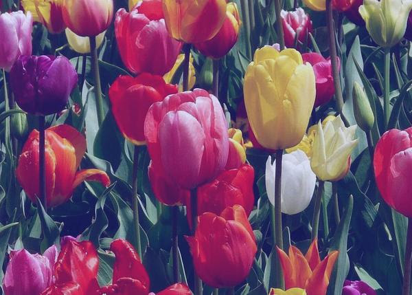
This photo is of tulips in bright sunlight. Even though we see various colors, they feel in harmony because they are all under the same color of light. Another more scientific way to say it is that the same wave lengths are hitting everything we see, in the 570 wavelength range.
 |
Next, we change the wave lengths to a more orange light, making them a bit longer. Still, everything is in harmony.
 |
We change the wave lengths again to a blue-violet range, considerably shortening them. The scene is still in harmony.
 |
But when we isolate the frontal yellow tulip and put it under a warmer light of longer lengths, leaving everything else in a cooler shorter length waves of light, we throw it out of harmony.
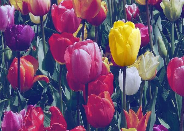 |
To put it back into harmony, we simply add to its color the blue-violet light being received by its surroundings. We do that in painting, too.
 |