What are these colors?
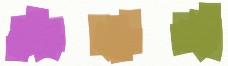 |
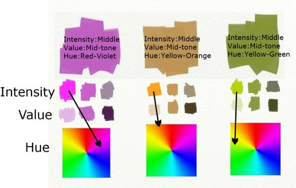
If your answers are mauve, tan,and olive green, you are not speaking the color language.
Begin here: Color is a language within itself. It has three major parts of speech--hue, value and intensity--as well as temperature which gets created by hue and intensity. Once we get to know each of these components of color, we can create any color we want just by asking three questions.
1. What is the hue?
2. What is the value?
3. What is the intensity?
The questions can be asked in any order. But what do they mean?
Hue
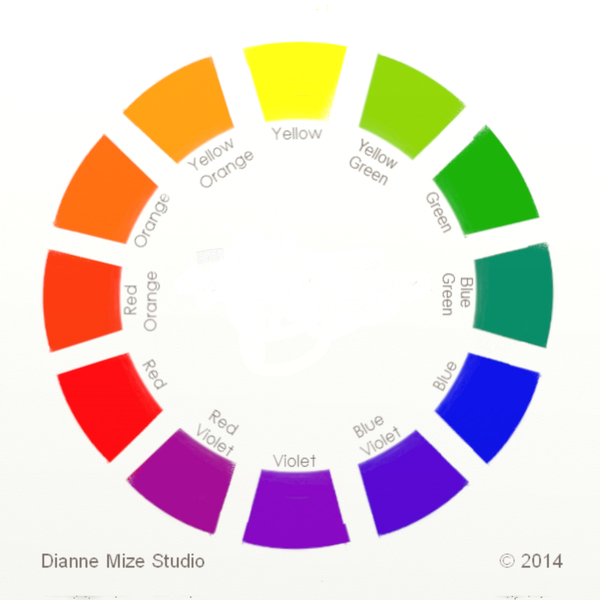 |
The color wheel was invented to help us work with hue. We can recognize hue if we call it by its color name such as red-violet, yellow-orange, yellow-green. We can know these like a parent knows the face of a child. We can see them in our minds when their names are called. Committing this to memory is the first step towards getting to know the language.
Intensity
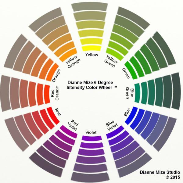 |
The intensity (or chroma) of a color is the degree of saturation of its hue. The color wheel shows the hues at 100% hue saturation. An absolute gray has zero saturation. When any hue's complement (the hue opposite it on the wheel) is mixed into it, the saturation decreases--becoming more neutral-- causing a lower intensity. Complements neutralize each other just like an acid neutralizes an alkali. Changing the intensity doesn't change the hue although it might change the value. Note: The labels intensity and chroma are interchangeable.
The swatches at the beginning are all reduced intensity. The first one we might have called mauve is actually middle-intensity red-violet. The easiest way to label an intensity is to use the words low(almost neutral), middle (slightly neutral) and high (highly saturated).
Value
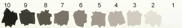 |
Value (also called tone) is the degree of light or dark within a color. We show it in a scale to help discern it. Unfortunately, color scientists have screwed up the numbering of this system. Earlier systems use 10 to indicate the darkest value (that's the one I learned), but more recent systems use 10 to indicate the lightest value.
The number matters only in so far is it helps to distinguish degrees of value. A better way to communicate the language of value is to call it high(light), mid-tone(middle) or low(dark).
And Here's How the Language Works
 |
1 comment:
Brilliant post on color, value, and chroma ... thank you !
Post a Comment