Welcome to Compose. There's lots of stuff here, all about composing paintings.

Current entries appear in Dianne's weekly newsletter.


Saturday, December 17, 2016

Sneaking Some Time to Feed the Inner Artist

Here in the U.S., our long holiday season filled back to back activities and commitments will often rob us of our easel time, time that we all cherish and far too often wish we had more of.  Here's a fun thing you can do in your sketchbook with your feet up watching TV.  It's especially fun during a sports event, but any program where people are doing stuff on the screen will work.
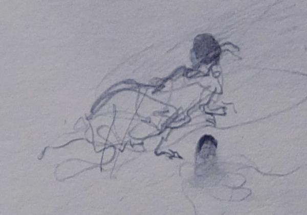
It's the simplest form of gesture drawing taught by Kimon Nicolaides early in the 20th century.  Today, it remains one of the most powerful ways for artists to grab a quick idea.  One example is the sketch Andrew Wyeth did as his initial idea for Christina's World.  
Image
Image
This shorthand method of studying draws only what the figure is doing, not the edges of the shapes.  It's quick, no more than 30 seconds.  Here's one I did of a man sitting.  My attention is on man sitting.  Once the pen starts moving, I follow the feeling of what the head is doing, what the torso is doing, the arms, legs and feet.  Not what it is, but what it is doing.
Image
Below, I've broken down a process I use to give you an idea of how it works. First, what is the head doing?
Image
Next, what the torso is doing?
Image
Finally, what the legs and feet are doing?
Image
Here's a page from my 2011 sketchbook done while I watching the Atlanta Braves play.

Image


Doing pure gesture drawing where you are capturing the movement-- only what the subject is doing-- can feed the inner artist in ways you never could believe.  Give it a try.  
Saturday, December 3, 2016

A Fun Way To Abstract

Behind every good painting is a sound abstract design.  In visual art most of the 20th century was devoted to some sort of abstraction.  Today many artists paint abstractly, but to a lot of people abstraction is meaningless. That's too bad because understanding abstraction can go a long way towards enhancing a realistic work whether photo-realistic or more impressionistic.
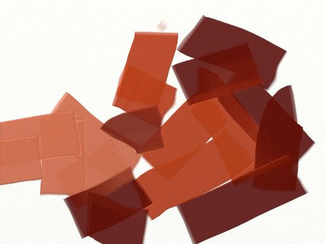
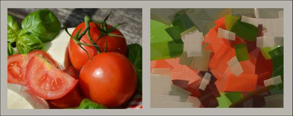
Here is an experiment that can open up for you one way abstraction can work.  In science, experiments often begin with setting intentions, so that's what we will do first.  The subject is the photo of tomatoes below.
OUR INTENTIONS
1. We will use only one tool, a flat brush, and with it we will use only a straight, flat stroke
2.  We will focus only on color
3.  Each stroke will take on a different direction than the previous stroke of the same color
4.  Each color is repeated at least twice.
Image
First pass:  Doing those four intentions, we'll place the lighter value reds of the tomatoes.
Image
Second Pass:  Still using the four intentions, we'll use the darker reds.
Image
Third Pass:  We add the lighter greens.
Image
Fourth pass:  We add the darker greens.
Image
Fifth pass:  The lighter grays.
Image
Sixth pass: The darker neutral reds
Image
Seventh pass:  The darker grays
Image
Eighth pass:  The middle value greens
Image
Ninth pass:  More light grays and the abstract is complete
Image
The sequence of color selection doesn't matter.  What matters is following the four intentions.  
 
Here is the subject and the abstract that grew out of it..  Why not try choosing a photo and abstracting it using this process.
Image

Saturday, November 26, 2016

The Scoop on Harmonizing Your Painting

Art reflects life, one way or another.  The discord we've all felt in recent weeks with the political dissonance in the States reminds me of how our painting, too, can become dissonant when it loses harmony.  It's no different from a musical instrument being out of tune, something that can sour our senses in a flash.  
Harmony means everything is in tune with its light source.  Just as sound frequency tunes a musical instrument, wave lengths of light will tune a painting.  The delivery of wave lengths from a light source causes whatever is lit by that source to be in harmonious light. To keep a painting harmonious, we use that principle.
Here's a chart showing the wavelengths of light in the visible spectrum.
Image
This photo is of tulips in bright sunlight.  Even though we see various colors, they feel in harmony because they are all under the same color of light.  Another more scientific way to say it is that the same wave lengths are hitting everything we see, in the 570 wavelength range.
Image
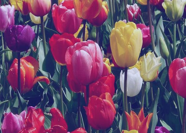
Next, we change the wave lengths to a more orange light, making them a bit longer.  Still, everything is in harmony.
Image
We change the wave lengths again to a blue-violet range, considerably shortening them.  The scene is still in harmony.
Image
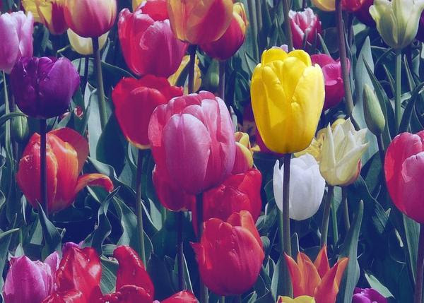
But when we isolate the frontal yellow tulip and put it under a warmer light of longer lengths, leaving everything else in a cooler shorter length waves of  light, we throw it out of harmony.
Image
To put it back into harmony, we simply add to its color the blue-violet light being received by its surroundings.  We do that in painting, too. 
Image

Saturday, November 5, 2016

Vibrant Grays on a Cloudy Day

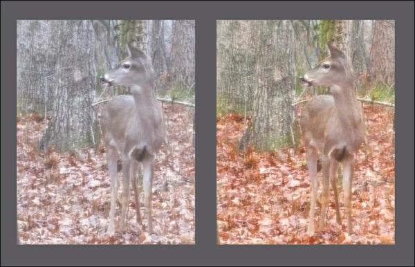
Many artists live in locations where sunny days are rare with not many opportunities to paint outside under a strong light source. We've been told that it's best to paint when the light is good, but maybe that advice is a bit short-sighted.  In fact, just by turning up the volume a little, we can push drab neutrals to become an appealing painting.​​​​​​​
Image
In the above photo, the scene on the left appears drab and gray.  The one on the right has the hue warmed and the intensity slightly raised.   Although this is a computer tweak it shows how little it takes to add some life to the bleak scene, but with our paint and brushes we can take it much further just by exploring the potential within an intensity scale.
Image
Let's begin with our knowledge that all neutrals are made of a set of complements.  With that in mind, we can take any set of complement at their highest intensity and by gradually adding one into the other like I've done above, we can create the complete scale of intensities that the two colors are capable of yielding when mixed together.  By choosing mixes from either the right or the left of the neutrals, we can interpret the scene as being in subdued light while creating a compelling painting. 
Image

Saturday, October 29, 2016

Finding Your Style

By their styles, do your recognize the artists who did these three portraits?
Image
What about these three landscapes?  Can you recognize by these styles who painted each of them? 
Image
Even if you don't know the artists by their work, you can see within each work a distinctiveness, something that sets each artist's work apart even though they might be influenced by the era in which they painted.   
WHAT MAKES STYLE
All my life I've been fascinated by listening to the different ways pianists play Beethovan's Moonlight Sonata.  Even more fascinating is that when you familiarize yourself with master pianists, it's easy to recognize their playing without being told who the performer is. The same is true for artists: when an artist has command of skills and composing principles, their work is recognizable from across the room.
So, how is this possible?  
Style is not something we invent.  It is our natural "handwriting."  It is the result of being in command of our skills to the point that we no longer have to think about the "how to" and delve straight into responding to what we see, interpreting it in a way that pleases us.  To try to force that to fit into a trend or to how another artist might do it is to truncate our own artist's voice in favor of imitating a style.
IT'S ALL ABOUT BEING NATURAL
Below the word "artist" is written by seven different people. The same word communicates seven unique interpretations.   Each style derived from thousands of repetitive strokes over the course of one's lifetime, writing without thinking about how it's being done.  Today, the mastery of these strokes creates the word "artist" as a concept.
Image
 Just as our handwriting evolves over our lifetime, so does our painting style emerge with every brushstroke we make.  When first we began to form letters, we did so deliberately, carefully forming their shapes.  As we became comfortable with the skill of writing, we no longer had to think about forming the shapes.  The thoughts transmit themselves through the shapes.  Today, those who know our handwriting will recognize it as ours unless we distort it.
So it is with our painting style! 

Saturday, October 1, 2016

Fall Colors in Shadow

Try this.  Looking at this photo, squint your eyes so that all the details go away, stare and hold it for a few seconds. 
Image
Notice that within those luscious colors, what you are seeing is mostly in shadow?.  
Image
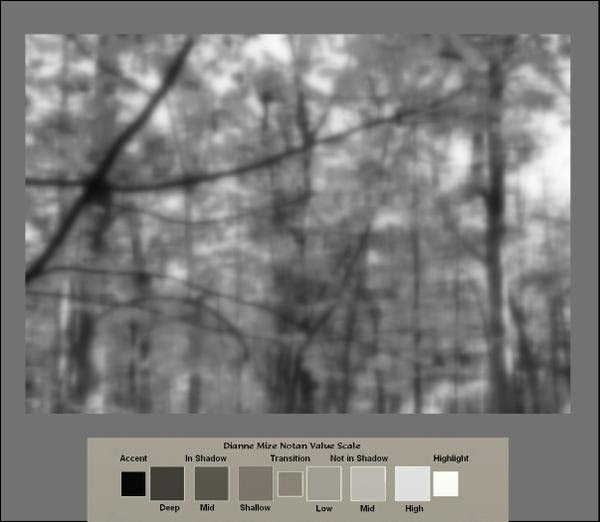
Even though the colors are striking, the brightness we see is mostly pieces of sky visible through the foliage.   All the shadowed areas are easier to discern if we take away the color.  
Image
 If you compare the mid-to-dark areas of the value scale to the blurred monotone photo, it become obvious how minimal the light is in the scene.  At the same time, if we pluck any one of those leaves and look at individually, it would appear something like this.
Image
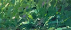
Here's a closeup view of one of the sections. Notice the difference in the color of the leaf above not in shadow and the leaves below in shadow.
Image
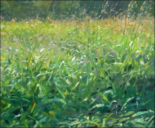
Once we recognize that an area of color is in shadow, we know immediately that regardless of how brilliant it seems to us, the only way we can interpret it accurately is to reduce the value and intensity of hues we recognize.  Here are some suggested combinations for you to play with to make that discovery. 
Image

Friday, September 23, 2016

The Magic of Gradations

Gradation is a seamless transition between opposites.  Light changes slowly to dark, repeated images continuously become larger or smaller, one color gently unfolds into another. It all appears to change before our eyes, to become something different from what we "know" images to be.
Actually, nothing changes at all.  The mechanics of our eyes cause us to see these things happening.  We know a tree trunk to be a tree trunk, but we see its characteristics according to how we perceive light's behavior from our unique viewpoint.  Examine how Colin Page interpreted his perception of value gradation caused by the light and shadow within his painting, Growing Tall.
Image
When we squint our eyes at his painting, we see a gradation of light flooding over a field of tall grasses, but if he had been positioned to the right or left, he would have shown us something entirely different.  Add to that, within Colin's value gradation creating distance, but there are smaller value gradations within that shadowed area in front.  Without these, his painting would be a lot less energetic. 
Image
It is within those internal smaller gradations found in the overall big ones where we can create the most magic within our paintings.   We just have to look beyond the obvious to find them.

Saturday, September 10, 2016

Our Creative Current

When we are fully immersed in the act of creating, there is a space within us where all that we are and all that we know come together into a oneness. We become so completely absorbed in what we are doing that we lose awareness of time and place.  When we stay present there, not allowing ourselves to be distracted or to resist what is happening, we create freely and from wholeness. Here, we lose all self-consciousness: we are totally engaged in the act of doing.  I call this experience our creative current.  It is the place within us from which we are free to create and, therefore, from which we grow and evolve. (From my book, Finding Freedom to Create, p. 5)
The creative current doesn't discriminate.  It worked for Michelangelo 600 years ago the same way it worked for Tom Glavine just twenty years ago.  All that it requires is focus and attention.  That's it.
Image
Michelangelo Buonarroti     Studies for The Libyan Sibyl       Red Chalk on Paper


Image
Hall of Fame, Former Atlanta Braves Pitcher-Tom Glavine 
The neat thing about the current is that we can use it for tiny steps of learning or practicing as well as being deeply involved in large projects. For example, if you want to learn to do notan drawing, you can choose a subject, focus on just shadows in a subject and give full attention to only shadow without noticing what the subject is and before you know it you're in the current.  You WILL do a notan drawing.  You won't be able to avoid doing so.  
Image
Like an electrical current whose voltage flows across a wire, the creative current flows across an intuitive path that we access when we are totally focused within the act of creating, whether practicing, performing,  composing, or constructing.  We all have access to it.  Using it is a matter of letting go of any fear or rational questioning or doubt.   
Whatever the endeaver--whether practicing exercises from my composing lessons, learning a new brushstroke, honing a new technique or simply responding directly to a plein air landscape, to allow yourself to enter and stay in your creative current will create growth and confidence like nothing else.

Saturday, September 3, 2016

Why Does SCALE Matter?

Not long ago, a student asked me how to decide what size to make an image in a painting. For today's composing tip, I want to share with you the answer I gave.  The size we make our images strongly effect how they communicate to their audience.  Let's explore that idea by looking at what some other artists have done with size.
Below are six paintings, each showing the human subject in a different scale as it relates to the format and surrounding images. Notice how each puts you, the viewer, at a unique distance from the person depicted in the painting. That distance helps determine how you relate to the subject in the painting.
Image
Feel how far you are from the people in painting 1 as compared with the people in painting 4. Sense how close you are to the subject in painting 3 as compared with 6. In painting 2, notice the extent to which the environment is important to the person portrayed as compared with painting 5. 
These comparisons show that each of the above painting places a different kind of emotional and relational emphasis on subject. Whereas painting 6 brings us right into the little girl's thoughts, painting 2 is as much about the market and street as about the person making a selection at the market.  Painting 3 makes us feel more like an observer from the street whereas in painting 5, we could be conversing with the subject.
 
So, when we compose, the closer we want our audience to be to the subject, the larger the image of the subject becomes in our painting. The more important we want the surroundings to be to the subject, the smaller the subject becomes as compared to other things in the painting.  Think about the subject's relationship with the audience, how you want the audience to feel about the subject, and that will clue you in on the size the subject should be.

Saturday, August 13, 2016

Keeping Colors and Values Clean

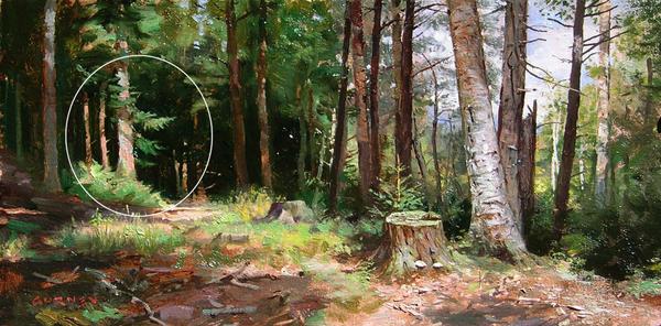
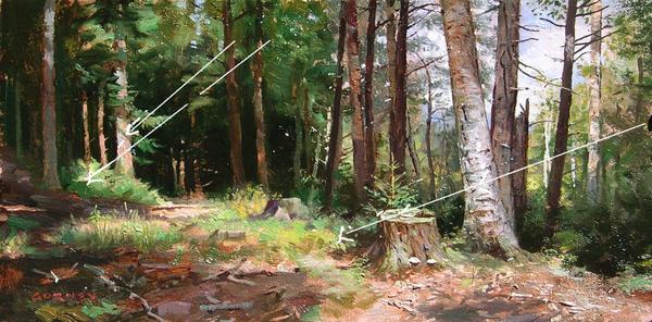
Many emerging painters complain about their values not being “clean” and most are at a loss as to what to do about it.  If you’ve never heard this particular term before, having “clean values” is simply artspeak for a work of art with convincing colors and strong, visually meaningful values like in this little forest scene painting by James Gurney.
Image
Gurney’s darks, midtones and lights each play a role in defining something specific about the forest. His shadows and lights describe the position of the light source as well as its effect upon the subject, so there’s no doubt about what’s going on.  Let's take a closer look at some of the mechanics at work here.
1.  Meaningful Focal Point
Image
Notice how clearly defined are the lights on the tree and the deep dark shadow shapes contrasting on either side of it.  

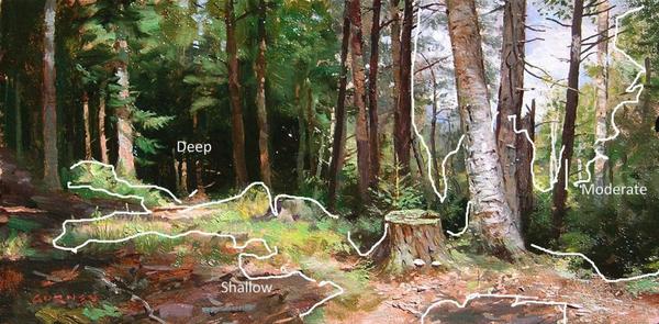
2.  Clearly Rendered Shadows
Image
Look at the value, hue and intensity modulation in Gurney's moderate and shallow shadows, and how easy our eyes transition from the shallow shadows in the upper tree foliage to the deep shadows near the ground. 

3.  Readable Angles of Light
Image
We have no trouble discerning the angle of the sunlight nor reading the scene as being lit from a single light source. 
These composition considerations go a long way towards yielding clean values and colors, but they must go hand in hand with a few technical practices.  Here are four I suggest:

1. Constantly clean your brush
Make a habit of holding a brush in one hand and a paper towel in the other. Any time you switch colors, rinse and wipe the brush by squeezing it out with the paper towel.
2. Don’t skimp on paint—cover the surface
Too little paint often results in weak color. Use adequate amounts of paint to cover the surface and avoid trying to stretch your paint by spreading it so thin that the texture of the surface comes through.
3. Avoid over-stroking and over-blending
Start thinking of your brush as a tool to shape the paint, not just as an applicator of paint. This means slow down. Be deliberate with each stroke and avoid repeating a stroke in the same spot.
4. Find the right hue to lighten your colors
Do you reach for white each time you want to make a color lighter? Well stop.
Adding white changes the color temperature AND the value, making the color look dramatically different. Rather than automatically reaching for white, try to find another color that will give you the value change you need without neutralizing the original hue. (Watercolor painters will know to use the water for making a value lighter.)