Welcome to Compose. There's lots of stuff here, all about composing paintings.

Current entries appear in Dianne's weekly newsletter.


Friday, May 27, 2011

When NOT To Compose

Earlier this spring, I visited a sheep farm to watch the annual sheering.  I had expected to see the sheering process, but had not anticipated that everywhere I looked there would be subject matter. It was close to overwhelming.

I saw potential paintings in every direction, hundreds of them.  At first I was a bit stunned by the overload of images. 

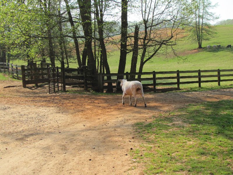
 ...a newly sheered sheep on the way back to pasture...

...freshly sheered sheep grazing... 

...a young girl riding her bike... 
.
...lamas in the back pasture guarding the sheep...

 ... unsheered sheep in the holding areas...

...sheep being shifted in place for a sheering...

...and the sheering, itself.

And it all was in motion.  Positioning the camera and taking pictures as fast as I could, I was still missing stuff in between shots. There was no time to think. And certainly no time to compose.  It was simply gathering raw images while trying to stay aware of all the surrounding sensations--the smells, the sounds, the atmosphere.

This is another side of being a painter. It's a time NOT to compose, just to tune into whatever images get your adrenaline going and gather as many as you can.  It's the flip side of having your subject in the studio with plenty of time to study it or of setting up to paint on location where the light moving is the only thing that makes you hustle.

What is done with the images gathered may or may not be significant.  They could get filed into the archives of my computer or they could become the subject of a spate of work.  That doesn't matter.  What matters is that I not miss an opportunity to record something that spoke to me, even if I didn't understand at the moment what it was saying.


Saturday, May 21, 2011

The 20th Century Argument

This post is more editorial than tutorial.  Important nonetheless.

In a recent issue of Southwest Art, Richard Schmid was asked, "What are some of the biggest changes you've seen in your career?"  His answer:  "I've seen a widespread turn away from what we call modern art, and a strong turn toward highly skilled and serious content in American painting."
Left:   Pablo Picasso  "Seated Woman with Wrist Watch,"  1932
Right:   Richard Schmid, "Portrait,"  1990's
Schmid's answer got my attention because, being close to his age, that probably would have been my answer as well.  Those of us who were university art students in the sixties know quite well the influence of 20th century dogma on our various directions as artists.  For decades, the mainstream required that we absorb its attitudes if we were to be successful.

What I admire about Schmid is that he was able to transition through those attitudes, taking from them teachings that could strengthen his painting while staying firm to his own identity as artist.  What does that mean?

20th century dogma considered developing drawing and painting skills archaic.  Ideas and expressiveness, uniqueness and invention and manipulating space were paramount.  Visual thinking ruled over skills.  Another way to say it is that the pendulum of visual art swung all the way to one side where either total distortion or extreme order over-rode craftsmanship.

Heroes of the day were artists like de Kooning, Rauschenburg and Mondrian.
Willem de Kooning    Robert Rauschenberg   Piet Mondrian
But pendulums often swing in the opposite direction when a thing wears itself out, when those involved began to demand something different from what they are being given, when preachings of the day become hollow and empty.  And so gradually, artists with university degrees began to enroll in workshops and apprentice themselves in order to develop the skills their colleges did not give them.

Workshops and tiny art schools mushroomed, founded by instructors who had managed to locate and study with rogue artists who had chosen to develop their skills outside of the university setting.  The universities and mainstream were the last to catch on and still today old attitudes prevail, but in spite of that, once again the painters and sculptors of our era are finding out that to be highly skilled is to enable creativity, not the other way around as preached by our 20th century heritage.

Saturday, May 7, 2011

One Idea, Many Variations

How many variations can you put on a theme?

Turkish pianist Fazil Say shows us how Mozart, being both playful and naughty, took "Twinkle, Twinkle Little Star" and did this:

 
Similarly, visual artist Pat Weaver has put more than two dozen twists on a single theme, a container of flowers.  Go HERE for a moment and take a look.  (Don't forget to come back.)

Just as composers like Mozart often elaborate on a simple tune, it's not unusual for a visual artist to explore a single idea in an array of works, each complete within itself, yet having its own unique take on the chosen theme.  One way to do this is to play with the color key like Pat Weaver has done.

Look at two of Pat's still life paintings:

Still life paintings by artist Pat Weaver
You can see that one of these painting's key registers on the warm side of the Color Wheel while the other falls in on the cool side.

But look what happens in this one:

Pat has used two keys in her pot of geraniums and with a sweet twist:  most of her green notes (green being on the cool side) are predominately a warm green whereas her red (red being warm) notes are on the cooler side of red.  

If you listen to all the spins Mozart put on "Twinkle, Twinkle..." you can hear how each dances around the tune, yet retains our recognition of it.  Pat Weaver's many variations on "flowers in a container" each carries a specific use of color giving it a singular interpretation and expression.

Each of these creators took a given and found multiple ways to expand it into something new and unique.

Saturday, April 23, 2011

It's Set in the Key

This is my vacation piece.  I'll be on medical sabbatical for a little while getting my right hand--my dominant one--repaired and recuperated.

Meanwhile, this is fun:

2700 years ago a Greek philosopher named Pythagoras standardized musical tuning into a system he called the Circle of Fifths.   It was he who diagrammed the relationship of our twelve major keys, an invaluable tool for composers and musicians in Western music.

 Within Pythagoras' Circle of Fifths, we can locate any key and find its related chords.  Here's how it looks:

The Circle of Fifths designed by Pythagoras in the 6th century, BC
(Disclaimer:  This particular design of Pythagoras diagram is posted on several internet sites.  It is unclear to whom it should be credited.)

To see how this works, locate C on the circle.  Glance to the left of C and you'll see F, look to the right to find G.  C, F and G are the three major chords in the key of C.  In the little circle underneath them are the minor chords related to the key of C.

Now here's the fun part: four hundred years ago the traditional Color Wheel was diagrammed  by Sir Isaac Newton.  This wheel also is a twelve-part unit.
The traditional Color Wheel as designed by Sir Isaac Newton in the 1600's.
No different from the Circle of Fifth's importance to musicians, the Color Wheel is the work horse of visual artists.  The more a musician learns about the Circle of Fifths, the richer the music can be, and the more a visual artist learns about the Color Wheel, the more fertile the possibilities are in painting and design.

And not unlike how a composer sets a musical piece in a key, the artist has the ability to set the key of a painting, giving it the same sort of unity as a key gives a piece of music.

Left   "Weaver" by Richard Schmid
   Right   In a Moscow Cafe"  by Robert Genn

The paintings above are similar in that each features a person engaged in doing something, but their major difference is their key.   Robert Genn's has keyed his piece in cool colors (colors in the bluish range) whereas Richard Schmid's painting is keyed in warm colors (colors in the yellow/red range).

Here is how each is positioned on Newton's Color Wheel:

Schmid and Genn paintings each placed in their key of colors. 

What's so much fun about all this is the similarity between the two diagrams we artists and musicians depend upon and the many parallels in the ways they are used.

And once my hands are working again, I plan to explore this in upcoming tutorials.  Meanwhile, enjoy this thought:  however you look at it, everything is connected.


Saturday, April 16, 2011

The Power of Gesture

Our gestures express our identity.  Whether in our handwriting,  our gait, or the movement of an arm while talking, folks who know us recognize us as quickly by our gesture as by our voice.

Gesture is movement   Gesture drawing is quick drawing capturing the movement within the subject.  The subject itself might not be moving, but our eyes are in perpetual motion as they scan its visual makeup. Long, subtle curves cause our eyes to move more slowly, short abrupt curves, faster.  We zip right along straight lines and leap from segment to segment when a line changes direction.

When we record these visual movements with a quick, linear drawing--as if doodling--we express the shape's gesture.  Our spectators recognize  the subject by what it's parts are doing rather  than by how it is described.   It is so simple, yet many artists find it challenging.

But for Larry Roebal, it's mere "doodling."
Larry Roebal's "doodle" for April 15, 2011
Almost daily for over the past three years, Larry "doodles" an image from the day's news. Using ballpoint pen, drawing on top of the news article that grabs his attention, he quickly renders a drawing of the news article's subject, then posts the drawing to his daily blog.  Larry calls these gesture drawings "doodles."

Three hundred years ago, there was another "doodler" doing very much the same kind of thing.  You might have heard his name:  Rembrandt.
From the sketchbooks of Rembrandt van Rijn  1606-1669
And five hundred years ago, there was an artist named Michelangelo who was himself quite the doodler .

 From the sketchbooks of Michangelo Buonarroti (1475-1564)
This thing we do that Larry calls doodling is an artist's most immediate tool for exploring and discovering  the subject's inherent essence.  It's a means for sharpening our observation skills while doing visual research.  And even though it's not results-oriented, the outcome has a life of its own.

Call it doodling, call it gesture drawing--its label is insignificant.  What is significant is its power to capture and express visually the heart and soul of the subject in the handwriting of the artist.

Saturday, April 9, 2011

The Power of a Repoussoir

What do I do if I want to get your attention?

In his popular Fifth Symphony, Beethovan gets our attention with a precise da/da/da/DUM.  And Welsh poet Dylan Thomas opens one of his poems, "And death shall have no dominion."  Not so unlike these attention grabbers, Andrew Wyeth in "Christina's World" does this:
"Christina's World"   Egg Tempera    Andrew Wyeth  
The female image in Wyeth's painting is a repoussoir in action:  it captures our attention and leads us to the distant images.
re·pous·soir
  [ruh-poo-swahr]  
(From Dictionary.com)

What fascinates me about this device is its flexibility, its potential for free expression within a traditional pattern, one that yields unity while bringing us into a painting.  (In case you'd like a more in-depth definition, I explained how repoussoir works in one of my Empty Easel articles a couple of years ago.)

 I particularly enjoy paintings whose notan (see last week's post) is interlocked within a repoussoir.  When I see this working in a painting, it reminds me of an Italian sonnet , a device that acts like a repoussoir:  two major parts where the first is an argument, the second a resolution.

Paintings employing a repoussoir within the notan  pattern have two major parts as well:  one overall light or dark value usually anchored at the bottom of the painting leading the eye to an opposite value anchored at the top.


Anchored at the bottom of each of the three paintings above is a major light leading our eyes to an important dark area anchored at the top.   Richard Schmid does this in his landscape painting on the right, I used in my painting of squirrels on the upper left, and Pat Weaver does a similar thing in a painting of people on the lower left.

If as you look at each of these paintings you squint your eyes,  you can see this happening.  You experience in each piece a repoussoir built within a notan pattern,  three totally different paintings each saying entirely different things, but employing the same device:  a visual sonnet.  Now, that's captivating!

Note:  If you'd like to receive these tutorials by email, sign up in the left column at the top.  And if you'd like me to do a tutorial on some individual composing principle or problem, let me know in the comments section below.

Saturday, April 2, 2011

Limits Or An Open Door?

There are no limitations except those we impose.  No form or pattern any artist selects need be confining, rather a glue that holds the piece together.  Today's doctrine that yesterday's pattern inhibits creativity is flat out wrong:  an artistic structure is a scheme, a path the artist chooses to enable an explosion of expression while keeping it unified.  The notion of breaking out of the box misleads us.


One structure I keep revisiting, one visual pattern that continues to lure my attention is the notan,  a simplified arrangement of two major shapes found in the overall collection of lights and darks.
Original photo of Herefords in pasture.

Notan study of original photo.  Notice how each inherent set of lights and the darks link together into one connected shape creating a pattern.  While discovering this pattern, I deleted the frontal trees because they divided the composition.

"Sautee Herefords"   oil painting based on the notan pattern
  
Notan exists as a concept invented somewhere in time and then given a name.  Today I use it as a guide for discovering light and dark patterns in nature.  It is that discovery that I use as the unifying adhesive of a painting.  Confident the notan will hold it together, I'm free to discover and explore all sorts fun stuff.


Chopin did that with the mazurka,--another concept invented and named somewhere in time--as pattern for at least 58 of his compositions.  And Shakespeare used the sonnet pattern--same process, different mode--exploiting it to spout forth more than 150 poems.  (See last week's post.)

Neither notan nor mazurka nor sonnet is a restriction, rather each is a container within which we can discover unlimited possibilities.  We need only to be alert.

Saturday, March 26, 2011

What's In This Greatness?

We wonder why some art works live for centuries while others get lost in archives of communal memory. Visual artists, writers and composers create works that excite us humans hundreds of years later.  What is there about Chopin,  Shakespeare and Michelangelo whose works continue to awaken within us a spirit of excitement, a desire to experience their them over and over again?


One thing that keeps getting my attention  is whether by conscious choice or by intention, they all have in common their use of an internal pattern:  Chopin's mazurkas, Shapespeare's sonnets and Michelangelo's triangles. Something about that structure enables artists to express the impact of a moment in time and make it eternal.

What's exciting to me is not the pattern itself, but how the the artists transform their pattern of choice while retaining it's underlying formation.
Michalengelo's "Pieta"


And so discovering patterns and finding ways artists transform them is what I'll be exploring as I resume my Compose tutorials.  That should keep me busy for a while!


Sunday, May 23, 2010

Current Update

Howard left us on January 28 of 2010.  I am in the throws of regrouping and coming to terms with my loss.  I have begun painting again, but am easing back into blogging.  So this blog will remain on hold until I can again gain the clarity of mind to resume it.  Meanwhile, thanks for your patience and support.  You can see what's I'm doing  HERE .


Dianne

P.S,  By some miracle, just weeks before Howard's death, we managed to get the poetry manuscript published.  The title is Under the Diamond Pulse, available at Amazon.com for $29.95.

Monday, October 19, 2009

October Update

In July my intentions were to write to this blog when there was an occasional available moment, but there has been no time for that. Howard is a poet and before becoming so ill had just finished compiling a manuscript of recent poetry for publication. There was no energy nor time left to seek out publishers so we both decided to publish it as a website. That has been the project of my focus since early summer. And it's been worth it. Now Howard's poetry is available at howardghanson.com and we both are so proud of the project.

Already having lived six months longer than expected by the doctors and still in the care of hospice, Howard continues to inspire me with a human spirit totally unaware of how fragile a body it lives in. We continue to cherish life rather than grieve impending death, laughing generously and enjoying one another's presence.

Saturday, July 11, 2009

Update and More Immediate Plans

It has now been three months since hospice became a way of life in our home. Howard is a real trooper, demanding in every way quality of life and refusing to be bedridden regardless of so very much loss of independence. Care must be constant, but already there have been multiple gems in moments of struggle. And laughter continues to play a key role in our lives.

There is no time or energy to paint, not yet. But I have decided, beginning next week, to resume my tutorials on this blog even though Bagatelles and Meanderings will remain on hold for a while. I have relinquished my writer's position on Empty Easel, at least for the time being. Dan has graciously offered for me to resume those tutorials whenever I can, but I won't be doing that any time soon.

Meanwhile, I look forward to getting my thought processes artward. Stay tuned.

Sunday, April 12, 2009

A Brief Time Off Line

Dear Friends,
I wanted to let you know that I have not disappeared, but I will be off-line for some time to come. My soul mate and life partner of the past 28 years is now in the care of Hospice here in our home, and this is where my focus and energies currently are. Until I can get back to painting and blogging, do enjoy what's already here.
Thanks for your visit.
Dianne

Saturday, March 28, 2009

The Complete Picture

Early on in my teaching career, I encountered a chart by Ocvirk, Bone, Stinson and Wigg in a text entitled Art Fundamentals, Theory and Practice. The chart was suppose to be a visual diagram of how our principles and elements work together, but I found it lacking so undertook to revise and redesign it. That process lasted for many, many years and still is not over today.

I used the chart as a "cheat sheet" when doing composition lessons with my students and continue to use it today with my critique group, Second Tuesday Art Guild. I introduced it to this blog once before, but am giving it an encore because next week I want to begin a series of tutorials on its contents. So for this week, here's the chart for you to ponder. Beginning next week, we will break it down, flesh it out and pull together how it includes so much of everything that goes into a good painting.

THINK CHART FOR VISUAL COMPOSING
Copyright, 2008 * Dianne Mize
“We construct images, we compose art work.”
The ACTION principles (Things we do to compose)
Select and Place (Rule of Thirds--Golden Mean—Rabatment—Notan, etc.)
Gradate or Modulate
Alternate
Contrast
We do this…
Vary
Repeat
Make similar
Elaborate
Economize
Isolate
Overlap
Juxtapose
Find Angle of Light/Shadow
Find and Use Perspective
Create Dominance
(and more)
The Elements (Our Vocabulary)
Color:
Value
Hue
…with these
Intensity
Temperature
Shape
Size
Direction
Line
Texture
The RESULTS (What We Get)
Pattern to avoid randomness
Balance to prevent one-sidedness
Order to negate chaos
…to get these.
Harmony over discord
Rhythm rather than static
Proportion to avoid lopsidedness
Movement or Transition as opposed to Aimlessness
Form to avoid distortion
Focal Point versus not sure where to look
Emphasis rather than erratic
Eye Path in favor of spottiness
Toward our ULTIMATE GOALS
Unity to avoid divisiveness, fragmentation (We want the work to hold together)
Purpose to negate aimlessness (We want the work to have meaning)
 

Saturday, March 21, 2009

Free To Create: The Big Eight

If you've been keeping up with this blog, you know that for the past eight weeks, I've been addressing individually our visual vocabulary, the elements. I've tried to show how each can play its own role in our painting not unlike parts of speech in the spoken language.

A noun names -- a shape defines
A pronoun stands in--size relates
A verb acts -- value structures
An adjective defines -- hue describes
An adverb modifies -- temperature harmonizes
A preposition links--a line leads
A conjunction connects--direction controls
An interjection accents--texture intrigues

We don't need to know what a noun is to ask for a refund, nor do we need to know what a verb is to spend the refund once we get it. English speaking people can communicate very well without knowing a thing about the structure of the English language. But once we DO know how these parts of speech work, we can use them to express ourselves more adequately.

It's called communication. As artists we're involved in a two-sided activity: on the one side we express ourselves--on the other, we communicate what we have expressed. No matter how poorly we have expressed it, something gets communicated even if it's total confusion.

But the better we understand the tools with which we work, the more in control we are with what they can do. The bigger reward, though, is this: the better we understand our tools, the freer we are to be creative with them.

Now, there's a lovely Springtime thought!!!

Saturday, March 14, 2009

Temperature: The Harmonizing Element

It's confusing to look at nature and determine whether the visual temperature is warm or cool. Yet master artist Richard Schmid is adamant (and I agree) that the temperature of the light is our most important harmonizing element because it effects all the colors illuminated by it.

But even Schmid admits that determining what we see as warm or cool can be tricky. Here are his own words:
"Generally speaking (and only generally), sunlight is warm. Consequently, the more overcast the sky, the cooler your light will be. Mother Nature is very tricky though. She can throw you a curve when you least expect it. Trust your eye always.
" (Taken from Schmid's website FAQ page)

Now, trusting our eyes look at this:
In our discussion about value I emphasized that we see because of light. A simple concept, but the heart of every decision we make when painting. Now we go one step further: every light source has a color, therefore a temperature--it is either warm, cool or neither. Forget about the "neither" and assume as an artist you're dealing with either warm or cool.

Both photos above show the same batch of lemons, yet the photo on the left is in warm light and the one on the right in cooler light. Visual temperatures are cooler when they are bluer, warmer when they are redder or yellower.

Now look at this:
The ball is blue (well, of course it is !) Blue is the coolest of colors, but notice where a warmer light hits the blue ball most directly, the color appears warmer. That same blue appears cooler as it moves into shadow. I've isolated these with samples across the top to make it easier to see. (You might have recognized that I used this same illustration in an Empty Easel tutorial about color.)

The reverse happens when a color is illuminated by a cool light.


Let's look at our lemons again--the ones in cool light. Now let's zoom into a shadowed area and sample it. The results are in the rectangle on the upper right edge.

Joila! The shadowed areas are warmer (more orange) than those more directly in light.


Perhaps this simple principle is the most important one to remember when dealing with temperature and color. Our natural tendancy--indeed, some have taught--is to always make shadows cooler, but in painting it's best not to live by rules other than always let your eye tell you what your looking at.

As a general rule of thumb, though, if you shift your eyes between light and shadow of an area, you WILL see a difference in temperature between the two. One will be cooler, the other will be warmer. Most likely, if the shadow is warmer then the light source is cool. If the shadow is cooler, the light source is warm.

Oddly, if you direct your painting choices by keeping this in mind, the painting should feel in tune or in harmony with itself.

And so, the conclusion we always come to is teach yourself how to see, then trust your eyes.

Saturday, March 7, 2009

Intensity: The Baffling Element

In the classroom, intensity was always the one element or concept that boggled the minds of my students. Folks got the value thing--it seemed easy enough to comprehend that a color gets lighter or darker depending upon whether it is in light or shadow. Hue was easy--regardless of whether we used the traditional triadic wheel or the Munsell wheel, students found naming the colors and organizing color schemes easy enough to deal with.

But when we hit the intensity idea, brakes were applied and tires started squealing. So how do we mortals wrap our minds around intensity?

Look at this strip of two colors.
These are the same hue, the same value, but of differing intensities. What is the hue? There's one clue. If you can look at a color and FIRST name its hue, THEN name its value, you might be able--afterwards-- to name its intensity. But how do you name an intensity?

I think that's part of the problem. Intense/neutral. These are the pairs. Neutral has no color at all--theoretically, this is. It's gray. Every single color under the sun can lose its color identity (hue) when totally neutralized by its complement. It can nearly lose its identity when mixed with gray, black or white.So, theoretically a color is most intense at its spectrum color where it has in it neither complement nor gray, black or white. With these added, though, it is either very intense, somewhat intense, somewhat neutral or almost neutral. So our language then is high intensity, middle intensity, low intensity or neutral.

Looking at a diagram of the spectrum (above) and the three colors underneath it, it's easy to see that all three hues are red-orange. The first is a bit browner, the second a bit rustier and the third closer to spectrum red-orange. So how do we know their intensity? The third is obviously closer to the spectrum.

Oranges, reds and purples get rustier or browner, yellows and yellow-oranges get more ochre, greens become olive, blues look grayer. So if you call the first color a brownish-orange, then you know it's more neutral.

Try this: let's look at Martin Figlinski's painting "Beach Path, Grayton Beach".

"Beach Path, Grayton Beach" (c) Artist Martin Figlinski


The three swatches above are sampled from Martin's painting. Take them one at a time, left to right. Name the hue, now the value, now the intensity. Use the language for naming the intensity as simply "high, middle, low" or "highish, middle, lowish". Doesn't need to get more complicated than that.

Go to the end of this post for the correct answers.

Let's do the same thing with Carol Marine's "Orange Parade"
"Orange Parade" (c) Artist Carol Marine
After we learn to name the intensity, we should be able to become conscious of it when we see it. So rather than call an old unpainted barn gray, we'd call it low-intensity, mid-value bluish-violet, for example.

Seeing and recognizing the hue will go a long way towards labeling the intensity. So remember, if you see it brownish or rust, it's probably red-violet, red, red-orange or orange; if it appears to be ocher, it's most likely yellow-orange or yellow or even yellow-green; if it seems more olive, it's green, if it seems gray either has no hue or it might be blue. These are examples of what you might expect, but don't depend upon them: rather, fix your eyes on the hue first. Once you name it, the value and the intensity should be easy.

Leave me a note in the comments section and tell me how this works for you.

Answers:
Figlinski samples: (1) left, blue-violet/light/low, (2)red-violet/light/low (3)red-orange/dark/low
Marine samples: (1) red-orange/middle/somewhat low, (2) orange/mid-light/somewhat high, (3)orange/high/somewhat low, (4)red-orange/low/low

Saturday, February 28, 2009

Meet Munsell

Below: Color Wheel based on Munsell's Five Primaries

It was Sir Isaac Newton who in 1666 invented what came to be known as the triadic color wheel built on three primary colors--yellow, red and blue.

But in 1898, Albert Munsell came up with a totally new color system, one built on what he called five primaries--yellow, red, violet, blue and green. (See wheel on at top.)

We can use the Munsell color wheel to put together color schemes discussed in last week's tutorial, but with slightly different results. For example, the complement of yellow according to Munsell is blue-violet, the complement of red is blue-green, but orange remains the complement of blue. Munsell's system gives a shorter range between red and yellow than our primary triad does. Whereas the triadic wheel yield 12 colors, then, Munsell has only 10.

Actually, Munsell's arrangement on the wheel is closer to how our eyes perceive color. Try this: find a bright red sheet of paper. Stare at it for 15 seconds, then suddenly shift your eyes to a white surface and hold for 3 or 4 seconds. An afterimage will appear that is actually blue-green rather than pure green.

In fact, Munsell's system is not actually built on a wheel, but rather a sphere that shows the interconnectedness of hue, value and intensity. Our triad wheel is based on hue alone.

To understand Munsell, imagine a globe with all the colors on the surface of its equator circling like colors positioned in a spectrum. Here the are the brightest, purest possible hues. Then imagine all these same colors gradually getting lighter as they migrate upward to the north pole and likewise, gradually getting darker as they move downward to the south pole. Here's what the outside of Munsell's sphere looks like.
Image borrowed from Albert H. Munsell, “A Pigment Color System and Notation

But there's more. The inside of the sphere toward its core illustrate how neutrals are formed. Imagine a slice across the center of the globe starting at green and ending at red-violet. Now imagine what's happening on that slice if on the green side a little bit of red-violet is added just inside the edge, then a little more as it moves toward the core, continuing until it reaches the core where it becomes totally neutral. On the red-violet side, the same thing is happening by adding a little bit of green at a time. That cross section would look something like this image I borrowed from Encyclopedia Britannica:

Inside the sphere color values get lighter as the rise to the top and darker toward the bottom. That's pretty much what the Munsell system looks like


In my mind, the Munsell system is scientific attempt to illustrate the workings of color whereas the triadic wheel is a thinking tool. There is no doubt that within the Munsell system, you could locate any color there is. It's somewhere in there, believe me. And it's fun to try to do that. In fact, it's a good way to understand the true nature of color.

But for my money, the triadic wheel is a better tool for thinking, leaving us more freedom for working out color mixtures.

You can get a more detailed explanation of the Munsell System by going HERE and for more references, go HERE.

Saturday, February 21, 2009

Hue: The Scheming Element


Fire truck red. Sky blue. Lemon yellow. The primary hues. Most folks call them them colors, but color covers value, intensity, and temperature as well as hue. This discussion is totally about hue, the way colors appear around a typical, traditional color wheel. Hue is the name of the color.

Today, there are multiple variations on the idea of a "color wheel", but if a person understands the traditional triadic wheel built on the primary colors yellow-red-blue, none of the others are really necessary. And it really is the simplest way to understand hue.


Studying hues aside from value, intensity and temperature helps us understand how colors relate to and effect one another.

First, there are the color schemes:
A color scheme is a limited selection of hues that will appear in the painting. The artist finds ways to adapt everything in the paintings so that these colors are the major ones appearing. They might vary in value, intensity or temperature but they will not veer away from the designated hues.

The traditional schemes are primary, secondary, tertiary, analogous, complementary, double complementary, split-complementary. Often, though, artists invent their own schemes some of which might be variations or off-shoots of these.

Primary: Red, Yellow and Blue


Charles Reid's "Brown Jumper" is done in a primary color scheme.


Secondary
: Purple, Orange and Green


Gaye Adams "White Water" is a secondary color scheme.


Tertiary Triad:


Yellow-Green, Red-Orange, Blue Violet or Blue-Green, Yellow-Orange and Red-Violet. Robert Genn's "Moscow Cafe" uses a
tertiary triad.


Analogous
: Any set of colors located between two primaries on the wheel
Clyde Aspevig's "End of June" is done with an analogous scheme with colors located between blue and yellow.


Complementary
:

Any two colors appearing as opposites on the wheel
Edgar Payne uses a complementary of reddish orange and greenish blue scheme in this sailboat painting. (Note: This is a close to a complementary scheme as I can find at the moment. Somebody's got a better one somewhere...)


Double Complementary:

Take one color, skip one, then pick the next. These plus their opposites create a double complement.
Morgan Weistling uses the double complements of yellow/violet and blue/orange in this lovely portrait, "Ophelia."


Split-Complementary:


Any color with both neighbors on either side of its opposite.
Lili Pell uses the this scheme with green opposing red-orange and red-violet. This is not
a pure SC scheme because of the appearance of blue. Few are pure.


In next week's tutorial, I'll discuss the Munsell Color Wheel and how it is different from the traditional primary wheel. See you then.